
How to Audit Your Website Like a Pro Designer
This is a practical way to review a website through the eyes of an experienced web designer. Not a technical checklist, and not a DIY SEO guide. Most business owners can tell when a site feels weak, vague or oddly hard to use, even if they cannot quite put their finger on the reason. In real audits, the problem is often not one big flaw but a series of smaller issues across messaging, structure, trust, usability and speed that quietly make the whole thing work less well than it should.
If you are considering a rebuild, or trying to brief an agency without wasting time, this kind of review helps you see what is actually wrong before anyone starts talking about colours and layouts. It gives you a clearer way to judge whether the issue is the website design itself, the way content is organised, the friction in key journeys, or simply that the site feels slow and dated in the wrong places. I have seen plenty of websites that looked polished at first glance but fell apart the moment you tried to use them properly, which is usually where the useful answers are.

Start with first impressions, not pages
A good review starts by checking what the site says about the business in the first few seconds, before getting pulled into details.
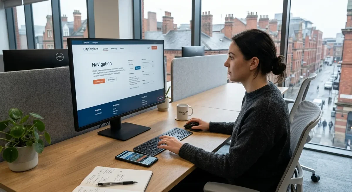
I start on the homepage because that is where most first judgements are made, then I check one key service page, the about page and the contact page. Those four pages usually tell you enough to spot whether the site has a clear structure or whether it is hiding basic gaps behind polished visuals. If the homepage cannot quickly explain what the business does, who it helps and what action a visitor should take next, the rest of the site is already working harder than it should.
Clarity beats decoration
Look at the top of the homepage like a new visitor, not like the owner who already knows the context. A strong site makes the business, offer and audience obvious straight away, using plain language rather than vague slogans or padded statements about quality and passion. Then move to a main service page and check whether it becomes more specific, not more confusing.
After that, the about page and contact page tell you a lot about credibility. A solid about page should make the business feel real, established and accountable, not anonymous or copied from a template. A contact page should feel straightforward for a UK audience, with clear contact options, a genuine location or service area where relevant, and none of the awkward friction that makes people hesitate before getting in touch.
Signs something feels off
Dated does not always mean old-fashioned design. More often it shows up as inconsistent headings, stock-looking imagery, mixed messages between pages, tired calls to action, or a layout that feels built from standard blocks without much thought for the business itself. If the site feels generic, unclear or slightly untrustworthy at a glance, that matters, because a UK business audience tends to notice polish, but they also notice when polish is covering a lack of substance.

Check whether the structure makes sense
Follow the path a normal visitor would take and see whether each page helps them move forward without having to think too hard.
Start with the main navigation. The labels should be plain English, not internal jargon, vague category names or clever wording that makes sense only after you already know the business. If someone lands on the site needing a service, they should be able to spot where to go without guessing whether “Solutions”, “Insights” or “What we do” hides the thing they actually want.
One or two clicks is usually enough
Important pages should be easy to reach from obvious places. A homepage should lead cleanly into key service pages, those service pages should point towards proof, FAQs or contact, and the contact page should never feel buried like an afterthought. If useful pages keep disappearing behind dropdowns, repeated menus or generic buttons, the structure is making simple decisions feel harder than they need to be.
Then look at how related pages support each other. A good service page does not sit in isolation. It should connect naturally to nearby topics a visitor may need next, such as a relevant case study, a process page, pricing guidance where appropriate, or a contact route that fits the stage they are at. On weaker sites, each page feels like a separate brochure panel, with no sense that anyone planned how a person would move from interest to trust and then to action.
Signs the site has grown without a plan
You can usually spot this quickly. Navigation items overlap, page titles say nearly the same thing, old sections linger in the menu long after they stopped being useful, and some pages feel oddly prominent while genuinely important ones are tucked away. That usually means pages were added over time in response to short term needs rather than fitted into a structure that makes sense for the business and for the people using the site.

Read the page as a client would
Judge whether each page answers the practical things someone needs to know before they decide to contact you.
Start with the headline. If a visitor lands on the page and still has to work out what it actually covers, the page is already creating doubt. A good headline says plainly what the service, offer or page is about, without hiding behind broad phrases like “tailored solutions” or “helping businesses grow”.
Clarity beats polish
Then read the page as if you know nothing beyond the business name. Can you quickly see what is being offered, who it is for, how the work happens, and what sort of result a client can reasonably expect. If those points are scattered across the page, buried in design elements, or left implied rather than explained, most people will not do the work of piecing it together.
Pay attention to the language itself. Strong pages usually use ordinary words and specific statements, such as explaining that a project includes website planning, design, development and launch support, rather than saying the service is “bespoke”, “strategic” and “results-driven” without showing what any of that means. The more a page relies on vague claims, the less confidence it tends to create.
Notice where effort shifts to the reader
Weak pages often expect people to join the dots for themselves. You see it when key details sit behind sliders, tabs, PDFs, overloaded FAQs, or buttons labelled “Learn more” that lead to another page instead of answering the obvious question there and then. If someone has to hunt for pricing context, wait until the final paragraph to understand the process, or guess whether the service is even meant for a business like theirs, the page is asking for too much patience.
Look for friction in the journey
Check the small moments where people hesitate, get stuck, or have no clear next step.
A lot of websites lose enquiries in ordinary places. Buttons are vague, contact links are tucked into the wrong part of the page, and useful pages simply stop without telling the visitor what to do next. I would check whether the main calls to action are clear, written in plain English, and placed where someone is likely to need them after reading key information, not just dropped into the header and footer out of habit.
Forms often create more resistance than people realise
Look at every contact form as if you were busy and mildly sceptical. If it asks for too much too soon, such as full postal address, detailed budget breakdowns, or several compulsory fields that do not help with the first reply, it is adding effort for no good reason. The wording matters too. Labels should be obvious, helpful, and human. A field called “Project overview” is easier to answer than one that sounds formal or unclear.
Then check whether pages end cleanly. A service page, pricing page, or case study should not leave people at a dead end once they have what they came for. If someone reaches the bottom and has no sensible next move, whether that is getting in touch, viewing related work, or reading the process, the page is wasting the attention it just earned.
Simple jobs should feel simple
Pay attention to everyday tasks like finding a phone number, booking a call, downloading a brochure, or understanding which service fits. If the layout makes people jump between pages, decode crowded sections, or reopen the menu to continue, the site is creating unnecessary drag. Good website design removes that low-level effort. It does not make basic actions feel like work.

Test trust signals with a sceptical eye
Look for enough concrete detail to feel confident the business is real, capable, and safe to approach.
Start with the obvious basics. Can you quickly find a real company name, a working email address, a phone number, and a clear location if the business serves a specific area such as London or the wider UK. If those details are buried, inconsistent, or missing altogether, the site creates doubt before you even get to the service itself.
Proof should feel specific
Case studies, portfolio pieces, and client examples need enough detail to mean something. I would look for what was actually delivered, what kind of business it was for, and whether the work shown matches the services being sold. A page filled with polished screenshots, vague praise, and no context often feels padded, especially if every project sounds identical.
Then check whether the site holds together properly. Tone should stay consistent from the home page to service pages to contact page, and factual details should not contradict each other. If one page says the firm works with established businesses, another talks like it serves everyone, and the footer shows an old address or outdated branding, that lack of care is hard to ignore.
Neglect shows up in small places
Old copyright years, broken links, empty social profiles, missing privacy or cookie pages, and news sections abandoned years ago all chip away at confidence. None of these things prove a business is poor at what it does, but together they suggest the website is not being looked after, which matters if the site is supposed to represent a professional service.

Review how the site behaves on a phone
Web designers check mobile pages properly because many enquiries come from people glancing at a site between meetings, on trains, or while comparing options quickly.
A layout that looks tidy on a laptop can become clumsy very fast on a small screen. Check whether headings still break in sensible places, buttons stay clear and easy to tap, and spacing gives each section room to breathe instead of stacking everything into one dense column.
Put the useful stuff near the top
On mobile, people make decisions with far less patience. If the first screen is taken up by a large image, a vague strapline, and a pop-up asking for sign-up before the page has said anything useful, the site is getting in its own way. The core message, the main service, and a sensible next step should appear early enough to catch someone who is only half a minute in.
Make one-thumb use feel normal
Menus and forms need a quick reality check here. A menu should open cleanly, close cleanly, and make it obvious where to go next without tiny links packed together. Forms should ask for what is genuinely needed, with fields large enough to tap comfortably and buttons placed where a right or left thumb can reach them without fuss.
Also look for the small irritations that add up: pop-ups covering the screen, cookie banners that push content out of view, text sitting too close to the edges, or buttons placed so tightly that you hit the wrong one. None of this is complicated, but it is exactly the sort of friction that quietly costs enquiries.

Judge performance by feel
Pay attention to delays, instability, and visual noise because they affect trust long before anyone measures a score.
Open a few key pages and use them normally. If images fade in late, text appears before the layout settles, or the menu hesitates when you tap it, that is not a minor technical quirk. It makes the site feel less reliable, especially to someone deciding whether to enquire.
Look for heaviness, not just waiting
Some sites do load, but still feel cumbersome. You scroll and things lurch into place, buttons shift just as you go to press them, or sections arrive in a staggered way that makes the whole page feel jumpy. That kind of instability creates friction because people have to keep reorienting themselves instead of focusing on the content.
Effects should support the page, not dominate it
Video backgrounds, sliding panels, animated counters, and scrolling effects can all be used sensibly, but they need a clear reason to be there. If motion keeps drawing your eye away from the message, if a video delays the useful content, or if transitions make the interface feel sluggish, the design is putting decoration ahead of usability.
A site that feels quick usually benefits from better judgement underneath: cleaner layouts, more disciplined media use, clearer priorities, and fewer things competing for attention at once. That does not mean every slow page has one obvious cause, but fast-feeling websites are rarely an accident.

Compare the design to the business it represents
Look past whether it feels modern and ask if it reflects the standard, pricing and credibility the business is trying to communicate.
A proper review checks for fit. A solid local trade business, a private clinic, a specialist consultant and a funded startup do not need the same visual language, but each should still look considered, confident and in step with what their clients expect to pay and trust them for.
Bespoke does not mean flashy
Some template-based sites are perfectly serviceable, especially for simpler businesses, but you can usually tell when a design has been dropped in with minimal thought. Repeated stock imagery, generic icon sets, awkward page layouts and sections that feel unrelated to the actual offer tend to make the site feel off-the-shelf, even when the branding itself is decent.
Premium claims need evidence in the details
If a business positions itself as high-end, specialist or trusted by serious clients, the presentation has to carry that weight. Thin copy, inconsistent spacing, obvious placeholder-style blocks, weak photography, clumsy forms or pages that feel unfinished can quietly undermine the whole proposition, because people notice quality through detail before they believe it in words.
This cuts both ways. I often see strong businesses with years of experience, good case studies and a sensible service model presented through a site that looks dated, generic or oddly cheap, which means the design is underselling what is actually a capable operation.

Make a short list of what matters most
Turn your notes into a few clear priorities so the important problems stand out from the merely irritating ones.
Once you have gone through the site, group what you found into four buckets: structure, clarity, friction and performance. That keeps the review useful. A service page buried in the navigation is a structure issue, vague page copy is a clarity issue, a clumsy enquiry form is friction, and heavy media that slows key pages is performance.
Judge each issue by business impact
Do not rank problems by how much they annoy you as you browse. Rank them by what they are likely to cost the business. Anything that makes it harder for people to understand the offer, trust the company, find the right page or make contact goes near the top, even if it looks minor on the surface.
Know the difference between a fix and a rebuild
Some things are quick fixes: tightening headings, simplifying navigation labels, improving button wording, removing weak sections, or making forms less awkward. Other patterns point to a deeper problem, such as muddled page hierarchy, inconsistent layouts across the site, service pages that never really explain what is offered, or a build that feels like a template being pushed beyond what it can sensibly do.
Keep your notes plain and brief enough that you could hand them to a web designer or agency without a long explanation. A simple line like “Clarity – homepage does not explain who the service is for” or “Friction – contact process asks too much before first enquiry” is usually far more useful than a colour-coded spreadsheet full of tiny observations.
Things People Want to Know
A Web Designer’s Take
We often see businesses judging a site by whether it looks modern, while the real problems sit in page order, vague headings, and dead-end calls to action. A common problem is copy being pasted straight into large text blocks without anyone deciding what each section needs to do, which makes even a decent design feel harder to use than it should.
If you can audit a page honestly and still cannot explain its purpose, audience, and next step in plain English, design tweaks are usually not the answer. That is normally the point where structure needs proper attention, because no amount of visual polish fixes a page that is unclear at its core.
You might like these too
These sit in the same category as the one you are reading. They follow the same thread and offer a bit more depth. Have a look if you want to go further.