How to Write Better Calls to Action
Most calls to action fail for the same reason pages fail generally: they ask people to do something before the page has made that next step obvious. I see this a lot on brochure sites and service pages – vague buttons, generic prompts, and the same line repeated everywhere – and the problem is rarely the wording alone. Better calls to action come from clarity, timing and context, so the right visitor can move forward without having to stop and work out what happens next.

What a call to action is actually doing
Its job is to guide the next sensible step, reduce hesitation, and make the page feel easier to act on.
A call to action is not just the words on a button. It includes the promise around it, the amount of commitment being asked for, and the context built by the page before someone reaches it. If a service page explains the offer clearly, a CTA helps the visitor move forward with less friction because they can see what happens next and why that next step fits their situation.
Primary and secondary actions do different jobs
Most business pages need a primary action for people who are ready now, and a secondary action for people who are interested but not quite there. On a service page, the primary action might be Book a site review or Request a proposal, while the secondary action might be See recent work or Read how the process works. That split matters because not everyone lands on the page at the same stage, and pushing everyone straight to Get in touch often ignores how decisions are actually made.
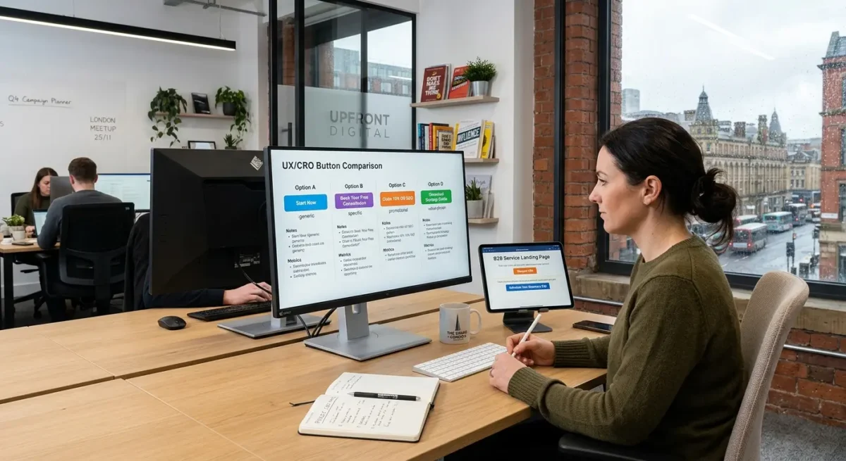
Specific actions lower uncertainty
Generic CTAs tend to hide the next step instead of clarifying it. Get in touch could mean anything from a quick question to a sales call, which leaves room for doubt. Book a site review, Ask for a rebuild estimate, or Send your brief gives a clearer signal about what the business does, what the visitor is being invited to do, and what sort of reply they are likely to get.
That is why CTAs support decision-making differently depending on the page. On a contact page, they set expectations and reduce anxiety about making the first move. On a service page, they connect the offer to a sensible next step. On a landing page, they keep the page focused so the action matches the intent that brought the visitor there in the first place.

Clarity first: say what happens next
The stronger option usually tells people the action, the format, and sometimes what they will get back.
Vague labels create friction because they make the visitor fill in the missing detail themselves. I often see buttons like Enquire, Learn more, or Get started used on pages that have already done the hard work of explaining the service, then the final step becomes oddly unclear. If someone has to pause and wonder whether they are booking a call, opening a form, requesting a quote, or just moving to another page, that small uncertainty is enough to slow action down.
Use verbs that describe a real next step
Good CTA wording usually starts with an actual action: call, book, request, download, compare, view, send. Those words do more than sound tidy on a button. They tell the visitor what kind of interaction they are agreeing to, which matters even more on service websites where people are often cautious about unwanted sales follow-up.
Sometimes it helps to name the next step directly, especially where commitment feels higher. Request a callback is clearer than Contact us because it signals both the format and what happens after the click. See pricing works well when cost is the next thing people need to judge fit, while Download the brief or Compare packages suits visitors who are still narrowing options rather than ready to speak.
Match the wording to intent
A person landing on a service page from a branded search may be ready for Book a consultation, while someone reading a comparison page may respond better to See how the process works or Compare website options. The right label depends on where they are in the decision, how much trust the page has built, and how much commitment the next step asks for. Keep buttons short, but use nearby copy, form labels, or supporting text to add detail where the button alone would be too blunt.

Timing matters more than most people think
People usually need enough evidence before they take the next step, especially where the service is expensive, specialised, or tied to long-term business performance.
A CTA can underperform simply because it appears before the page has answered the obvious questions. On higher-value services, most visitors want to know what you do, who it is for, how you work, and whether you look credible before they commit to a call or enquiry. If the page asks for action too early, the button is not the problem. The missing context is.
Different pages earn action in different ways
On a homepage, an early CTA can work because some visitors already know the business and just need a clear route forward, but it still helps to support that with proof, positioning, or a short explanation nearby. Service pages usually need more runway because the visitor is judging fit, scope, and trust. Case studies often work later still, once the reader has seen the problem, the approach, and the result. Contact pages are different again because the person has already decided to reach out, so the job there is less about persuasion and more about reducing friction.
Longer pages need more than one opportunity to act
Repeated CTAs are useful on long pages, not because people need pushing, but because they reach readiness at different points. Someone scanning a service page may want to enquire after the first clear explanation, while another person will read pricing notes, process details, and FAQs before they feel comfortable. Repetition works best when each CTA appears after a meaningful chunk of information, so the action feels earned rather than dropped in by habit.
An early CTA still makes sense when the page attracts high-intent traffic, such as branded searches, referrals, repeat visitors, or people returning after comparing options. In those cases, a visible first-step action respects their momentum. The mistake is assuming every visitor arrives in that state, then designing the whole page around the quickest possible click.
Context changes what the right CTA looks like
The button should follow the page, the source of the visit, and how ready that person is to act.
A homepage usually needs to serve mixed intent, so the strongest CTA is often broad and low-friction, such as See services, View our work, or Start your project. A service page is narrower. If someone is reading about commercial conveyancing, pension advice, office fit-outs, or IT support, the CTA should reflect that specific decision and next step, not fall back on the same generic Get started button used site-wide.
Traffic source changes the job of the CTA
Organic search visitors are often still sizing things up because they have landed on a single page, not chosen the business yet. They may need See how the service works, Read related case studies, or Check whether this is right for your business before they are ready to enquire. Returning visitors behave differently because they already know the name, remember the offer, or have compared options elsewhere, so a more direct action such as Book a call or Request a proposal can make sense.
Pages built for research need CTAs that help people keep evaluating, especially in B2B, legal, and financial services where the wrong click can feel premature or, in some cases, inappropriate. A comparison page for accountancy packages might point to Compare service levels or Speak to an adviser, while a solicitor’s page about employment disputes may be better with Discuss your situation than anything that sounds instant, absolute, or overly promotional. In compliance-sensitive sectors, the CTA has to fit the tone of the service as well as the stage of the decision.
Match the action to the type of page
Direct enquiry pages can be more straightforward because the visitor already expects a form, a phone number, or a booking option, but even then the wording should match the real process. For a consultant, Arrange an initial call may be accurate. For a trades firm, Request a site visit or Ask for a quotation may be clearer. For a B2B software or engineering company, Talk through your requirements often does a better job than a vague button that could mean anything.
Write CTAs that match the level of commitment
Ask for the next sensible step, not the biggest one available.
Most visitors are still working out whether you are credible, relevant, and likely to be a good fit. A low-commitment CTA helps with that stage: View our work, Read how we work, Check FAQs, or See what is included. Medium-commitment actions suit people who are interested but not ready to speak yet, such as Download the brief, Compare options, or See example projects. High-commitment actions like Book a call, Request a proposal, or Contact us belong later, once the page has done enough to justify them.
Price, risk and timescale all change the ask
The more expensive, complex, or business-critical the service is, the less likely someone is to jump straight into a sales conversation from a cold visit. A firm choosing a new website, appointing a solicitor, or comparing specialist consultants usually needs evidence first, because the decision carries cost, internal scrutiny, and some risk if they get it wrong. In those cases, softer CTAs are not a compromise. They are often the shortest route to a genuine lead because they let people build confidence in the right order.
Do not trap every visitor in the same route
Forcing every click towards a contact form tends to lose the careful buyers you actually want. If someone is comparing suppliers on a train between meetings, they may be happy to review case studies, scan a process page, or check whether you handle their type of project, but not ready to fill in a form asking for budget, timing, and half a project brief. Give them a useful next step and they are more likely to come back better informed, with a clearer enquiry and less friction on both sides.
This is especially true on pages that attract early-stage search traffic. A service page can offer a direct enquiry CTA, but it should usually sit alongside softer options for people who need more context before committing themselves. That simple choice often tells you something valuable as well, because the people who do decide to get in touch have usually seen enough to know why they are contacting you.

Good CTAs depend on what surrounds them
People decide whether to click based on the nearby explanation, the evidence on the page, and how much effort the next step appears to involve.
A button rarely does the hard work on its own. The lines above it usually matter more, because they answer the practical questions people have before acting: what happens next, who this is for, how long it takes, and whether the enquiry commits them to anything. A CTA such as Request a proposal becomes easier to trust if the copy around it explains the scope, mentions the sort of projects you take on, and sets a realistic expectation for the next reply.
Useful detail removes avoidable doubt
Pages tend to perform better when the CTA sits near proof that helps someone justify the click to themselves or to colleagues. That might be a short process summary, a list of deliverables, an outline of timescales, examples of the sectors you work with, or a note on what is included before any commitment is made. On service pages for web projects, I have found that people are far more comfortable making contact after they have seen how discovery, website design, build and launch are handled, because the step feels defined rather than open-ended.
The form and the button need to agree with each other
There is also a direct link between form length, field requests and button wording. If the button says Book an initial call but the form asks for budget, full requirements, preferred platform and target launch date, the page is asking for more than the label suggests. A shorter form with sensible fields such as name, email, company and a brief outline often fits early-stage enquiries better, while a longer brief form makes more sense later, once the page has explained why that information is needed.
CTAs placed under thin, generic copy often struggle because the page has not earned the click. If the content could apply to any agency, gives no real sense of process, and offers nothing concrete about outcomes or working style, the button feels premature however polished it looks. That is why strong response often comes from better page structure rather than louder wording, especially on service pages where buyers are trying to judge credibility quickly.

Common CTA mistakes on business websites
The problems below usually come from muddled page structure, unclear next steps, or asking for more than the click appeared to involve.
One of the most common issues on service sites is giving people too many primary actions at once. I often see a hero section offering Book a call, Get a quote, View packages and Send an enquiry in the same space, all styled as if they matter equally. That does not create choice so much as hesitation, especially when each option leads to a different level of commitment.
Vague labels usually hide friction
Buttons such as Submit, Get started or Learn more often ask the visitor to trust the page without telling them what actually happens next. On business websites, that uncertainty matters because people are often comparing suppliers quickly and trying to judge effort, risk and relevance. A label like Send project details, Book an intro call or Email your brief gives them something concrete to agree to.
Another pattern that causes friction is repeating the same generic CTA across every page regardless of intent. If a case study, a service page and an article all end with Contact us, the site ignores the fact that readers are at different stages and need different next steps. I also see websites send every click to a general contact page when a direct booking link or a visible email address would be simpler, particularly for people who already know what they want and do not need another layer in between.
The click and the next page need to match
A CTA loses trust quickly when it promises one thing and the next page asks for something else. If a button says Book a call but opens a long form asking for budget, timeline, specification and internal sign-off status, the label was doing less work than it claimed. The same problem appears when Request a quote leads to a generic inbox form with no indication of scope, response time or what information is actually needed.
How to improve CTAs without rewriting the whole site
A quick review process that helps you fix weak next steps without turning it into a full content project
Start with four checks on each important page: what the page is meant to achieve, what the visitor is probably trying to do, what the current CTA asks them to do, and whether the next step is obvious before they click. You can do this with a simple spreadsheet or even a marked-up PDF. Most problems show up quickly once those four points are written down side by side.
Look for mismatch before you change button copy
A mismatch usually appears when the page answers one need and the CTA asks for another. A practical guide that ends with Book a sales call, a detailed service page that only offers Learn more, or a case study that sends people to a generic contact form are all common examples. If the content is helping someone compare options, understand process or judge fit, the CTA should move them one step forward from that point rather than jumping straight to the highest commitment.
Test the smallest useful change first
In most cases I would test wording, placement, surrounding copy and commitment level in that order, because those are usually the quickest fixes with the clearest effect. Sometimes the button text is fine and the real issue is that it appears too early, sits under vague copy, or leads to a form that asks for too much too soon. You do not need huge traffic to learn from this if the pattern is obvious and the page has a clear role in your sales process.
Judge changes by lead quality as well as raw enquiry numbers, because more clicks are not always better if they produce poor-fit enquiries or half-finished forms. If a clearer CTA brings in fewer but better conversations, that is usually an improvement. On service websites, the best CTA is often the one that filters lightly, sets the right expectation and gets the right people to take the next step with less friction.
Where AI-generated copy often gets CTAs wrong
Without clear guidance, it usually reaches for safe, generic next steps instead of the action that actually fits the page.
Most AI tools are trained to produce language that sounds broadly acceptable across lots of situations, so they tend to fall back on labels like Get started, Learn more, Contact us or Book now. Those are not always wrong, but they are often too vague to carry real meaning on a service site where the next step depends on pricing model, sales process, lead quality and how much the visitor already knows.
Polished wording can still be empty
A CTA can read smoothly and still do a poor job. I see this quite often in AI-assisted drafts. The button sounds confident, the surrounding sentence sounds tidy, but neither tells the visitor what happens next, who it is for, or why this step makes sense here rather than elsewhere on the page.
This is where human judgement matters. A business that qualifies leads through a short enquiry form needs different CTA wording from one that offers fixed-price packages, free consultations or direct booking into a diary. The right label depends on intent as well. Someone reading a detailed service page may be ready to discuss scope, while someone on a comparison page may only want to see examples, pricing approach or process before they commit.
Use AI for options, not the final call
AI is useful for generating variations quickly if you already know the job the CTA needs to do. I would use it to explore phrasing, shorten awkward wording or test alternatives around the same action, then choose manually based on the page goal, the likely visitor mindset and what happens after the click.
Things People Want to Know
A Web Designer‘s Take
We often see service pages where every button says the same thing, even though the visitor is at a different stage on each page. A common problem is writing the CTA before the page structure is worked out, which usually leaves the button carrying too much weight because the surrounding content has not done its job.
If the action needs explanation, I would usually fix the page context before trying to improve the button text. A weaker label on a well-structured page will often outperform a clever one dropped into the wrong place, because most hesitation comes from uncertainty rather than wording.
You might like these too
These sit in the same category as the one you are reading. They follow the same thread and offer a bit more depth. Have a look if you want to go further.