Local SEO for London Web Designers

Local SEO for Web Designers

Local SEO is not just a Google Business Profile job, and it is not something you bolt on with a few directory listings after the site goes live. A lot of good-looking websites struggle in London because the design never makes the business location, service area, page intent, or trust signals properly clear, so search engines and real people are left filling in the gaps.

This is where web design does more of the heavy lifting than many people realise. Page structure, internal linking, service and area pages, contact details, schema, review placement, and even the way navigation is named all shape local relevance. I have seen plenty of builds that looked polished but gave no strong signal about who they serve or where they are based, which is usually a design problem before it becomes an SEO problem. This guide looks at the parts that matter, without leaning on citation-heavy tactics or the usual clutter.

Why local SEO starts with the site, not the directory profile

Why local SEO starts with the site, not the directory profile

Local visibility is much easier when the website clearly shows where you work, what you do, and that the business itself is real.

A directory profile can support that picture, but it should not be doing all the explaining.

If the site is vague, the local signal is vague as well. I see this often on polished builds with big banners, generic headings, and service pages that could belong to almost any agency in almost any city. They look tidy, but they do not give Google or the visitor enough to work with.

Weak page structure is usually where the problem starts.

If every key service sits on one broad page, if location details are buried in the footer, or if the navigation uses clever labels instead of plain ones, local relevance gets diluted. The site stops making a clear case for specific services in a specific place, and instead reads like a general brochure.

A nice-looking site and a locally useful site are not the same thing.

Good design still matters. It builds confidence, helps people move through the site, and makes the business feel established. But local usefulness comes from structure and clarity: proper service pages, a contact page with real address details where appropriate, consistent mention of the area served, and internal links that connect related topics instead of leaving each page to stand alone.

That is why Google Business Profile helps, but cannot repair a weak website.

Your profile might confirm the business name, location, opening hours, and reviews, which is valuable. But if someone clicks through and lands on a site that barely mentions London, does not explain the services properly, and gives no sense of who the business actually works with, the profile has handed over to a poor destination.

For London web designers, this matters even more because the market is crowded.

There are countless agencies, freelancers, and template shops all saying roughly the same thing. A site that clearly separates web design, web development, WordPress work, and related services, while also showing where the business is based and who it tends to help, gives a much stronger local signal than a homepage full of vague promises.

The strongest local signal is usually the honest one.

If you are based in London and genuinely work with London businesses, say so plainly and support it across the site. If you serve a wider UK client base as well, include that too. Trying to force artificial local signals into every paragraph, or spinning up thin pages for places you do not really serve, usually creates more noise than value.

My own judgement on this is simple: one solid, credible location setup beats a messy attempt to appear everywhere.

Search engines are better at spotting consistency than people give them credit for, and people are even quicker to notice when a business sounds like it is stretching the truth. A website that matches business reality tends to hold up better over time, both in local search and in actual enquiries.

Build pages around real service intent and real places

Build pages around real service intent and real places

Plan pages around the work you actually sell, the clients you actually help, and the areas where there is a credible reason to have a dedicated page.

The strongest page plans usually start with demand, not with a keyword list.

If a London web design business offers brochure websites, WordPress development, ecommerce builds, redesigns, and ongoing support, those are not one page pretending to do everything. They are separate services with different buyer intent, different questions, and often different sales journeys.

A proper service page should explain what is being offered, who it is for, and where the value sits.

That means plain descriptions of the work, the kind of business it suits, what problems it tends to solve, and what is included or not included. A page for WordPress development should not read like a page for brand strategy with a few technical words dropped in.

This matters for local SEO because relevance is built from specifics.

If someone lands on a page about web design for professional services firms in London, and the content clearly speaks to firms that need trust, clarity, and lead generation, that page sends a much stronger signal than a broad agency page padded with city names. It also gives the visitor a reason to stay.

Sector pages can help as well, but only where the business has something real to say.

For example, a web design business might have useful pages for accountants, law firms, consultants, clinics, or construction companies if those sectors come up often in real projects. Each page needs its own angle. Compliance concerns, enquiry quality, page structure, booking flows, and trust signals vary a lot by sector, so the content should reflect that difference.

Location pages need even more restraint.

A dedicated London page makes sense for a London-based web designer. A page for a smaller area such as Camden or Islington might make sense if there is a real office, a steady stream of work there, or a distinct service proposition tied to that area. Without that, the page often ends up thin, repetitive, and hard to justify.

Copying the same page for Camden, Islington, Chelsea, Hackney, Southwark, and every other borough is usually weak because nothing important changes between them.

The services are the same. The process is the same. The proof is often the same. Swapping out place names does not create local relevance in any meaningful sense. It creates a row of near-duplicates that add little for the reader and rarely age well.

I would rather see one strong London page than twenty borough pages written to fill a sitemap.

For a typical London web design business, sensible page planning might look like this: a homepage that makes the London base clear, core service pages for web design, WordPress development, ecommerce, website redesign, and support, plus a contact page with proper business details. Then add sector pages where there is proven demand, such as web design for law firms or web design for consultants, and only add location pages where there is a genuine commercial case.

Another sensible setup is a main London page supported by stronger proof within service pages.

That could mean a page for WordPress development in London, if that service has enough demand and enough distinct content to justify standing alone, while broader areas are covered through project examples, testimonials, and case studies rather than cloned local landing pages. In practice, that often produces a cleaner site and a more believable one.

The test is simple. Each page should earn its place by answering a different need.

If two pages would say almost the same thing to almost the same person, they probably should not both exist. That is not a content problem. It is usually a planning problem.

Make location signals obvious without cluttering the design

Make location signals obvious without cluttering the design

Show where the business is based and where it works in the places people naturally look, without turning the site into a directory listing.

Local signals work best when they feel built in, not bolted on.

A London web designer should make the business name, address, phone number, and email easy to find and consistent everywhere they appear. That means the same trading name, the same address format, and the same contact details in the header, footer, contact page, Google Business Profile, and any directory listings worth keeping.

Small mismatches create doubt faster than most people realise.

If the footer says London, the contact page shows a different town, and the Google profile uses a shortened business name, the site starts sending mixed signals. That is not just an SEO issue. It makes the business look less settled.

The header needs restraint.

For most service businesses, a simple cue is enough. Something like “London web design and development” near the main heading, or a short location line in the top bar, usually does the job without crowding the layout. Forcing a full street address into the header on every page often makes the design feel heavy, especially on mobile.

The footer is where fuller business details usually belong.

This is a sensible place for the business name, registered or trading address where appropriate, phone number, email, and opening hours if they matter. It gives users a predictable place to check details, and it lets the rest of the page stay focused on the actual service.

The contact page should do the hard work.

That page can carry the full address, transport or parking notes if visits are relevant, and a clear explanation of how the business works. If clients are served remotely across London and the wider UK, say that plainly. If meetings are by appointment only, say that too. Clear beats polished here.

Page copy needs location references in the right places, not everywhere.

The homepage should make the base location clear early on. Service pages can mention London where it genuinely helps frame the offer, especially if the work involves local knowledge, face-to-face workshops, or sector familiarity in the capital. Stuffing borough names into body copy looks cheap and usually reads that way.

There is also an important difference between office location wording and service area wording.

“Based in London” tells people where the business is physically located. “Serving clients across London and the UK” tells them where the business works. Those are not the same claim, and mixing them carelessly is a common mistake. If the office is in Clerkenwell but the company works nationwide, say both in plain English instead of implying an office in every area.

Maps are useful when they help someone do something.

If clients visit the office, a map on the contact page can reduce friction. It helps with directions, nearby stations, and simple reassurance that the place is real. If meetings are mostly remote and nobody needs to visit, an embedded map is often just extra weight on the page.

I would rather use a clean address block with a link to Google Maps than drop in a large embed for the sake of it.

That keeps the page faster, avoids a clumsy block of third-party styling, and still gives people what they need. A map is a usability choice first. It is not an SEO strategy.

Trust matters more in local search than most designers admit

Trust matters more in local search than most designers admit

Good design helps people verify who they are dealing with, what has been done before, and how easy it is to make contact

Local visibility is rarely just about location words on a page.

People compare a few sites quickly, especially in London where there is no shortage of choice. If one site feels specific, grounded and easy to deal with, while another hides behind generic promises and polished filler, the stronger site usually earns the enquiry.

Case studies do a lot of heavy lifting here.

I do not mean anonymous portfolio tiles with a logo and a nice screenshot. I mean real project pages that explain the brief, the problems with the old site, what changed in the build, and what mattered to the client commercially. For a local service business, even a short write-up with clear before-and-after context says far more than a gallery ever will.

If the work involved a London company, say so where appropriate.

That does not mean forcing borough names into every paragraph. It means giving enough detail to show the job was real. A line such as “Website rebuild for a London property firm with a slow, outdated brochure site” is useful. “Helping ambitious brands grow” tells nobody anything.

Team and company information matters for the same reason.

A proper about page, a named lead contact, and a straightforward explanation of how projects are handled all reduce doubt. If the business is a small specialist studio, say that plainly. If design and development are done in-house, that is worth stating too, because many clients have dealt with agencies that sell the work and then pass it around.

Process content is often treated as sales padding, but it can be genuinely useful.

Most clients are not trying to learn web design. They want to know what happens after they enquire, what you need from them, how decisions are made, and whether the project is likely to become hard work. A simple process page with realistic steps can improve conversion because it removes uncertainty, and it also makes the company feel more established.

Clear contact routes matter more than clever layouts.

If someone is ready to get in touch, they should not have to hunt for the form, wonder who receives it, or guess what to include. A good enquiry flow gives people options. Phone if they want to speak now. Email if they have documents. A short form if they want a quick first step. That is better than one oversized form asking for a full project brief before any conversation has happened.

I usually prefer shorter forms for service businesses.

Name, company, contact details, a short outline of the project, and perhaps budget or timescale if that information is genuinely useful. Asking for too much too early often lowers response quality rather than improving it, especially on mobile and especially for busy founders.

Stock imagery is where a lot of otherwise decent sites start to feel unconvincing.

If a London web designer claims to offer bespoke work but fills the site with smiling call-centre photos and generic meeting room shots, the message starts to wobble. Real team photos are not always essential, and not every business needs a photoshoot, but showing the actual people, office, or working style where possible usually lands better than borrowed gloss.

Vague claims have the same effect.

Words like trusted, expert and leading are easy to add and hard to believe on their own. Specific statements hold up better. Explain what you do, who you do it for, what platform you work with, and how projects are managed. Plain detail builds more confidence than big adjectives.

Design should also make reassurance easy to find at the right moments.

That might be a relevant project link near a service description, a short note about response times on the contact page, or a visible company address in the footer. None of this needs to be loud. It just needs to be present, consistent and believable.

Site structure should help both users and crawlers understand the business

Site structure should help both users and crawlers understand the business

Organise pages so services, sectors, locations and contact details connect in a way that makes sense to a real visitor

A good local site usually feels simple because the structure has been thought through properly.

Most London web design sites do not need dozens of top-level pages fighting for attention. They need a clear hierarchy. Homepage at the top, then core service pages, then supporting pages for relevant sectors or locations, with the contact page easy to reach from anywhere.

That hierarchy helps people find things quickly, but it also helps search engines understand what the business actually does and how different topics relate to each other.

For example, if you offer WordPress design, website rebuilds and technical SEO support, those should usually sit as distinct service pages under a sensible services section. If you also work with law firms, property companies and consultants, those sector pages should connect back to the relevant services rather than floating around as isolated content.

Location pages need the same discipline.

If a studio is based in London and wants to target nearby or relevant areas, those pages should sit within a location section and link naturally to the services available there. A page about web design in Clerkenwell or Camden should not read like a separate mini-site. It should clearly belong to the same business, the same offer and the same enquiry path.

Internal linking matters most when it follows real user journeys.

Someone might land on the homepage, move to a service page, check a related project or sector page, then head to contact. Another person might start on a location page, want proof of relevant work, then look at how the process works before getting in touch. Those are useful routes to support because they reflect how people actually make decisions.

I would rather see five well-placed internal links that move someone forward than twenty keyword-heavy links dropped into every paragraph.

Navigation labels should also say exactly what they mean. Services. Work. About. Contact. If there is a locations section, call it Locations. If there is a page for industries, call it Sectors or Industries. Clever wording often forces people to pause and decode the menu, which is the opposite of good navigation.

This is where overbuilt menus often cause damage.

Huge desktop menus, tabs inside tabs, duplicated links, hidden mobile panels and pages filed under three different headings can make the site feel larger than it is, but they often weaken relevance. Important pages receive less focus. Similar pages start competing with each other. Users miss the obvious path because the interface keeps offering side roads.

Scattered content causes the same problem in a quieter way.

If service details are split between the homepage, a generic service page, a half-finished sector page and an old blog post, the message becomes patchy. It is harder for search engines to work out which page matters most, and harder for a potential client to trust that they have found the right answer.

For most small and mid-sized firms, a tighter structure is usually better than an ambitious one.

A smaller number of strong pages, each with a clear role and sensible links between them, tends to outperform a bloated sitemap built on assumptions about future growth. You can always expand later if the content gap is real and the business case is clear.

Technical choices still shape local performance

Technical choices still shape local performance

The build decisions behind speed, clarity and crawlability still affect how well a local site works.

A London service page can say all the right things and still underperform if the site is slow, awkward on mobile, or difficult to index properly.

That matters because local searches often happen on phones, between meetings, on patchy connections, with very little patience. If the page stutters, shifts around while loading, or hides key information behind oversized banners and sliders, people leave before the enquiry starts.

Fast loading pages usually come from restraint more than tricks.

Clean themes, sensible image handling, limited plugin use and straightforward layouts tend to do better than heavy templates packed with effects nobody needs. I would take a plain, quick page with a strong message over a glossy one that takes too long to become usable.

Mobile design needs the same common sense.

Click-to-call should be easy to find. Addresses and service areas should be visible without hunting for them. Contact forms should be short enough to complete on a phone without feeling like admin.

Schema can help with clarity, but it is not magic.

Where appropriate, local business schema gives search engines a cleaner reading of the company name, address, contact details, opening information and service area. It supports understanding. It does not compensate for weak content, poor structure or a confused location strategy.

Indexation basics are less glamorous, but often more important.

The right pages need to be indexable, the thin or duplicate ones should not compete, and canonical tags should make it clear which version of a page is the main one. On WordPress sites, this often becomes messy after redesigns, page builder experiments, or location page expansions that were never properly tidied up.

Duplicate location content is a common problem.

If Camden, Islington and Shoreditch pages all say the same thing with only the place name swapped out, they weaken each other. A better approach is fewer location pages, each with a real purpose, clearer local context and a sensible canonical setup where similar content genuinely has to exist.

This is also where bloated templates do quiet damage.

Many come with plugin bundles, duplicate script loading, unnecessary layout features and settings panels that encourage clutter. You can end up with solid local targeting buried inside a site that is slower, harder to maintain and less reliable than it should be, which is not a good trade for most small firms.

Content should answer local buying questions, not just fill space

Content should answer local buying questions, not just fill space

Good local content helps London clients decide whether your approach, timing and type of work are right for them before they get in touch.

Most serious enquiries start with a shortlist, not a blank slate.

People are usually comparing a few web designers, checking who feels credible, and trying to work out whether a conversation is worth their time. That is why the most useful content often sits on service pages, process pages, pricing pages and FAQs rather than in a blog archive full of generic articles.

If you build websites for businesses in London, say how you price work.

You do not have to publish fixed fees if every project varies, but you should explain the approach. A client should be able to tell whether you work on tailored proposals, defined packages, phased projects, or a mixture depending on scope. That removes a lot of friction, especially for owners who have already wasted time on vague discovery calls that revealed nothing useful.

The same goes for process.

Explain what happens after an enquiry, what input you need, how content is handled, and who is responsible for decisions at each stage. For a busy company director or marketing manager, knowing that the job will be structured properly matters almost as much as the design itself.

Timelines deserve the same level of honesty.

A brochure site, a lead generation site and a larger WordPress rebuild do not move at the same pace, and pretending otherwise usually creates problems later. A simple explanation of what affects timing, such as content readiness, stakeholder sign-off, functionality and migration work, is far more helpful than a neat promise that does not survive first contact with the real project.

It also helps to be clear about fit.

Say who the work suits and who it probably does not. If you are strongest with established service businesses, multi-location firms, professional practices or funded startups, say so plainly. If you are not the right choice for very small one-page builds, urgent same-week launches or bargain template work, that clarity saves time on both sides.

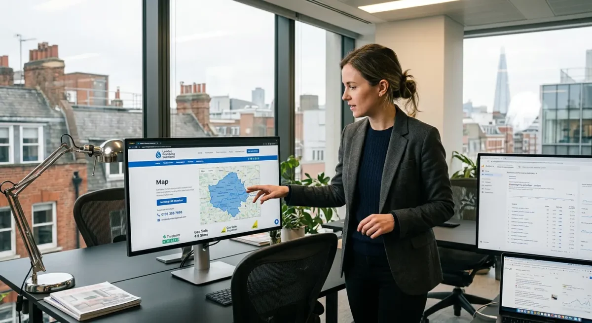
Local context is useful when it adds something real.

For a London web designer, that might mean showing you understand the practical needs of firms competing in crowded boroughs, businesses serving distinct parts of the city, or companies selling high-value services where trust has to be built quickly. It does not mean stuffing pages with place names or writing thin area pages for every postcode district you can think of.

FAQs often do better work than people expect.

A strong FAQ section can answer the exact points that stop someone from enquiring, such as whether you write content, whether SEO is included in the build, whether you can work with an existing brand, whether meetings need to be in person, or whether support continues after launch. These are buying questions, not filler, and they often deserve a proper answer on the main page rather than being buried in a help section nobody reads.

One small judgement call from experience: if a topic helps a prospect choose, keep it close to the service page.

If it only exists to make the site look active, it is usually not worth much. Thin blog posts about broad marketing topics like general social media tips, vague branding advice or recycled AI commentary rarely help a local web design enquiry because they do not move the buying decision forward. They attract the wrong audience, add maintenance overhead, and can make a specialist site feel oddly unfocused.

Useful content earns its place by removing doubt.

That usually means fewer pages, written with more care, built around the questions a real London client asks before they commit budget to a new website.

What a strong local web design page usually includes

What a strong local web design page usually includes

Use this as a practical model, then adjust it to the way the business actually sells and the area it is trying to reach.

The page should open with a clear headline that says what you do and where that matters.

Something plain like Web Design for London Service Businesses does more useful work than a vague line about growth or digital presence. If the business serves a narrower patch, such as Central London, South West London or a specific borough, say that only if it reflects the real client base and delivery model.

Under that, add a short introduction that explains the type of work, the kind of client, and the main commercial point of the site.

That might be lead generation, enquiries for a professional service, or a rebuild of an outdated WordPress site that no longer reflects the business properly. Keep it concise. A visitor should know within a few seconds whether they are in the right place.

Then give enough service detail to show range without turning the section into a shopping list.

A few linked items is usually enough. For example, bespoke WordPress development, website redesigns, technical SEO foundations, content structure, and ongoing support. If each service has its own page, link to it naturally so the reader can go deeper without hunting through the menu.

Proof needs to sit close to the core offer.

That can be a relevant case study, a short project example, recognisable client sectors, or a brief explanation of the type of results the work was built to support. Avoid padding the page with badges, counters or generic trust strips that say very little. One solid project link with a useful summary often carries more weight than six vague claims.

Contact options should be easy to spot and low friction.

Some visitors will want a proper enquiry form. Others just want an email address, a phone number, or a clear next step such as booking an intro call. On local service pages especially, this matters because people are often comparing three or four firms quickly and will default to the one that makes contact simple.

Internal links should help the buying journey, not just fill space.

Good links here usually point to related services, location-relevant case studies, a process page, or a page explaining how SEO is handled in the build. A link to a broad blog post about general marketing advice usually adds nothing at this stage. If the page is meant to convert local interest into an enquiry, every link should reduce doubt or answer a practical buying question.

Location clarity still matters, but it needs to feel real.

If the business is based in London, show the address details, service area, meeting approach, and whether projects are handled remotely, in person, or both. If clients are spread across the UK and internationally, say that too. It helps people understand whether London is the base, the market, or both.

A short section on fit is often worth including.

This is where you can say the work suits established service firms, growing SMEs, funded startups, or companies replacing an underperforming site. That kind of filtering is useful. It saves the page from sounding generic, and it gives better prospects confidence that you understand their situation.

My usual judgement call is this: if a page cannot support its headline with proof, detail and a credible next step, it is probably too thin to be useful.

Not every local page needs the same sections, and not every business should use the same format. A single-location studio targeting London owner-managed firms will structure the page differently from a multi-service agency covering several UK regions. The right shape depends on the business model, the sales process, and how tightly the target area is defined.

Things People Want to Know

Usually not. Most London web designers are better off with one strong London page and a few carefully chosen area pages only where there is real relevance – for example a separate service focus, regular work in that borough, a useful case study, or clear local proof that changes the page in a meaningful way.

Repetitive borough pages with near-identical copy tend to look thin, and they rarely help users make a decision. If the page cannot say something specific about the work, the clients, the location, or the buying intent, it is usually better folded into a broader London page with stronger structure, clearer trust signals, and better internal links.

A Google map can help on a contact or location page because it makes the business feel more real and makes visits, calls and directions easier. That is useful for trust, especially if you have a genuine London office or serve clients from a clear physical base.

It is not a local SEO tactic on its own. If the page has weak content, vague location signals, poor structure or inconsistent business details, embedding a map will not fix that. I usually treat it as a usability element, not a ranking strategy.

Quite a lot. Local SEO is not just about a Google Business Profile or a few place names on the page. Design affects how clearly your services, areas, contact details and trust signals are presented, whether each page has a clear local intent, and whether the site structure helps search engines understand what you do and where you do it.

In practice, that means usable mobile layouts, fast pages, sensible navigation, strong service pages, and obvious location details that feel real rather than stuffed in for SEO. If a London web designer has a vague homepage, thin service content and no clear address or service area information, the site will usually underperform locally even if the technical setup is fine.

A good London web design service page should say exactly what is being offered, who it is for, and what kind of business it suits. If London matters to the service, make that clear in a practical way – where the business is based, whether meetings are in person or remote, and whether the work is aimed at London firms specifically or clients across the UK as well.

It also needs proof close to the offer, not tucked away elsewhere. That usually means a relevant project example or case study, a simple contact route, and internal links to useful next-step pages such as process, SEO, WordPress development, or support, so a potential client can check the detail without digging through the site.

Yes, WordPress can rank very well locally. The platform is not the limiting factor – the build quality is. A fast site with clean templates, sensible page structure, clear location signals, and solid technical setup will usually do far better than a bloated install packed with page builder clutter and unnecessary plugins.

For local visibility, the important bits are practical: properly built service and area pages, consistent business details, strong internal linking, and content that makes it obvious where you work and who you help. I have seen plenty of WordPress sites underperform for one simple reason – they were weighed down by poor theme choices, messy code, and plugin overload before the SEO work had even started.

A Web Designer’s Take

We often see London sites held back by simple structural issues rather than anything exotic. A common problem is pages trying to cover too much at once, so the service, the place, and the proof all compete with each other instead of working together. One of the first things we check is page purpose, because local signals land better when each page has a clear job.

If a business serves London, it is usually better to be plainly specific than artificially broad. A smaller set of well-structured pages with honest location detail will often do more for local visibility than spinning out thin area pages that add nothing useful.

You might like these too

These sit in the same category as the one you are reading. They follow the same thread and offer a bit more depth. Have a look if you want to go further.