What Mobile-First Design Really Means in Practice
Mobile-first design does not mean you build a desktop site, then “make it responsive” at the end. It means you start with the smallest screen first and decide what really matters when someone is on the move, often on a slower connection, trying to get an answer quickly. That constraint forces clearer structure, tighter content, and fewer heavy extras. Then you expand the layout for larger screens, instead of squeezing a big design down and hoping it still works. This article is about the practical choices that come out of that approach, not trend talk.
Mobile-first is a workflow, not a screen size
It means designing for someone on a phone first, then adding layout and features as the screen and connection allow
Mobile-first is simple in principle. You start by planning the page for mobile users, then enhance it for tablets and desktops. The priorities are set at the smallest screen, where attention is shorter, thumbs are in the way, and the connection might not be perfect.
That is different from the older approach where you design a full desktop page first and then try to shrink it down. A desktop-first build can still end up “responsive”, but the order of decisions matters. Responsive just means the layout adapts to different screen sizes. It does not guarantee the mobile version is the best version.
In real projects, desktop-first sites often carry too much content into mobile. Big hero sections, long intros, and multiple calls to action stack up fast. What looked balanced on a wide screen becomes a long scroll before the user reaches the point.
Performance is another common issue. If the desktop design relies on large images, sliders, heavy fonts, or third-party scripts, those assets still have to load on a phone. You can optimise later, but you are usually fighting the original design choices rather than building something lean from the start.
Navigation also gets awkward when it is adapted late. Desktop menus with lots of items turn into cramped burger menus with no clear grouping. Users then have to dig, or they miss key pages entirely. On service sites, that often means people cannot quickly find pricing, availability, or how to contact you.
Desktop-first is not always wrong. If your users are mostly at a desk in working hours, it can be a sensible starting point. But if you are not sure, I default to mobile-first because it forces clarity early, and that usually improves the desktop experience too.
Start with user intent: what mobile visitors actually need
Mobile use changes priorities, so the page should be built around the quickest path to the right outcome
On mobile, people are often in a different situation. They might be on the move, between meetings, or standing outside a site. They might have limited time. They might be on a weak signal, or on mobile data they are trying not to waste. All of that changes what “good” looks like.
It usually means they want one of a few things fast: a phone number, a way to send an enquiry, a booking step, directions, opening hours, pricing guidance, or a clear answer to “do you do this?”. Not every business is the same, but most service sites have a handful of high-intent actions that matter more on mobile than on desktop.
So I start by choosing a primary goal for each page. One goal. On a contact page, that might be “call” or “send an enquiry”. On a service page, it might be “request a quote” or “book a consultation”. On a location page, it might be “get directions” or “check availability”. If a page has three equal goals, it usually has none, because the user has to do the sorting work.
A practical way to decide is to ask: if someone lands here from Google on their phone, what is the next sensible step? Then make that step obvious, and easy to complete with one hand. That might mean a clear button, a short form, or a visible phone link, depending on the service and how your customers prefer to contact you.
Once the goal is clear, content order becomes much easier. Put the key info first. That is usually a plain headline that says what you do, who it is for, and where you work (if location matters). Then a short line on the main outcome or benefit, written in normal language. Then the next step.
After that, you can add the supporting pieces that reduce doubt. A quick list of what is included. Typical turnaround or process in a few steps. Proof points like case studies or testimonials, if you have them. Details can wait until the user has decided they are in the right place.
And some things can go. Mobile-first is where you notice the “nice to have” parts that slow people down. Long scene-setting intros, repeated headings, big blocks of marketing copy, and sliders are common culprits. If it does not help someone decide or act, it is often better removed than “squeezed in”.
This is also why “everything above the fold” is the wrong target. The fold just means what is visible before scrolling, and it changes on every phone. Trying to cram everything into that first screen usually makes the first screen worse. You get tiny text, cramped buttons, and no clear hierarchy.
A better target is: above the fold should answer “am I in the right place?” and “what do I do next?”. Then let the page breathe and earn the scroll with useful detail. My judgement call is simple: if you are tempted to add another element to the top, remove something instead. The top of the page is not a storage unit.
Information architecture: fewer choices, clearer paths
Mobile-first makes you organise the whole site so people can find things quickly, not just admire the homepage.
Mobile screens do not forgive messy structure. When the menu is hidden behind an icon, every tap has a cost. If someone has to open the menu, scan a long list, then guess which label might contain what they need, they often back out and try a different result.
That is why mobile-first forces an information architecture decision, not just a layout decision. Information architecture is just the plan for how pages are grouped and linked, so both people and search engines can understand the site.
Start with navigation that works on a small screen. Keep the top-level menu short. Use labels that match how customers talk, not internal job titles. “Services”, “Areas”, “Pricing”, “Work”, “About”, “Contact” is usually more predictable than clever category names. Predictable is good here.
Reducing decision points matters more than reducing clicks. If you have ten top-level items, users have ten decisions before they even start. If you have five, with sensible grouping underneath, the path is clearer even if it takes one extra tap.
A practical approach is to group by what the visitor is trying to do. For service businesses that often means: what you do (services), where you do it (locations), evidence (case studies), and how to start (contact or booking). The exact labels depend on your business, but the grouping logic should be obvious.
Dropdowns are not the enemy. They can be fine on mobile if they are short, tap-friendly, and not nested three levels deep. The issue is usually overstuffing, not the pattern itself.
Mega-menus are a special case. They can be justified if you have a lot of genuinely different sections, like a large eCommerce catalogue, a university-style site, or a publisher with multiple verticals. They are usually not justified for a focused service business site, where the menu becomes a second homepage and competes with the actual page content. My judgement call: if you need a mega-menu to explain what you do, the service structure probably needs tightening first.
Mobile-first structure is also about page relationships. Service pages should link to the next sensible step: relevant case studies, FAQs, pricing guidance, and a contact route. Location pages should link back to the main service, and to nearby or related areas when it is genuinely helpful. This is internal linking, meaning links between your own pages.
Done well, internal linking helps users move through the site without hunting through the menu. It also helps search engines understand what each page is about and how it fits into the bigger picture. You are making the hierarchy visible.
One small tip that pays off: make sure each key page has a clear parent and a few clear siblings. In plain terms, it should be obvious where it lives in the structure, and what else sits alongside it. If a page feels “orphaned” and only accessible from a footer link, that is usually a sign the navigation and content plan do not match.
Designing layouts mobile-first: stacking is not enough
A single column is a start, but the real work is choosing what people can tap, read, and finish without friction
A lot of “mobile-friendly” design stops at one move: take the desktop layout and stack it into a single column. That helps, but it is not mobile-first. Mobile-first means you decide what matters on a small screen, then build layouts that support those actions properly.
The first big change is designing for touch. A mouse pointer is precise. A thumb is not. Links, buttons, filters, and form fields need breathing room so people do not tap the wrong thing. That affects spacing, the size of tap targets, and where key actions sit on the screen. “Tap target” just means the clickable area, not the visual styling.
Thumb reach matters as well. On mobile, the easiest places to hit are usually around the lower part of the screen. If your primary call to action sits at the top, users can still reach it, but it often feels awkward. In practice, this changes how you place sticky buttons, booking links, and important filters. You do not need to force everything to the bottom, but you should be intentional.
Typography is the next decision point. On a small screen, readability is not just about making the font bigger. Long lines become hard to track, so your text width needs to be controlled even on mobile. Contrast matters too, especially for grey text on white backgrounds, which can look “clean” and still be tiring to read. I would rather see slightly stronger contrast and calmer line spacing than fashionable thin type that only works in mock-ups.
Headings also need discipline. If every line is a headline, nothing scans well. Mobile readers skim. Clear heading levels, short subheads, and paragraphs with a point to them beat walls of text every time.
Complex content is where mobile-first layout really earns its keep. Tables are a common problem. If you squeeze a wide table into a narrow screen, it becomes unreadable. Better options include: simplify the table, turn rows into stacked cards, or allow horizontal scrolling with a clear cue so users know it is scrollable. Which one is best depends on what the table is doing, but pretending a wide table will “just fit” usually ends in frustration.
Comparison blocks can have the same issue. Side-by-side comparisons often work better as a vertical sequence on mobile, with the most important differences repeated in each section so users do not have to remember what was three scrolls ago. It is a content decision as much as a layout decision.
Long forms are another practical test. Mobile-first forms are not just narrower. They are broken into sensible steps, with clear labels, helpful input types, and error messages that do not make the page jump around. A small judgement call here: if a form feels long on desktop, it is probably too long on mobile. You either need fewer fields, or you need to explain why you are asking for each one.
Then there is the “expand” part of responsive design. Good layouts do not just scale up. They change. On tablets and desktops you can introduce columns where it improves scanning, move supporting content into a sidebar, and place secondary actions where they are visible without competing with the main task. You can also increase whitespace and bring in richer navigation patterns, because there is room for them and users are often in a different mode.
The key is this: start with a layout that works when space is tight, fingers are clumsy, and attention is limited. Then, as screens get larger, use the extra space to improve comprehension and flow, not to reintroduce clutter. That is what mobile-first design looks like in practice.
Performance is a mobile-first requirement, not an extra
If it feels quick on a phone, it will usually feel quick everywhere, and that comes down to build choices as much as design
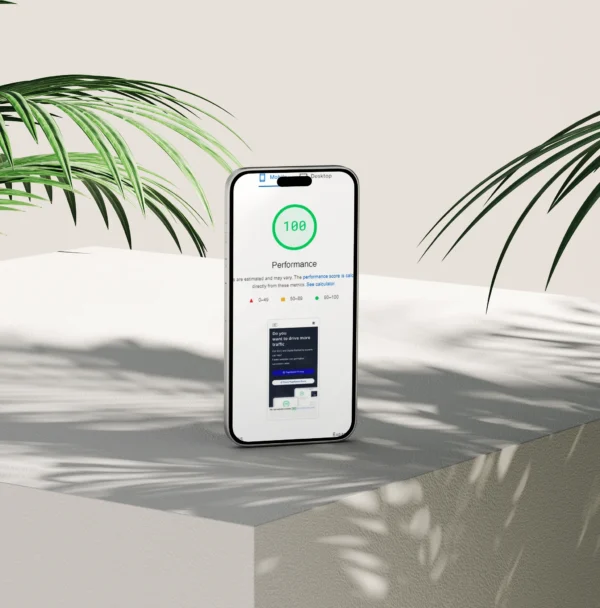
Mobile-first is not just about layout. It is also about speed. If a page loads slowly or stutters when you scroll, it does not matter how tidy the design is. People leave.
Mobile performance tends to fail first because phones have less headroom. Networks can be patchy, even in London. The CPU is weaker than a desktop, so heavy scripts take longer to run. Images are often the biggest files on the page, and it is easy to ship a desktop-sized image to a small screen by accident. Third-party scripts are another common culprit, things like chat widgets, tracking tags, embedded booking systems, and social feeds.
A useful mental model: loading a page is not just downloading files. The browser has to parse HTML, build the layout, load fonts, apply CSS, and run JavaScript. JavaScript is the code that makes interactive features work. Too much of it can make a site feel laggy even after it “loads”.
In practice, I prioritise performance in a few predictable places.
- Images first. Serve the right size for the device, compress them, and use modern formats where sensible. Lazy loading helps too, which means images further down the page load only when the user scrolls near them.
- Fonts next. Too many font files slow things down. Keep the number of font families and weights tight, and avoid loading things you are not using.
- CSS and JS are where builds either stay lean or drift. Strip out unused styles, avoid shipping big libraries for small effects, and load non-critical scripts later.
- Caching matters because it stops repeat visits from feeling like a first visit. Caching means the browser or server can reuse files instead of fetching them again.
- Reducing plugins is often the simplest win on WordPress. Every plugin is not “bad”, but each one can add assets, database queries, and admin complexity. Fewer moving parts usually means fewer surprises.
Be careful with anything that looks impressive but ships a lot of weight. Sliders are a classic. They often load large images, add JavaScript, and distract from the message. Heavy animations can also hurt, especially if they run on scroll. And large video backgrounds can be brutal on mobile data and battery, even when optimised. My judgement call: if the page works without it, treat it as optional and earn it back only if it genuinely improves understanding or conversion.
Performance budgets help keep this practical. Think of them as limits you agree upfront, rather than something you “check at the end”. For example: a maximum number of fonts, a maximum number of third-party tools, a cap on the size of your largest images, and a rule that only one “heavy” feature is allowed on a page. The exact numbers depend on the site, but the approach is simple: decide what you can afford, then design and build within those limits.
Tools can help you measure, but they do not replace judgement. What matters is how the site feels on a mid-range phone on a normal connection, especially on key pages like services, case studies, and contact.
Mobile-first and SEO: where it matters and where it does not
Mobile-first helps SEO when it forces better structure and cleaner pages, but it does not replace solid technical basics.
Mobile-first and SEO overlap more than people expect, but not in a magic way. It is mostly that building for a small screen pushes you towards clarity. Clear pages are easier for users to understand and easier for search engines to interpret.
Where mobile-first thinking supports SEO is in the fundamentals:
- Structure – sensible page sections, predictable layouts, and a clear hierarchy.
- Clarity – less waffle, more intent. One page should do one job.
- Speed – lighter pages are easier to crawl and nicer to use.
- Internal linking – mobile layouts often force you to choose links that actually matter, which usually improves navigation for people and for crawlers.
The big SEO risk with mobile-first builds is content parity. That just means the important content should exist on mobile in a way that is accessible to users and machines. If the desktop version has key copy, FAQs, reviews, or internal links, the mobile version should not quietly drop them.
Hiding content purely for layout is not the same as removing it, but you still need to be careful. Accordions and tabs are fine when they are built with proper HTML and CSS. The problems start when content only appears after a heavy script runs, or when links and text are injected after the page loads.
Simple rule: if you disable JavaScript and the page loses critical content, you have created an avoidable risk. JavaScript is not “bad”, but SEO and accessibility both prefer pages that work without relying on it for the basics.
Then there is the technical hygiene that gets missed because it is not visible in the design. A mobile-first approach does not fix these for you, but it does make it more obvious when something is messy.
- Meta titles and descriptions – titles matter most. Descriptions influence clicks, not ranking, but they should still be written properly.
- Headings (H1, H2, H3) – one clear H1 per page, then use H2s and H3s in order. Headings are labels, not styling tools.
- Schema – structured data that helps search engines understand things like services, reviews, FAQs, and organisations. Add it when it reflects real content on the page.
- Canonical tags – a hint that tells Google which URL is the main version if there are duplicates.
- Crawl blocks – robots.txt rules, noindex tags, and password protection can stop pages being indexed. Sometimes that is correct, sometimes it is a mistake.
One practical habit I recommend: check a key service page on mobile and ask two questions. Can a human find the main message, proof, and next step without hunting? And can a crawler see the same core content without needing special behaviour from scripts?
Accessibility overlaps heavily with mobile-first when it is done properly. Mobile constraints push you towards larger tap targets, readable font sizes, sensible contrast, and layouts that work in a single column. Those choices also help people using screen readers, keyboard navigation, or zoom.
My judgement call: if a mobile design choice makes content harder to reach, it is usually the wrong trade. Keep the experience clean, but do not hide the substance. Good SEO is mostly about being understandable, crawlable, and consistent, on every device.
Forms, conversions, and friction: the real mobile test
Most mobile leads are lost in small, avoidable moments where the form feels annoying or unreliable.
On service business sites, the main job of mobile is usually simple. Help someone make contact without hassle. When it goes wrong, it is rarely because the design is “bad”. It is because the experience has too much friction at the exact moment a person is trying to act.
The common culprits are predictable:
- Long forms that feel like a questionnaire.
- Tiny input fields and labels that are hard to tap accurately.
- Unclear error messages like “invalid value” with no clue what to fix.
- Awkward validation. That is when the form checks your input and rejects it, often at the wrong time.
Mobile makes all of this worse. People are often distracted. Autocorrect interferes. Signal drops. If a form wipes their answers after one small mistake, many will not try again.
Tactics that usually help are not flashy. They are practical.
- Ask for fewer fields. Name, email or phone, and the message is often enough for a first contact.
- Use sensible input types so the right keyboard appears. Phone fields should bring up the number keypad, email fields should include the @ key.
- Support autofill. If the browser can fill name, email, and phone, let it.
- Make errors obvious and specific. Tell people what to change, next to the field, in plain English.
- Show a clear confirmation after submission, and ideally email a copy. Silence feels like a failure.
A small detail that makes a big difference: do not validate too aggressively while someone is still typing. It is better to check on blur (when they leave the field) or on submit, then highlight exactly what needs fixing.
Click-to-call, maps, and messaging can help, but only when they match intent. If you offer urgent services, a tap-to-call button is useful. If your work is consultative or higher value, many people prefer a written enquiry first, especially outside office hours. I usually include both, but I avoid making the phone option so dominant that it gets in the way of the form.
Maps are similar. They are helpful if you have a real location people visit. They can be noise if you serve clients remotely or at their premises. A small address line and service area often does the job without forcing a map embed that slows the page down.
Messaging options like WhatsApp can work well for some audiences, but they can also create choice overload. If you add messaging, be clear about what it is for and when you reply. Otherwise it becomes another icon that people ignore.
Trust matters more on mobile because people are making fast judgements on a small screen. Keep the trust signals close to the contact point, not buried in the footer.
- Reviews: a short selection near the form, with a link to see more.
- Accreditations and memberships: only the ones that are real and relevant.
- Privacy: a simple line about how you use the details, with a link to your privacy policy.
- Clear contact details: phone, email, and location or service area, consistent across the site.
My judgement call: if your mobile form takes more than a minute to complete, it is probably too heavy for first contact. You can always follow up with a longer questionnaire after the initial enquiry, when the person already trusts you and has decided they want to talk.
Designing from mobile up to desktop: what changes on larger screens
Start with the mobile experience, then use the extra space to make decisions easier, not noisier
Mobile-first does not mean desktop is ignored. It means the core journey is designed to work when space, attention, and connection are limited. Then, as the screen gets bigger, you enhance the same journey.
Enhancement is a simple idea: you keep the structure and content priorities, but you present them in a way that takes advantage of the space. The person should still recognise the page. It should just feel calmer and easier to scan.
On larger screens you can add things that genuinely help, as long as they support the main task.
Comparison views are a good example. On mobile, comparing services or packages usually becomes a stacked list. That is fine, but it is slow to scan. On desktop you can lay options side by side, keep feature labels in the left column, and make differences obvious without forcing people to scroll up and down.
Supporting content is another. Mobile often needs a tighter line. Desktop can afford a bit more explanation, extra screenshots, a short FAQ, or a small case study excerpt, as long as it does not push the primary call to action into the distance. Think of it as answering the next question someone is likely to have, right when they have room to read it.
Secondary navigation can also be more visible. On mobile, extra menus often get hidden behind a button to keep the interface clean. On desktop you might show a sidebar for long guides, add an in-page table of contents, or surface related services in a right-hand column. It should be optional help, not a distraction.
The trap on desktop is bloat. More space does not mean you should add more content. It is easy to fill a wide screen with extra panels, carousels, badges, and “helpful” widgets. Most of the time that just increases choice and reduces clarity.
A good rule is this: if something is not useful on mobile, it probably does not deserve to appear on desktop either. There are exceptions, like side-by-side comparison, but the content still has to earn its place.
Consistency across breakpoints matters. A breakpoint is just a screen width where the layout changes. The structure should stay familiar. Same headings. Same calls to action. Same order of information. What changes is presentation, like moving from one column to two, increasing spacing, or turning a long list into a grid.
If the desktop version introduces a new layout logic, people feel it. They might not explain it, but it shows up as hesitation. That is usually where conversion rates quietly drop.
And you need to test properly. Resizing a browser window helps, but it is not enough. Real devices behave differently. Touch targets, font rendering, sticky headers, and form keyboards can all change the experience. Different browsers also have their own quirks, especially around CSS layout and form controls.
My judgement call: test on at least one iPhone Safari, one Android Chrome, and a desktop browser like Chrome or Edge, plus Safari on a Mac if your audience is likely to use it. If you only test by dragging the window narrower, you will miss the problems that actually annoy users.
WordPress-specific reality: themes, builders, and maintainable mobile-first builds
How mobile-first works in WordPress when you want speed, clean structure, and something you can keep maintaining.
WordPress can deliver proper mobile-first design, but the result depends heavily on the build approach. Not just the visuals. The underlying HTML (the page code) affects speed, accessibility, and how reliably layouts behave across screen sizes.
Start with the theme. A good theme gives you clean markup, sensible spacing, and minimal front end baggage. That usually means fewer bundled sliders, pop-ups, icon libraries, and “all-in-one” features you will never use. Those things tend to load on every page, including mobile, whether you need them or not.
From a mobile-first point of view, performance is part of the design. If the theme outputs heavy code, you end up fighting it later with extra plugins and workarounds. It costs time, and it rarely feels tidy.
Then there are page builders. They can be useful, especially when a marketing team needs to move quickly or when layouts change often. The trade-off is that many builders add a lot of extra markup and scripts to make the editing experience possible. On mobile connections, that overhead is not theoretical. It affects load time, responsiveness, and sometimes layout stability.
Builders also create a maintenance question. If a page is built from dozens of nested elements, small changes can become fiddly, and it is easier for someone to break spacing or typography without meaning to. That is not a “client problem”. It is a system design problem.
That is why I tend to prefer the block editor (Gutenberg) for most service business sites. Not because it is trendy. Because it is part of WordPress core, it can be kept lightweight, and it supports reusable blocks and patterns.
A reusable block is a single saved component you can update once and have it update everywhere. A pattern is a saved layout you can insert again and again. Used well, they keep mobile-first decisions consistent across pages, like heading hierarchy, button styling, spacing, and how content stacks on smaller screens.
This is where many WordPress sites quietly lose mobile-first discipline. Someone builds a new page in a hurry and improvises the layout. Another page gets different padding, different button sizes, and a slightly different hero section. On desktop it looks “fine”. On mobile it feels messy, because every page behaves differently.
Plugin weight is another common issue. Plugins are not bad. But each one is another moving part, and many load CSS and JavaScript on every page. JavaScript is the code that runs in the browser. Too much of it can slow down scrolling, menus, and form interactions on mobile.
Script conflicts are also real. Two plugins can both try to control the same thing, like a slider, a cookie banner, or form validation, and you end up with broken layouts at specific screen sizes. This is why a site can look perfect in one browser and feel awkward in another.
Images are the last big, boring, expensive problem. WordPress will not automatically fix poor uploads. If someone uploads a 5000px wide photo straight from a phone and it gets used in a small mobile card, the page still has to download that file unless the theme and settings handle responsive images properly. It is one of the easiest ways to accidentally make a mobile-first site slow.
Practical advice: decide your build approach early, then standardise it. Use a theme that is lean, use blocks and patterns for common sections, and be strict about plugins. My judgement call is simple: if a plugin or builder feature only exists to make something “look cool”, it rarely earns its keep on a business site, and it almost always makes mobile performance worse.
A quick checklist: what I review on a mobile-first project
Use this as a short review list for your current site, or to sanity-check a proposal before you sign it off.
I do not treat a checklist as “the test”. Real mobile-first work still needs proper testing on real devices. But this list catches most of the common issues quickly, and it helps keep conversations grounded.
Navigation and hierarchy on a phone. Can someone get to the main pages with one thumb, without hunting? I look for a clear primary menu, sensible labels, and a layout that makes the next step obvious. If the nav becomes a tiny hamburger icon with six layers of sub-menus, it usually needs simplifying.
Core content visible and accessible. On first load, can a visitor see what you do, where you operate, and what to do next? I watch out for huge hero sections that push the actual message and contact options below the fold. “Above the fold” just means what people can see without scrolling.
Legibility and tap targets. Text should be readable without zooming, and buttons should be easy to press without hitting the wrong thing. Links packed close together are a classic mobile frustration, especially in footers, side menus, and product grids.
Page speed basics: images, scripts, fonts. Images should be the right size for the space they are shown in, not massive files shrunk by the browser. Scripts are bits of code that run in the browser, and too many can make a page feel slow even after it loads. Fonts matter too. Loading lots of font weights can be surprisingly heavy, so I usually keep it tight unless there is a strong brand reason not to.
Form usability and error handling. Forms should be easy to complete on a phone: sensible field order, the right keyboard type (email field shows an email keyboard), and no tiny checkboxes. Then I check what happens when something goes wrong. If an error message appears at the top while the user is halfway down the form, they may never see it. Errors need to be clear, specific, and close to the field.
Tracking and cookie banners not blocking the experience. Cookie banners should not cover the whole screen or trap people before they can even read the page. Tracking needs to be set up carefully too, but from a mobile-first point of view the basic question is simple: does it get in the way of using the site?
My small judgement call: if something only works when the user is patient, on strong Wi-Fi, with perfect eyesight, it is not mobile-first. It might still “pass” on desktop. It will still lose enquiries on a phone.
FAQ
Words from the experts
We often see mobile-first called “done” because the layout shrinks without breaking, but the experience still feels cramped and slow. One method that keeps it honest is to check load behaviour on a real phone, on a normal connection, before signing anything off.
In practice, mobile-first is worth treating as the default for most business sites, because it forces clarity and restraint early on. The judgement call is simple: if a feature adds friction on mobile, it needs a strong reason to exist at all.
You might like these too
These sit in the same category as the one you are reading. They follow the same thread and offer a bit more depth. Have a look if you want to go further.