What Makes a Good Website in 2026 (Beyond Aesthetics)
A good-looking homepage is not the same thing as a good website. In 2026, your site is judged by outcomes: can real people find what they need quickly, can search engines and AI systems understand what you do, and does the site load fast enough that visitors do not give up? It also needs to feel trustworthy, with clear information and no odd gaps that make someone hesitate. And it has to be maintainable in the real world – updated, improved, and expanded without everything falling over when you touch it.
This is not a list of trends or shiny features. It is a practical set of fundamentals that hold up over time, even as the way people discover websites keeps shifting. If you run a business, the goal is simple: a site that answers the right questions, suggests the next sensible step, and keeps working quietly in the background.
1) Quality beyond visuals: a website is a system, not a screenshot
A good site comes from how the parts work together – the words, the journeys, the speed, the structure, and how easy it is to keep it running.
Visual web design is what your site looks like. Functional quality is what your site does when someone tries to use it.
You can have a modern-looking homepage that still fails the basics. The page loads slowly on mobile. The navigation makes you think too hard. The copy sounds nice but does not answer the real questions. Or the contact step is hidden behind three clicks and a form that feels like effort.
This matters more in 2026 because people arrive with less patience and more options. Search engines and AI tools also need clarity. They cannot reliably recommend what they cannot understand.
Here are common examples I see in the wild:
- A polished site that is heavy. Big images and too much script (extra code that runs in the browser) make it feel sluggish, especially on 4G.
- A beautiful layout with vague headings. Lots of “solutions” and “services”, not enough specifics like who it is for, what you actually do, and what the next step is.
- A site that looks credible until you try to verify things. No real address, no clear company details, no names, no case studies, no policies, or outdated pages that suggest neglect.
- A site that the owner cannot edit without fear. The page builder is fragile, the templates are inconsistent, and every small change breaks spacing or styling.
Looks still matter. They help with trust and first impressions. But visuals should support clarity, not compete with it. If a design choice makes the important information harder to spot, it is not doing its job.
A simple definition of a good website in 2026 is this: it is understandable, fast, trustworthy, adaptable, and maintainable.
Understable means a visitor can tell in seconds what you do, who it is for, and what to do next. Fast means it loads quickly and feels responsive. Trustworthy means it answers the doubts people have before they ask, with clear proof and complete information. Adaptable means you can add new pages, services, locations, or FAQs without rebuilding the site. Maintainable means updates and content changes are routine, not risky.
One judgement call that usually pays off: if you have to choose, prioritise clarity and speed over clever visuals. You can refine aesthetics over time. Recovering from a site that confuses people or performs badly is much harder, and it costs you enquiries quietly.
2) Clarity first: users should know what you do in 5 seconds
Make it easy to understand, easy to scan, and easy to choose the next step
If someone lands on your site and has to work out what you do, you are already on the back foot. In 2026, people skim harder. They also arrive via search results, map results, and AI summaries that drop them onto a deep page, not your homepage.
Clarity is not about writing more. It is about putting the right information in the right place, in the right order. That reduces cognitive load – the mental effort required to make sense of a page and decide what to do.
Start with the above-the-fold basics. Above the fold just means what you can see before scrolling on a typical screen. Within that space, a visitor should get four answers quickly:
- What you do – the actual service, not a vibe.
- Who it is for – a type of customer, industry, or situation.
- Where you operate – London, UK-wide, remote, specific areas, or international.
- What to do next – one obvious step such as “Book a call”, “Get a quote”, or “Email us”.
This can be done in one clean headline, a short supporting line, and a single primary button. If you also need a second option, make it clearly secondary, like a plain text link.
Write for scanning, not for performance. Most people read in fragments. Help them by using:
- Clear headings that say what the section is about
- Short paragraphs that stick to one point
- Lists for options, steps, and inclusions
- Plain language, with fewer “industry terms” unless your customers use them too
A practical test I use: can someone scroll a page for ten seconds, only reading headings, and still understand the offer and the flow? If not, the structure is doing too much work in the reader’s head.
There are a few clarity failures I see constantly, even on expensive-looking sites:
- Vague taglines like “Empowering businesses” or “Next-level solutions”. They do not help someone decide if you are relevant.
- Competing CTAs – three buttons fighting each other above the fold. People pause, and pausing is a form of leaving.
- Jargon-heavy copy that sounds professional but says very little. If a sentence needs translating into normal speech, rewrite it.
- Hidden pricing or process. You do not always need fixed prices, but you usually need ranges, factors, or at least “how it works” and what happens after the enquiry.
Clarity is tied to conversion in a simple way: when people understand, they act. When they do not, they hesitate, open another tab, or decide you are probably not for them. That is not always a “bad lead” problem. It is often a “they could not see themselves in the offer” problem.
It also matters for search engines and AI tools. They are trying to match a query to a page that answers it. If your headings and page structure are specific, the page is easier to interpret and recommend. If everything is “services” and “solutions”, you are making it harder for systems to connect you to the right intent.
One judgement call that tends to pay off: pick one primary action per page, and make it consistent across the site. You can still support different journeys, but the page should not feel like a choose-your-own-adventure.
3) Structure that both search engines and AI systems can use
Make your pages easy to interpret, so they can be indexed, summarised, and recommended without guesswork
A good-looking website can still be hard to “read” for systems. Search engines and AI tools are not judging style. They are extracting meaning. Your job is to make the meaning obvious through structure.
This starts with information architecture. That is just the way your pages are organised and labelled. If someone (or a crawler) cannot predict where a piece of information should live, the site will feel messy no matter how polished it looks.
For most service businesses, a sensible baseline looks like this:
- Services – ideally one page per core service, not one mega page with everything.
- Locations (if relevant) – areas you actually serve, written for real decision-making, not thin variations.
- Case studies – proof and specifics, linked from related services.
- About – who is behind the work, how you operate, what you are like to work with.
- Contact – clear routes to get in touch, plus what happens next.
- FAQs – the questions people keep asking before buying or onboarding.
That structure helps humans, but it also helps AI summaries and suggestions. When each page has a clear job, systems can match a query to the right page. It reduces the risk of your homepage being used as the answer to everything.
Within each page, semantic structure matters. “Semantic” just means the HTML is using the right labels for the right content. In practice, you do not need to touch code if your WordPress build is sound and you use blocks properly.
Use headings properly:
- One H1 per page for the main topic.
- H2s for the main sections.
- H3s for sub-sections, only when you need them.
- Headings should describe the content, not tease it. “Pricing and what affects it” beats “Investment”.
Also use descriptive page titles. The page title is what shows in browser tabs and often becomes the search result title. It should say what the page is, in plain language. If you have multiple services, “Services” is rarely enough on its own.
Internal linking is the other big piece. Think of it as signposting, not SEO trickery. Link between pages where it genuinely helps the reader move to the next step.
Examples that usually make sense:
- From a service page to 1-3 relevant case studies.
- From a case study back to the service used, plus a contact step.
- From a location page to the most relevant service pages (not all of them).
- From FAQs to deeper pages where the answer lives, if the answer is more than a paragraph.
Judgement call: I would rather have fewer pages that are clearly linked and maintained than dozens of near-duplicates. A smaller site with clean routes often performs better long term, especially when you factor in updates and accuracy.
On FAQs, they help when they answer real sales and support questions. Things like timeframes, process, what you need from the client, what is included, what is not, and how ongoing support works. They can reduce back-and-forth and filter out poor-fit enquiries.
They become noise when they are stuffed with made-up questions or when every page repeats the same generic FAQ block. If a question is not asked by real prospects, it is usually not worth the space. If the answer is “it depends” and you cannot add a useful explanation, it is probably not a good FAQ.
Finally, schema. Schema is extra structured data you add to a page so systems can interpret it more reliably. Think of it like labelling boxes when you move house. The contents are still the contents, but the labels stop things being misfiled.
Schema is for clarity, not magic. It does not guarantee higher rankings or that an AI will mention you. It can help search engines understand what your page represents, and it can support richer results when the content already deserves it.
For a typical service business site, the schema types that tend to matter are:
- Organisation – who you are, your name, logo, and basic identity signals.
- Service – what you provide, in a structured way, on key service pages.
- FAQ – only when the questions and answers are genuinely on the page and genuinely useful.
- Article – for editorial content, where authorship and publish dates matter.
Where schema goes wrong is when it is used to “say” things the page does not support, or when it is added everywhere without care. Keep it honest and consistent with the visible content. If you ever change services, locations, or policies, update the pages and the structured data together. Maintenance is part of structure too.
4) Performance and reliability: fast is a feature, not a nice-to-have
Speed, stability, and resilience come from boring choices done well
A good-looking site that feels sluggish does not feel premium. It feels uncertain. People hesitate, especially on mobile, and especially if they arrived from an ad and are already a bit sceptical.
Performance matters for a few practical reasons. User patience is thin. Mobile networks are inconsistent. Paid traffic is expensive, so every extra second is money you are burning. And search engines have finite time to crawl your site, so a heavy, slow setup can reduce how efficiently your pages get discovered and refreshed.
When owners hear “speed”, they often think it is one magic tweak. In reality, slow sites usually come from lots of small costs adding up. Big images, too many fonts, script-heavy plugins, and a site stack that is fine for a brochure site but not for a busy WordPress build.
The common causes of a slow WordPress site
Images. This is the biggest one. Modern sites use lots of imagery, but raw uploads are often huge. You want correctly sized images, compressed, and served in modern formats where possible. Lazy loading helps too – that means images below the fold load later, not all at once.
Fonts. Web fonts look nice, but each font file is a download. Multiple font families and weights add up quickly. My default is simple: one family, limited weights, and only load what you actually use.
Scripts. Many themes and plugins load JavaScript and CSS on every page, even when only one page needs it. This is where “feature” plugins can quietly become a tax on the whole site.
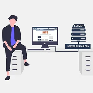
Caching. Caching means saving a ready-to-serve version of a page so WordPress does less work each visit. Without it, the server is rebuilding pages constantly. With it, the site feels more stable under load.
Hosting fit. Not all hosting is equal, but it is also not one-size-fits-all. A small local service site can run well on modest hosting if it is built cleanly. A site with heavy traffic, ecommerce, or lots of logged-in users needs more headroom and a stack tuned for WordPress.
Database hygiene. WordPress stores content and settings in a database. Over time it can fill with old revisions, expired transients (temporary cached data), and leftover plugin tables. You do not need to obsess over it, but you do need a basic tidy-up plan.
Practical choices that keep performance under control
Set a performance budget. This is just a limit you agree upfront, like “no more than two font weights” or “no more than one heavy animation library”. It stops the slow creep where every new page adds another widget, another slider, another tracking script.
Avoid plugin bloat. A plugin is not bad because it is a plugin. It is bad when it duplicates something you already have, loads assets site-wide for one small feature, or creates a maintenance burden. If you need three plugins to achieve what one well-chosen plugin can do, that is a warning sign.
Choose lighter themes and builds. A lightweight base with purposeful functionality usually beats an “all-in-one” theme stuffed with features you will never use. You can still design something polished. You are just not paying for it on every page load.
Be careful with third-party scripts. Live chat widgets, booking tools, heatmaps, and tracking tags can be useful, but each one adds requests and can block rendering. Judgement call: if a script is not clearly helping sales or operations, it does not go on the site.
Do not chase perfect tool scores. Speed tools are useful for spotting problems, not for winning points. A “100/100” target can lead to silly compromises, like stripping out useful functionality or spending time on changes that nobody will notice.
Reliability basics: the stuff you only notice when it breaks
Performance is not just speed. It is also reliability. If your site is down, half-updated, or throwing errors, it does not matter how nice the design is.
Backups. You want automated backups, stored off the server, with a restore process that has actually been tested. “We have backups” is meaningless until you have restored one successfully.
Uptime monitoring. This is a simple service that checks your site regularly and alerts you if it goes down. It reduces the time you spend losing enquiries without knowing it.
Safe updates. WordPress needs updates. So do plugins and themes. The safe approach is to update regularly, but not blindly. For more complex sites, a staging environment is worth it – that is a private copy of the site where you test updates before pushing them live.
Maintenance is part of quality. A website is not a one-off asset. If your plan relies on “we will just not touch it”, performance and reliability will slowly degrade. A simple monthly routine usually beats a big panic rebuild every few years.
5) Trust signals: prove you are real and competent
Credibility comes from what you show, how clearly you say it, and whether the site feels looked after.
A cautious buyer is looking for reasons to believe you. Not just that you exist, but that you can deliver what you claim. In 2026 that is even more important because people arrive from more places than Google. AI recommendations, maps, LinkedIn, referrals, partner sites. They all send traffic that wants quick reassurance.
Trust is partly design, but mostly content and basic technical hygiene. If key information is missing or the site feels neglected, even a beautiful layout will not save it.
Start with trust content: answer the obvious questions
Make your contact details unmissable. Put a real email address and phone number in the header or footer, not just a form. Add your location if it matters, and be clear about what “London” means if you are remote or hybrid.
Your About page should sound like a human wrote it. Explain who you are, who the work is for, and what you actually do day-to-day. If you are founder-led, say so and include a photo if you are comfortable with it. For some service businesses, that single page does more for conversions than another round of design tweaks.
Spell out your service scope. What you do, what you do not do, and what the client needs to provide. Clear boundaries reduce awkward calls later, and they also read as competence.
Add a short process page or section. How projects start, what the stages are, how long it usually takes, and what happens after launch. You do not need a 12-step methodology. You need expectations set in plain English.
Proof beats claims
Testimonials help, but only when they have context. A name, a role, what you did, and the type of business. “Great service” on its own is noise. If a client cannot be named, explain why and give as much detail as is sensible.
Case studies are stronger than portfolios. Include specifics: the problem, what you changed, and what “done” looked like. Do not force numbers if you do not have reliable tracking. It is fine to focus on outcomes like “reduced admin time” or “clearer enquiries”, as long as you describe how you got there.
List credentials that matter to your buyer. Relevant accreditations, partner status, professional memberships, security training, industry experience. Skip padding. If you have to explain why an award matters, it probably does not.
Compliance basics for UK-facing sites
I am not giving legal advice here, but there are a few basics most UK sites should cover. At minimum you want a privacy policy that matches what the site actually does, and a cookie approach that is honest about tracking.
Be careful with cookie banners. If you use non-essential tracking, give a real choice. If you do not use it, do not pretend you do just because a plugin added a scary pop-up. Judgement call: many small service sites are better off using fewer third-party trackers, both for trust and for speed.
Accessibility also feeds trust. “Reasonable” usually means the site is usable with a keyboard, has sensible colour contrast, readable text, and clear focus states for forms and menus. Add image alt text where it carries meaning. Make links descriptive. This is not about perfection, it is about not excluding people through avoidable choices.
Technical trust: the quiet signals people notice
Use HTTPS everywhere. That is the padlock in the browser and it means the connection is encrypted. In practice, it is table stakes for forms, logins, and credibility in general.
Make forms feel safe. Use spam protection that does not punish real users, keep form fields to what you genuinely need, and confirm what happens next after someone submits. If you collect sensitive data, be explicit about how it will be used and stored.
Avoid broken pages and dead ends. Fix 404s, remove outdated pages from navigation, and redirect old URLs properly. Nothing says “we are not on top of things” like a pricing page from three years ago or a blog post that links to missing services.
Keep key pages current. Review your homepage, services, About, contact, and any “top traffic” pages at least quarterly. You do not need constant content. You do need accuracy.
7) Designed for AI discovery without chasing gimmicks
People now find businesses through search, maps, social and AI assistants, so your site needs to be an easy, reliable source
In 2026, your website is not just being read by people. It is being interpreted, summarised, and sometimes quoted by systems that try to answer questions quickly. That includes search features, map packs, social previews, and AI assistants.
The goal is not to chase “AI optimisation”. It is to make your site clear enough that both humans and machines can trust what it says.
In practice, AI systems tend to surface sources that do a few boring things well: they give clear answers, keep facts consistent, structure pages sensibly, and cite reputable references when that adds weight.
What AI systems usually reward (without you trying to game them)
Clear answers. If someone asks “How long does a WordPress rebuild take?” a good page does not bury the answer under three screens of background. Put the direct answer near the top, then explain the variables underneath.
Consistent facts. Dates, locations, service areas, and claims need to match across your own pages. If you say “London-based” on one page and “Manchester” on another, you are signalling mess, not reach.
Well-structured pages. Headings should describe what the section contains, not be cute. Lists help when you are outlining deliverables, constraints, steps, or requirements. Machines like that because it reduces ambiguity. Humans like it because it is quicker to scan.
Reputable references when relevant. You do not need sources for everything. But if you mention something that benefits from an external anchor (for example, accessibility guidance or a security standard), link to the primary source. It is also just good practice.
Consistency across the web matters more than people think
Your website is only one part of your footprint. If an AI assistant is trying to decide whether you are a credible local option, it will often cross-check.
At a minimum, keep these aligned wherever your business appears:
- Business name (pick one format and stick to it)
- Address and service area (be precise about “based in” vs “serving”)
- Phone number and email (avoid having three versions floating around)
- Core services (use the same plain-English descriptions)
- Key profiles where relevant (Google Business Profile, LinkedIn, industry directories you actually care about)
This is not about being everywhere. It is about being consistent where it matters. If you are a local service business, your map profile is often as important as your homepage. If you are B2B and not location-led, your LinkedIn presence may carry more weight.
Traps that look like “SEO work” but usually backfire
Doorway pages. These are pages made to catch variations of a search, like “Web design in [Area]” repeated across 20 neighbourhoods with the same content. They rarely help long-term, and they make the site feel spammy to real buyers.
Thin content. A page that says very little, or avoids specifics to sound broad, is not useful to anyone. AI systems have the same problem humans do: there is nothing solid to quote.
Rewriting the same page 20 ways. If you offer one service, do not spin it into endless near-duplicates. It creates internal competition and confusion. One strong page with clear sections, plus a few genuinely distinct supporting pages, is normally the better route.
My judgement call: if a page does not add a new decision-making detail for the buyer, it probably does not deserve to exist.
A practical checklist for being a good source
You do not need special tooling. You need pages that answer questions cleanly and hold up under scrutiny.
- Answer-first sections near the top of key pages (a short summary that would still make sense if quoted out of context)
- FAQs with substance (real objections, real constraints, real next steps, not fluff)
- Definitions for jargon you use (one line is enough, for example: “Core Web Vitals are Google’s performance metrics for loading, responsiveness and layout stability.”)
- Constraints clearly stated (what you will not do, what depends on content, approvals, third parties, or competition)
- Examples of scenarios and outcomes (not necessarily case studies, even simple “If you have X, we usually recommend Y” is useful)
- Consistent service descriptions across your site, proposals, and public profiles
- Contact and location clarity (a real address if you have one, or an honest service area statement if you do not)
If you do those things, you make the site easier to recommend, easier to summarise, and easier to trust. Not because you found a hack, but because you built something that actually answers the question properly.
8) Adaptability and future proofness: easy to change without rebuilding
A good site is built so you can add, edit, and reorganise without pulling the whole thing apart
In practice, “future-proof” is not a promise. It is a set of choices that make change cheaper and less risky later. Services shift. Markets move. Compliance rules get updated. Your website should be able to keep up without becoming a rebuild every 18 months.
The first part is modular structure. In WordPress, that usually means reusable blocks and patterns.
A block is a page building unit, like a heading, image, testimonial, or pricing table. A pattern is a saved layout made from blocks that you can reuse.
When a site uses modular components properly, you stop editing the same thing in ten places. You update it once, then reuse it with confidence. Typical examples are a “Services summary” row, a call-to-action panel, a trust strip with accreditations, and a standard FAQ section.
My judgement call: if you find yourself copying and pasting the same section more than twice, it should probably be a reusable pattern or a synced block. Copy-paste sites always drift out of sync over time.
The second part is keeping custom code maintainable. Custom code is fine. It is often necessary for performance, accessibility, or a clean editorial experience. But it needs to be readable by the next person who touches it, including you six months from now.
That means sensible naming, a consistent structure, and light documentation. Not a novel. Just enough notes to explain what a component does, where it is used, and what not to change casually. It also means not over-engineering things that could have stayed simple.
The third part is separating concerns: content vs layout. Content should live in the editor where you can change it, not baked into templates.
A template is the underlying layout file that outputs a page type, like a service page or a blog post. If key text is hard-coded into templates, small changes become developer tasks. That is slow, and it increases the chance of “quick fixes” that create inconsistent messaging.
It is usually better to keep templates focused on structure, and let the copy, contact details, and service descriptions live in WordPress fields and blocks. The layout stays stable. The message can evolve.
Finally, plan for change in obvious places. New services, new locations, rebrands, and compliance updates are the normal ones.
For services, you want a structure that supports adding a new page and weaving it into navigation, internal links, and related sections without rewriting everything. For locations, avoid spinning up near-duplicate pages. Instead, build a clear “Areas served” approach that is honest, useful, and doesn’t create a maintenance mess.
For rebrands, keep things like logos, colours, and typography defined in one place, not scattered through custom CSS and one-off page tweaks. And for compliance, make sure you can update privacy, cookie settings, accessibility statements, and terms without needing a developer every time a tool changes its UI or policy wording.
If you want one practical test, try this: could you change your main phone number, update your core service list, and add a new “Book a call” section across the site in under an hour? If not, the site is probably too tightly coupled to its current version of the business.
9) Maintenance reality: the website is never ‘done’
Treat upkeep like a normal part of running the business, so small tasks do not turn into expensive fixes later.
A good website holds up because someone keeps it in shape. Not every day. But regularly, with a simple routine. If you ignore it for long enough, the site does not usually explode overnight. It just gets gradually slower, slightly broken, and harder to trust.
The goal is boring reliability. Updates happen. Backups exist. Key pages stay accurate. Enquiries still arrive. That is what “well maintained” really means.
WordPress maintenance basics (the technical housekeeping)
WordPress maintenance is mostly four things: updates, security, backups, and performance checks.
Updates means keeping WordPress core, plugins, and your theme current. Plugins are add-ons that provide features like forms, SEO, or caching. Updates reduce bugs and compatibility issues, and they close off known problems. They also sometimes introduce new ones, so it is sensible to update in a controlled way rather than clicking everything at once on a Friday afternoon.
Security is basic hygiene. Strong passwords, two-factor login where possible, and only giving admin access to people who genuinely need it. Also remove plugins you are not using. Disabled is not the same as removed.
Backups are your rollback plan. You want automated backups that you can actually restore, stored off the server as well as on it. The practical bit here is testing a restore occasionally. A backup you have never restored is a comforting idea, not a plan.
Performance checks are quick sanity checks. Load a few key pages on mobile data. Check that images are not huge, pages are not creeping heavier, and nothing obvious is slowing things down. If the site uses caching (a system that saves pre-built pages to load faster), updates can change what needs caching and what should be excluded.
Content maintenance (the stuff customers actually notice)
Most “site problems” I see in the real world are content problems, not code problems. Outdated copy, stale offers, or a key page that does not match how the business works now.
At minimum, keep your core pages current: Home, Services, Pricing (if you show it), About, Contact, and any “Start here” landing pages you use in ads or email. Remove dead offers. Update team details. Fix opening hours. And check any compliance pages you publish so they still reflect what you do.
Also test your forms. Send a test enquiry to every form on the site now and then. Check where it lands, and whether notifications still reach the right inbox. Email deliverability changes over time, and form plugins change too.
Links rot quietly. A partner changes their URL. A PDF is removed. A page is renamed. Use a link checker occasionally, but also do a human pass through your top pages. Tools find broken links. Humans spot confusing ones.
Ownership and access (the “can you actually control it?” list)
This part is not glamorous, but it matters when something needs changing quickly.
Make sure you know who controls:
- Domain registration (the name, like yourcompany.co.uk).
- DNS (the settings that point the domain to your website and email provider).
- Hosting (the server where the site lives).
- WordPress admin access (at least two admin accounts, owned by real people, not a shared login).
- Analytics (so you can see traffic and key actions).
- Google Search Console (how Google reports indexing, errors, and search visibility).
If any of those are in a former supplier’s name and you cannot access them, you do not really own the site. You are renting it. That is fine until there is a problem, or you want to move.
My judgement call: keep a simple “site access” document. One page. Where things are registered, who has access, and how to reach support. Store it somewhere your business controls, not inside someone’s inbox.
What to automate vs what needs a human
Automation is great for repeatable tasks that should happen even when you are busy.
Good candidates for automation:
- Daily or weekly backups (depending on how often the site changes).
- Uptime monitoring (a tool that checks the site is reachable).
- Security scanning and login alerts.
- Scheduled plugin and core updates, if your setup supports safe updates and easy rollback.
- Basic performance monitoring.
Human review still matters for anything that affects meaning, trust, or conversion. A tool cannot tell you if your service page is now unclear, or if your enquiry form feels awkward on a phone.
Things that benefit from a person looking:
- Scanning key pages for accuracy and tone.
- Checking that calls to action still match how you want leads handled.
- Reviewing site search queries and common customer questions, then updating content to answer them.
- Spot-checking mobile layout after updates.
- Looking at Search Console for indexing issues or pages that have dropped off.
A sensible routine is light but consistent. Monthly: run updates, check backups, test forms, and scan your top pages. Quarterly: review services and offers, prune or refresh old content, and do a slightly deeper performance check. After any major change, like a theme update or new plugin, do a quick walkthrough on mobile and desktop and confirm nothing critical has shifted.
If that feels like a lot, start smaller. The minimum I would not skip is backups, updates, and form testing. Everything else is easier when those basics are already handled.
10) A practical review checklist: how to tell if your site is good right now
Use this like a quick MOT you can do yourself, without needing to be technical
You do not need a full audit to spot the big issues. You need a repeatable way to check the basics, the parts that affect leads, trust, and search visibility.
Set a timer for 20 minutes. Use your phone for most of it. That is where problems show up first.
1) The 2-minute stranger test (clarity, pricing, contact, trust)
Ask someone who does not know your business to open your homepage on their phone. Or do it yourself in an incognito window and pretend you are a cold visitor.
- Can they explain what you do in one sentence? If they cannot, your headline and first screen are too vague.
- Can they find who it is for? A quick line like “for X in Y” helps more than clever wording.
- Can they find pricing or at least how you price? If you cannot publish prices, publish a range, a “from” figure, or clear factors that affect cost.
- Can they find your process? Even 3-5 steps is enough. People want to know what happens after they enquire.
- Can they contact you in under 2 minutes? Phone, email, and a simple form. No hunting.
- Can they tell you are real? Look for a real address or service area, real names, and proof of work. If you use testimonials, make them specific and believable.
My judgement call: if your homepage tries to do everything, it usually does nothing well. It is often better to keep the homepage simple and push detail into service pages that each have a clear purpose.
2) Performance and “does it feel smooth?” checks (mobile first)
You are not chasing perfect scores. You are checking for obvious friction that makes people leave, and for issues that also hurt search performance.
- Do key pages load quickly on mobile? Check your homepage, a main service page, and your contact page on 4G or 5G.
- Are images sensible? If a page feels heavy, it often is. Huge images are a common cause. As a rule, images should be sized for how they display, not uploaded straight from a camera.
- Do you see layout jumps while it loads? If buttons and text move around as images load, that is a layout shift. It feels sloppy and it causes mis-taps on phones.
- Is the page readable immediately? If you stare at a blank screen before anything appears, something is blocking the first paint.
If you only do one thing here, do this: open a key page on your phone and scroll while it loads. If it stutters, jumps, or makes you wait, your visitors feel that too.
3) Structure checks (navigation, page focus, internal links)
Structure is what makes a site easy for people, and easy for Google and AI systems to interpret. It is also what stops your content turning into a messy pile over time.
- Is the main navigation clear? Aim for a small set of plain labels. If you need to explain a menu item, rename it.
- Does each page have one job? One primary action is enough. For example: a service page should explain that service and lead to an enquiry, not try to sell every other service.
- Do internal links make sense? Link to related services, FAQs, case studies, and the next logical step. Avoid random “read more” links with no context.
- Can you get from any key page to contact in one click? A persistent “Contact” link is simple and effective.
- Are there duplicate or competing pages? Two pages trying to rank for the same thing usually weakens both and confuses visitors.
A small non-technical tip: read your service page headings only. If the headings do not tell a clear story, the page probably needs restructuring.
4) Operational checks (the unsexy bits that keep it working)
This is the “can we rely on it?” section. Most website disasters are not design problems. They are neglected maintenance and missing access.
- Backups exist and are recent. A backup is a copy of your site you can restore if something breaks. You should know where they are and how far back they go.
- Updates are not years behind. WordPress core, plugins, and themes need updates for security and compatibility. If you are scared to update, that usually means the setup is fragile.
- Forms work. Submit your main enquiry form and confirm it arrives. Also check the confirmation message and any automated email reply.
- Tracking is set up. At minimum, you want analytics and Search Console. Analytics tells you what people do. Search Console tells you how Google sees the site.
- Basic error checks. Click your top navigation links, test the phone number link on mobile, and make sure key pages do not show “not found”.
If you want a simple routine: do the form test and update check monthly, and do the 2-minute stranger test quarterly. Websites drift. A small, regular review keeps yours honest.
A quick scoring method (so you can decide what to fix first)
Give each area a score from 1 to 5: clarity, performance, structure, operations. Fix the lowest score first. It is usually the fastest route to better leads and fewer surprises.
FAQ
Words from the experts
We often see the same thing: a site that looks polished, but the structure does not hold up when someone lands on it cold. A common problem is pages trying to do too much at once, so the message blurs and the next step is not obvious. One practical habit that avoids this is starting every page by writing down its single purpose before any layout decisions.
In 2026, a good website is the one that stays useful when discovery shifts, whether that is search results, AI suggestions, or a change in what your customers ask. If you have to choose, prioritise clarity and predictable performance over extra visual effects, because those foundations keep paying off long after the design trend has moved on.
You might like these too
These sit in the same category as the one you are reading. They follow the same thread and offer a bit more depth. Have a look if you want to go further.