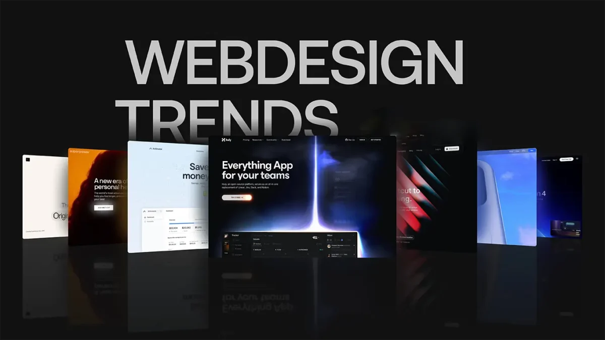
Top Web Design Trends Shaping 2026
When I say “trend” in web design for 2026, I do not mean whatever is popular on a design gallery this month. I mean the changes that make a site easier to use, quicker to load, more accessible (so more people can actually use it), and easier for search engines to understand. The filter is simple: if it measurably helps real users or reduces friction in how you run the site, it is worth paying attention to. If it is mostly aesthetic, short-lived, or adds weight and complexity, you can usually ignore it. A lot of what gets labelled “design” is really product and engineering decisions under the surface, especially on WordPress where your theme, plugins, content structure, and performance settings do most of the heavy lifting.
Structural shifts vs visual fashion: how to tell the difference
Use a quick test to decide if a “trend” will actually help your users and your business, or just add noise and maintenance.
Most “web design trends” fall into two buckets. Some change how well a site works over the long term. Others are mostly surface-level patterns that look new for a season, then age quickly and get in the way.
A simple way to tell the difference is to ask what problem the trend solves. If it removes friction for real users, or reduces the risk of the site becoming slow, messy, or hard to update, it is worth a closer look. If the main benefit is that it looks different, treat it as optional.
Here is the checklist I use when a client asks, “Should we do this?”
- Does it improve task success (can people complete the thing they came for, like booking, buying, or getting a quote)?
- Does it improve load time (how quickly pages become usable, especially on mobile data)?
- Does it improve accessibility (can more people use it, including keyboard users and people using screen readers)?
- Does it improve maintainability (is it easier to update content and keep the site stable over time)?
- Does it improve SEO (is your content clearer to search engines, with sensible structure and internal linking)?
If a trend does not clearly help at least one of those, it is usually “visual fashion”. Not always bad, but it should not be driving the project.
Structural shifts tend to be boring on the surface, but they pay off. Examples:
- Performance budgets – setting limits for page weight, image sizes, and script use so speed does not slowly degrade as the site grows.
- Accessibility as standard – proper headings, focus states, colour contrast, form labels, and predictable navigation.
- Content structure – clear page templates, consistent sections, and a sensible hierarchy so users and search engines can scan and understand pages.
- Reduced plugin sprawl – fewer overlapping tools, more deliberate choices, less risk during updates.
Visual fashion tends to add weight or complexity without improving outcomes. Examples:
- Decorative animations that trigger on every scroll and distract from content.
- Novelty layouts that look clever but make it harder to scan, compare options, or find key information.
- Overbuilt interactions that require extra scripts for basic things like tabs and sliders, when simple HTML would do.
That said, “fashion” trends can be useful when they solve a real constraint. Mobile usage pushes simpler navigation and faster pages. Compliance can force accessibility improvements. Conversion work can justify changes to forms, page flow, and content order if it removes friction for people ready to enquire or buy.
My judgement call: if a trend increases complexity, it needs a clear measurable upside. In practice, I would rather ship a calmer page that loads quickly and reads well than a heavier one that looks more “current” for three months.
Performance is a design constraint now, not a technical afterthought
Speed and stability affect what you can safely put on the page, so layout and interactions need to earn their place.
In 2026, “design” is not just how a site looks. It is how quickly a page becomes usable, how stable it feels while loading, and whether it responds instantly when someone taps or types. Those things shape the layout, the amount of motion, and even what content you choose to embed.
A practical way to think about this is Core Web Vitals. They are not the whole story, but they are a decent proxy for real user experience.
- LCP (Largest Contentful Paint) – how quickly the main content appears. Usually the hero image, headline, or first big block of content.
- INP (Interaction to Next Paint) – how quickly the page responds when someone interacts. Think tapping a menu, opening an accordion, typing into a form.
- CLS (Cumulative Layout Shift) – how much the page jumps around while loading. If buttons move under your finger, this is the problem.
When these go wrong, you can often feel it without looking at a report. The page looks “done” but the menu lags. Text shifts after images load. A pop-up loads late and shoves everything down. That is a design issue as much as a build issue.
On WordPress, slow sites usually come from a handful of familiar causes.
- Heavy themes – lots of features you are not using, but you still pay for them in code and styles on every page.
- Too many plugins – especially when several do overlapping jobs, or each adds its own scripts and styles site-wide.
- Unoptimised media – oversized images, missing dimensions, and auto-playing videos in the wrong places.
- Third-party scripts – chat widgets, trackers, social embeds, booking tools. Useful sometimes, but they can be the slowest thing on the page because you do not control them.
The good news is that “performance design” is mostly about restraint. You make a few clear choices early, and the site stays quicker as it grows.
Design decisions that usually reduce bloat:
- Fewer fonts – each web font is another file to load, and multiple weights add up fast.
- Restrained motion – animation is fine when it supports understanding, but constant scroll-trigger effects tend to hurt INP and distract from content.
- Simpler components – do you really need sliders, carousels, and tab systems everywhere, or would clear headings and short sections scan better?
- Careful embeds – treat maps, social posts, and video players like heavy luggage. Use them where they support a decision, not as decoration.
Some of this is a branding conversation too. A strong identity does not require four web fonts, three animation styles, and a full-screen video header. In practice, one well-chosen typeface used consistently, with good spacing and a clear hierarchy, often looks more “premium” and loads faster than a more complex setup.
My judgement call: if an interaction or visual element needs extra scripts, it should have a clear job. If it is only there to make the page feel “busier”, it is usually not worth the performance cost or the maintenance that comes with it.
Also worth saying plainly: faster sites tend to be easier to use and easier to index, but performance alone does not guarantee rankings. It is more like removing a handicap. You still need clear content, sensible structure, and pages that answer real searches.
Accessibility is moving from “nice to have” to operational requirement
Think of it as reducing risk and friction, while making the site easier to use for more people
Accessibility is one of those topics that sounds like paperwork until you see it in real user behaviour. People use phones in bright light. They browse with one hand. They have temporary injuries. They use screen readers. They tab through a page because the trackpad is annoying. If your site works well for those situations, it usually works better for everyone.
In practical web design work, accessibility shows up in a few repeatable areas. None of them are exotic. They are the basics done properly, consistently.
Colour contrast is the obvious one. Body text needs enough contrast against its background to stay readable, especially on mobile and in daylight. This is not just about “passing a test”. Low contrast also makes people slow down, misread, or bounce.
Focus states matter more than most people realise. The focus state is the visible highlight on a link or button when you navigate with a keyboard. If you remove it for styling reasons, you make the site harder to use for keyboard users, and you also make it harder for power users who tab through forms quickly.
Keyboard support means you can reach and operate all important controls without a mouse. Menus should open and close predictably. Modals should not trap users with no clear exit. Accordions should be usable with the keyboard, not just clickable with a finger.
Form labels are a constant source of problems on business sites. A label is the text that is programmatically linked to a form field, not just a placeholder inside the input. Placeholders disappear when someone types, and screen readers often do not treat them as a proper label. Good labels also reduce form errors because people can double-check what you are asking for.
Headings are structural, not decorative. A heading outline (H1, then H2s, then H3s under the relevant H2) helps screen readers navigate and it helps everyone scan the page. It also tends to improve content clarity, which is never bad for SEO.
Error messages are where usability and accessibility meet in a very direct way. If a form fails, the user needs to know what went wrong, where, and how to fix it. “Something went wrong” is not enough. Ideally the message sits near the field, is written in plain English, and does not rely on colour alone to communicate the problem.
The quiet truth here is that accessible patterns usually improve usability for everyone. Clear contrast helps tired eyes. Visible focus helps fast navigation. Proper labels reduce drop-offs on enquiry forms. Logical headings make pages easier to skim. These are not edge cases. They are daily use cases.
The mistake I see is treating accessibility like a final polish. It rarely works. You end up with a list of fixes that fight the design system and break again the next time someone adds a page.
A better approach is to build it into components and workflow.
- Start with a small set of approved components (buttons, forms, cards, accordions, navigation) and make those solid. If the building blocks are good, most pages inherit good behaviour.
- Define defaults in the design system. For example: focus styles are part of the button style, not an optional extra. Error states are designed, not improvised.
- Content templates help. Give editors a simple structure to follow, with the right heading levels and a sensible pattern for FAQs, service pages, and case studies.
- Keep a short pre-publish checklist. Image alt text where it matters, headings in order, links that describe where they go, forms tested with keyboard.
If you want one small judgement call from me: avoid custom widgets that reinvent standard controls unless you have a strong reason. Native HTML elements and well-tested patterns are usually more reliable for accessibility and easier to maintain.
Maintenance matters too. Accessibility is not a one-off project. New pages can introduce heading issues. A new plugin can add a pop-up that breaks keyboard navigation. A form builder update can change markup. Even small content changes, like using a heading for styling, can undo good structure.
So the goal is not to claim perfection without checking. It is to build a site that is designed to be usable, and to keep it that way with sensible components, consistent content habits, and periodic checks as the site evolves.
Designing for clarity: stronger information architecture and content structure
The most useful “trend” is pages that answer real questions fast, without making people think too hard.
Clarity is not a visual style. It is how quickly someone can work out what you do, who it is for, and what to do next. In 2026, that matters more than ever because most visitors arrive impatient, distracted, and already comparing options. This is where information architecture helps. That is just a fancy way of saying: how your pages are grouped, named, and linked together.Navigation that matches how users think
Menus work best when they reflect the questions people already have in their head. Not your internal org chart. For most service businesses, that usually means navigation based on services, outcomes, and sometimes industries. A practical pattern that holds up well:- Services (what you do) – clear labels like “Web design”, “WordPress development”, “Support and maintenance”.
- Outcomes (what they get) – for example “Faster site”, “More leads”, “Better SEO foundations”. Use this carefully and keep it grounded in what you actually deliver.
- Industries (if relevant) – only when your offer genuinely changes by sector, like healthcare, finance, or property.
Layouts that support scanning, not reading homework
Most business pages get scanned first and read later. The layout should accept that. Use descriptive headings that say what the section contains, not vague labels like “Overview” or “What we do”. A solid structure for service pages is:- A short summary at the top – who it is for, what the service includes, and the next step.
- Tight sections with clear H2 and H3 headings.
- Supporting detail in bullets where it helps.
- One clear primary call to action (CTA) per page. A CTA is the next step you want the user to take, like “Book a call”.
Content patterns that help users and SEO
Good SEO tends to follow good structure. Not tricks. When content is organised around real questions, search engines can understand it better and users can decide faster. A few patterns that consistently help:- FAQs with real answers – answer the awkward questions too, like timelines, what you need from the client, what happens after launch, and what you do not include.
- Comparison blocks – for example “Template site vs bespoke build” or “Single page vs full site”. Keep it fair. Explain trade-offs, not winners.
- Service area pages done properly – only create location pages if you can make them genuinely useful. Add what changes for that area: on-site meetings, local case studies, response times, or relevant constraints. Avoid cloning the same page with different place names.
Reducing cognitive load: fewer choices, clearer labels
Cognitive load is the mental effort required to use a page. If people have to decode your labels, hunt for the next step, or remember what they saw two sections ago, they are more likely to leave. The fixes are usually simple, but they require discipline:- Limit choices – a small set of clear options beats a mega-menu of “everything we offer”.
- Use plain labels – “Pricing” is clearer than “Investment”. “Case studies” beats “Our work” when you want proof.
- Repeat key components – same button style, same CTA placement, same card layout. Consistency reduces effort.
- Keep sections tight – one point per section. If a section needs three unrelated points, split it.
Component-based design systems are becoming standard for business sites
A simple set of reusable parts keeps your site consistent, faster to build, and cheaper to maintain
A design system is just a shared kit of parts, plus rules for how to use them. Think reusable components (buttons, cards, pricing tables, testimonial blocks), consistent spacing, typography (fonts, sizes, line spacing), and content patterns (how a service page is laid out, how a case study is structured).
The aim is not to make every page look the same. It is to stop the slow drift where every new page invents its own styling, its own layout, and its own idea of what a “section” should be.
This trend matters because it affects usability and performance. Consistency helps people scan quicker. Reuse reduces bloat. And fewer special cases usually means fewer bugs.
What “design system” means in plain terms
For a business website, a practical design system usually includes:
- Reusable components – pre-built blocks for common needs (hero, feature grid, FAQ, contact strip).
- Rules – what combinations are allowed, and what to avoid (for example, one primary button per section).
- Spacing – a small set of spacing sizes used everywhere, so pages feel aligned.
- Typography – consistent heading styles, body text, link style, and readable line lengths.
- Content patterns – repeatable page structures that match how people decide (summary, proof, process, FAQs, CTA).
If those pieces are in place, you get a site that feels intentional. More importantly, it stays that way when new pages are added.
Why it helps on WordPress in particular
WordPress editing is much smoother when the building blocks are agreed upfront. Editors can assemble pages using known components, rather than asking for “a new layout” every time.
- Easier editing – people can focus on the words and the offer, not fiddling with layout.
- Fewer one-off templates – less custom code for “this page is special”, which makes future changes safer.
- Less CSS/JS drift – fewer random styles and scripts added over time “just for one page”. That drift is a common reason sites get slower and harder to maintain.
Quick definition: CSS controls how things look. JS (JavaScript) controls interactive behaviour. When both grow in an unplanned way, performance and consistency suffer.
Governance: the part most sites skip, then regret
A design system only works if someone owns it. Otherwise, it becomes “whatever the last editor did”. That is how page-builder chaos starts: slightly different buttons, odd spacing, five versions of the same card, and a homepage that looks like it came from three different sites.
Set a simple rule early: who is allowed to create new components, and what the process is.
- Nominate an owner – usually your developer, designer, or whoever maintains the site.
- Lock the basics – limit fonts, colours, and spacing options in the editor where possible.
- Add, don’t improvise – if a new layout is needed, create it as a proper component so it can be reused and improved.
- Keep a short “how to use this” page – one internal doc showing the approved components and where they belong.
One judgement call: if everyone can do anything in the editor, you will pay for it later in cleanup and redesign time. A bit of constraint is usually cheaper than “flexibility”.
A realistic note for small sites
Small sites do not need enterprise-level complexity. You can get most of the benefit with a lightweight system: a handful of well-made sections, a clear type scale, and consistent spacing.
If your site is 5 to 15 pages, aim for a tight set of components that cover 80% of what you publish. Then add carefully when a real need shows up. That keeps costs under control and stops the site turning into a patchwork as the business evolves.
WordPress in 2026: block-based editing used properly (and when to avoid it)
A modern WordPress build should be stable, fast, and easy to edit without breaking the layout.
WordPress has moved on. Most solid builds now use block themes and block patterns, but only when they are treated as a system, not a box of random layout tricks.
A block theme is a theme built around the block editor, including templates and styles. Block patterns are pre-built sections you can drop into pages, like a hero, a service grid, or an FAQ block.
When this is implemented well, it improves two things that matter to real businesses: consistency and speed. Consistency because everyone is using the same approved layouts and spacing. Speed because you can often reduce one-off templates, reduce messy CSS, and avoid loading heavy page-builder features that you do not need.
The best results come from a small library of patterns that match your typical pages. Services, case studies, about, contact. Not fifty variations of the same section.
Where it goes wrong is also predictable.
First, too many custom blocks. Custom blocks are bespoke components built in code. They can be great for things like a directory, a calculator, or a data-driven layout, but they add maintenance overhead. If every layout becomes a custom block, editing gets rigid and future updates get riskier.
Second, brittle styling. This is when pages only look correct because of a stack of special cases in CSS, or because a block relies on “that exact combination” of settings. It usually shows up later, when someone duplicates a section, changes a heading, and the spacing collapses.
Third, editor overload. The block editor can expose a lot of controls. If you leave everything open, content editing turns into design-by-committee. People spend time nudging padding and picking colours instead of publishing useful content.
Sometimes a classic approach or a limited editor is the better call. If your site is a tightly controlled marketing site where every page is signed off and should never drift, hard-coded templates with a very constrained editing surface can be cheaper to run long term. The same applies to regulated content, or teams where multiple people publish and brand consistency matters more than flexibility.
One practical way to think about it: if you want people to edit words, give them patterns. If you want people to edit layouts, you are accepting ongoing design governance work.
Also, treat the content editing experience as part of UX. Not visitor UX, but internal UX. If your team cannot confidently publish a new service page without calling someone, you do not have an editing system. You have a bottleneck.
Plan for three basics: training, guardrails, and documentation. Training should cover what patterns exist and when to use them. Guardrails means limiting fonts, colours, and spacing options so the editor cannot accidentally create a new visual style. Documentation can be a single internal page that shows approved sections, do’s and don’ts, and examples of a “good” service page.
A small judgement call from real projects: I would rather ship fewer options that people use correctly than offer endless flexibility that slowly breaks the site. WordPress can be very editorial-friendly in 2026, but only if the build makes the right things easy and the wrong things hard.
Media and motion: using video, animation, and 3D without harming UX
Use motion when it helps someone understand, find, or finish something, not just to decorate the page
Motion can be genuinely useful. It can also be noise that slows the site down and makes it harder to use. The difference is intent.
A simple guideline I use on client work: only add motion when it explains something, guides attention, or confirms an action. If it does not do one of those jobs, it probably should not be there.
- Explains – a short product demo, a step-by-step animation, a before/after transformation that needs movement to make sense.
- Guides – a subtle highlight showing where to click next, or a gentle scroll cue when a page is long.
- Confirms – a clear state change after submitting a form, adding to basket, or saving a setting.
Everything else is decorative motion. Decorative motion is where projects drift into “modern for the sake of modern”, and it tends to cost you performance and clarity.
Performance: keep media from becoming the page
Video and animation are some of the easiest ways to hurt load time. The fix is rarely complicated, but it does need discipline.
- Lazy load where you can – that means the media loads only when it is close to being seen, not all at once at the top of the visit.
- Compress aggressively – if a video is background texture, it does not need to be crisp. Save quality for the parts where detail matters.
- Use a poster image – a poster is the still image shown before a video plays. It should look intentional, not like a random paused frame.
- Avoid autoplay with sound – it is intrusive, and it creates immediate friction. If you must autoplay, keep it muted and give a clear control.
- Be careful with embedded players – third-party video embeds can bring extra scripts. Sometimes it is fine. Sometimes it is the slowest thing on the page.
One practical judgement call: if a homepage hero needs a big autoplay video to “set the mood”, I would usually rather use a strong image and a clear message. It loads faster, it is easier to maintain, and it tends to convert better because people can read it instantly.
Accessibility: respect people who experience motion differently
Motion can trigger dizziness or nausea for some users, and flashing can be dangerous. You do not need to be an expert to handle this responsibly, but you do need to plan for it.
- Support reduced motion – many people set a “reduce motion” preference in their device settings. Your site should honour it by turning off non-essential animation.
- Avoid flashing and rapid flicker – do not use strobe-like effects, fast pulsing, or harsh alternating colours.
- Keep interactions predictable – menus should open like menus, not fly around the screen. Buttons should behave like buttons. Novel motion often breaks trust.
- Do not hide content behind animation – if something is important, it should be visible without waiting for a sequence to play.
Also think about keyboard and touch use. A moving target is harder to click. A “floating” control that shifts position can be frustrating on mobile.
Good alternatives to heavy effects
If the goal is to look polished and credible, you do not need 3D scenes and complex animation on every page. Most business sites get better results from fundamentals done well.
- Good photography – real people, real work, consistent lighting. It builds trust faster than effects.
- Diagrams and simple visuals – clear process diagrams or annotated screenshots often explain more than a video.
- Lightweight micro-interactions – small feedback like a button state change, a tidy focus outline, or an accordion that opens smoothly. Useful, not showy.
- Strong typography and spacing – if the layout reads well, you do not need motion to “add interest”.
Used carefully, motion makes a site feel easier. Used everywhere, it makes the site feel heavier. In 2026, that trade-off matters more than whether the page looks trendy.
Forms, booking, and lead handling: the unglamorous UX that drives revenue
If people cannot enquire quickly and confidently, the rest of the site does not matter much.
Most business sites lose good leads in the boring bits. Contact forms that feel fiddly. Booking flows that hide the next step. Messages that vanish into a void. None of this is exciting, but it is where real opportunities are won or lost.
In 2026, the “trend” is simply doing the basics properly, then connecting the dots behind the scenes so you can respond fast and track what is working.
Form design basics that still get ignored
Start by asking for less. Every extra field is a reason to give up, especially on mobile. If you do not need it to reply or qualify the enquiry, remove it.
Use clear labels, not placeholder-only text. Placeholders disappear when someone starts typing, so they are a poor substitute for a label, and they are harder for accessibility tools to handle.
Add inline validation. That means the form flags issues as the person fills it in, not only after they hit submit. Keep it calm. “Please enter a valid email address” beats a red box that just says “Error”.
Error states need to be helpful. Show which field is wrong, explain what to do, and do not wipe what they already typed. If the form reloads and clears everything, people rarely try again.
Trust signals that reduce hesitation
People are careful with their details now. A short privacy note near the submit button helps. Keep it plain: what you do with the data, and what you do not do. Link to the full privacy policy if needed.
Set expectations on response time. If you usually reply within one working day, say that. If it varies, say what it depends on. Silence creates doubt.
Use a proper confirmation message. Not just “Thanks”. Tell them what happens next, and include a fallback like “If you do not hear back, check spam or call us”. If the enquiry triggers an email to the user, tell them to expect it.
Spam prevention without punishing real users
Spam is real, but you should not make genuine clients jump through hoops. Avoid puzzles and hard-to-read captchas where possible, especially for high-value, high-trust services.
Better options include invisible checks and simple “honeypot” fields. A honeypot is a hidden field bots often fill in, which lets you quietly block them without affecting normal people.
Rate limiting can help too. That is just a rule that stops repeated submissions from the same source in a short time. It reduces noise without changing the user experience for most people.
One judgement call: if spam is manageable, I would rather accept a small amount of filtering than add friction to every serious enquiry. For many service businesses, that trade-off is worth it.
Integration and tracking: the hidden work that makes it reliable
A form is not finished when it “sends an email”. Think about where leads should land. Many teams need enquiries in a CRM, a shared inbox, or a helpdesk tool, not just in someone’s personal mailbox.
CRM means customer relationship management. It is where you store and manage leads and clients.
Email deliverability matters as well. That is the likelihood your emails actually arrive, rather than being filtered into spam. Basic setup like sending through a proper mail service and authenticating your domain can make a noticeable difference, especially for automated confirmations.
Also add analytics events for key steps. An event is a tracked action like “form submitted” or “booking confirmed”. This is how you tell whether traffic is turning into enquiries, and whether a form change helped or hurt.
Finally, test the whole journey. Submit the form. Check where it goes. Check the confirmation. Check the email. Then do it on mobile, on a slow connection, and with keyboard navigation. These are small checks, but they catch the failures that quietly cost you work.
AI in web design: where it helps (and where it causes mess)
Use AI to speed up the boring parts, then apply human judgement so the site still sounds like your business.
AI is useful in a web project, but it is not a design strategy. Treat it like a junior assistant that works fast and needs supervision. If you do that, it saves time. If you don’t, you end up with generic pages, mixed messages, and a lot of rework later.
Where it helps most is early-stage workflow. For example, drafting content from rough bullet points, summarising long client notes into themes, and producing a few initial information architecture options. Information architecture just means how the pages are organised and how users find what they need.
It is also decent at first-pass accessibility tasks, like drafting image alt text. Alt text is the short description used by screen readers and shown if an image fails to load. The key phrase is “draft”. You still need to review it for accuracy and tone, especially for product photos, team shots, and anything that could be misdescribed.
One practical use I like is creating multiple IA options quickly. You can ask for a “simple” structure, a “service-led” structure, and a “problem-led” structure, then sense-check each against how people actually search and how the business sells. It is faster than starting with a blank page, and it makes decision-making clearer in workshops.
But AI causes mess in predictable ways. The biggest is generic copy. You get smooth sentences that say very little, which is not helpful for customers or for positioning. The second is factual errors. AI can confidently produce details that sound right but are wrong, or outdated, or not true for your business.
Tone is another common problem. Even if each page reads “fine”, the overall voice can drift, especially when different people prompt the tool in different ways. You also risk duplicate content. That can mean repeating the same phrases across your own site, or publishing text that is similar to what other firms are also generating from the same patterns.
Then there is privacy. Client notes often include personal data, commercial details, or information covered by NDAs. Be careful what you paste into third-party tools. If in doubt, strip out names and sensitive specifics, or keep that part of the work fully manual.
A practical rule that works in real projects: AI output needs an owner, an editor, and a style guide. The owner is responsible for whether it is correct and appropriate. The editor tightens it and removes filler. The style guide keeps the tone and formatting consistent across the whole site, including word choices, spelling (UK), and how you describe services.
To keep the site human, you need specifics that AI cannot guess. Real examples. Concrete proof. Clear positioning. That means named services, defined locations served (if relevant), what is included, what is not, and evidence like case studies, process steps, accreditations, or measurable outcomes you can genuinely stand behind.
If you sell expertise, say what that expertise looks like in practice. “We build fast WordPress sites” is a start. “We reduce plugin bloat, keep third-party scripts under control, and ship pages that pass real-world performance checks” is clearer and more believable, as long as it is true for your work.
My small judgement call: if your homepage and key service pages sound like they could belong to any company, do not use AI for the final copy. Use it to outline, to organise, to sharpen. Then write the last 20 percent yourself, or have a human writer do it with proper context. That last bit is usually what makes the site convert.
Short-lived trends to ignore in 2026 (unless you have a specific reason)
Common “cool” requests that usually cost more in speed and clarity than they return in results
Some design requests come up again and again in client calls. They look impressive in a demo. They can also make a site slower, harder to use, and harder to maintain. If your website is meant to generate enquiries, bookings, or sales, these are the ones I treat with caution.
This is not about taste. It is about usability and performance. Performance means how quickly pages load and respond on real devices, over real mobile connections.
Overdesigned scroll effects and heavy parallax
Parallax is when foreground and background move at different speeds as you scroll. A little can be fine. Heavy parallax, layered animations, and scroll-triggered effects on every section tend to create three problems: slower loading, janky scrolling on mid-range phones, and content that is harder to scan.
They also increase build complexity. That means more testing, more edge cases, and more time spent fixing “weird” behaviour after updates.
Practical alternative: keep motion purposeful. Use one or two small transitions to show hierarchy or reinforce a key point, then stop. Most users are trying to get to an answer, not watch the page perform.
Auto-playing background video as a default hero treatment
Video can be useful when it shows something that words and stills cannot. The issue is using it as the default “hero” on every homepage because it feels modern. Background video adds weight, often delays first meaningful content, and can distract from your message.
It can also create accessibility issues if motion is not handled properly. Some users are sensitive to movement, and autoplay can be uncomfortable even when it is silent.
Practical alternative: start with a strong headline, a clear subheading, and a good image that loads fast. If video genuinely helps, make it deliberate and test it. Consider click-to-play, shorter loops, and a proper fallback image.
Novelty navigation patterns that hide basic pages
Menus that look clever in a concept can be frustrating in real use. Hidden navigation, experimental icons without labels, “mystery meat” hover effects, or layouts that bury your Services and Contact pages tend to increase confusion, especially on mobile.
The trade-off is simple: you gain novelty, but you lose findability. Findability is how quickly someone can locate what they came for, without thinking.
Practical alternative: use familiar patterns. Clear top-level items. Descriptive labels. Keep key pages visible. If you want to be distinctive, do it with content and layout, not by making the menu a puzzle.
Overly experimental typography that hurts readability
Type is doing most of the work on a business website. Unusual fonts, extreme weights, low contrast, tight line spacing, or tiny body text can look “designerly” and still be tiring to read. It also increases the risk of inconsistent rendering across devices.
Practical alternative: prioritise legibility. Use one strong typeface pair, sensible sizes, and comfortable line length. Save your personality for headings, not paragraphs. You want people to read, not squint.
A quick note on exceptions
There are exceptions. Art-led brands, studios, musicians, and campaigns can justify higher friction if the experience is the product. In those cases, the site is part of the performance.
Most service businesses are different. For a consultancy, trades company, clinic, or B2B firm, clarity usually wins. My judgement call: if a trend makes it harder to understand what you do, who it is for, and what to do next, it is not a trend worth paying for.
What to prioritise for a business website in 2026: a practical order of operations
This is the order that tends to keep projects calm, focused, and useful – without getting distracted by shiny extras.
Most “trend” discussions miss the boring part. The boring part is what makes a site work. If you get the foundations right, you can layer design on top and it will still be fast, clear, and easy to run.
Here is a practical checklist I use to keep priorities straight. It is not a universal roadmap. It is a sensible order of operations that fits how business websites succeed in real life.
1) Start with goals and user tasks
Before layouts, agree what “success” means. More enquiries. Better quality leads. Fewer support calls. Faster hiring. Something you can actually recognise.
Then list the top user tasks. For example: check pricing, see examples, confirm service area, compare packages, book a call, verify credibility, or find answers to common questions.
Judgement call: if a page element does not help a real task, it is probably decoration. Decoration is fine, but it should not be in the critical path.
2) Information architecture and content plan
Information architecture is just how pages are organised and labelled. It decides whether people can find things quickly, and it affects SEO because search engines need clear structure too.
Start with a sitemap that reflects how customers think, not how your company is structured internally. Keep the main navigation simple. Make Services, About, Case Studies or Work, and Contact easy to reach.
Then build a content plan. What goes on each page, what proof you need, and what questions you must answer. This is where most projects either get easier, or get messy later.
3) Performance budget and technical approach
Set a performance budget early. That is a simple limit on how heavy the pages can be, so speed does not get “accidentally” sacrificed.
Agree the technical approach that supports it. For WordPress, that usually means being selective with plugins, keeping page templates lean, and avoiding features that add weight without adding value.
This is also where you decide what must be rock solid on mobile and slower connections. In the UK, you will still get plenty of users on mid-range phones, and they should not be punished for it.
4) Accessibility baseline
Accessibility is making sure people can use your site regardless of device or ability. It includes keyboard use, readable contrast, sensible headings, clear link text, and forms that are easy to complete.
You do not need to turn the project into a compliance exercise to benefit from basics. A good baseline reduces friction for everyone, and it also tends to improve content clarity.
Practical tip: treat accessibility checks like spelling. You do not “add it at the end”. You keep it in mind as you write and build.
5) Component system and editing workflow
A component system is a set of repeatable page sections. Think hero, testimonial block, service list, FAQ, pricing table, call to action. Built once, reused cleanly.
This matters more in 2026 because sites are rarely “done”. You will add new services, publish articles, update case studies, and tweak messaging. If editing is awkward, content goes stale.
Decide who will update what, and how often. If a non-technical person needs to edit pages, keep the options constrained. Too much freedom usually leads to inconsistent pages and broken layout.
6) Measurement plan (what you track and why)
Decide what you will measure before launch. Otherwise you end up tracking nothing useful, or tracking everything and learning nothing.
Pick a small set tied to your goals. Examples: contact form submissions, phone link clicks, quote requests, brochure downloads, booking completions, and visits to key service pages.
Also agree how you will judge traffic quality. Enquiries that match your service. Repeat visits to case studies. Time spent on key pages can help, but only when you know what “good” looks like for your audience.
If you do one thing here, make it this: track actions that represent intent, not vanity numbers. Page views are fine for context, but they are not the business outcome.
When you follow this order, trends become easier to evaluate. If something improves task completion, clarity, or load time, it is worth discussing. If it mainly adds weight, friction, or maintenance, I would ignore it and spend the budget elsewhere.
FAQ
Words from the experts
We often see the same pattern when a new “trend” lands on a site: the page looks different, but the basics get messier. We often see navigation and CTAs becoming less obvious, then enquiries dip and nobody can quite say why. One simple way to keep yourself honest is to check heading structure – one clear H1, then logical H2s and H3s that match what the page is actually trying to help someone do.
If a 2026 trend does not improve usability or performance, it is safe to ignore. In practice, structural shifts like better information architecture, leaner pages, and predictable behaviour on real devices tend to keep paying off, while novelty interactions usually add friction and maintenance with very little upside.
You might like these too
These sit in the same category as the one you are reading. They follow the same thread and offer a bit more depth. Have a look if you want to go further.