SEO Basics for Web Designers

Most SEO problems I see are baked in before anyone touches a plugin or writes a line of code. They come from design decisions – what goes where, what gets linked, what gets hidden, and the order a page tells its story. This guide keeps it simple and non-technical. It covers what you need to think about in advance when building a website: layout that supports scanning, links that help people (and search engines) find the next step, and a content flow that makes the page easy to understand and easy to expand later without creating a mess.
What web designers control (and why it matters for SEO)
SEO starts with how a site is organised, not with tricks or tools
Design is not separate from SEO. The structure you design becomes the foundation search engines build on. If that foundation is clear, pages are easier to crawl (find and read), index (store), and match to what people search for.
A site can look good and still be hard to understand. Good-looking design is about polish. SEO-friendly design is about meaning. Headings that explain what a section is about. Pages that have one clear purpose. Links that point somewhere useful instead of dumping everything into a mega menu.
Search engines do not “see” a page like a person does. They rely on signals like hierarchy and context. That mostly comes from what you choose to show, in what order, and what you link it to. If the layout forces important content below the fold, buries it in tabs, or hides it behind vague labels, you make the job harder for both users and search engines.
As a website designer, you have the most leverage in three areas.
Page templates. Templates decide what a “service page” or a “case study” looks like every time. If the template supports a clear intro, a proper heading structure, and space for supporting content, you can scale the site without every new page turning into a custom layout puzzle.
Navigation. Navigation is not just a menu. It is the main map of the site. A sensible nav helps search engines understand which pages matter, and how topics relate. It also stops people bouncing because they cannot find the next step.
Content hierarchy. This is the order and importance of content on the page. It includes headings, section order, and what gets visual emphasis. A simple rule I use is: if someone scrolls quickly, they should still get the gist from headings and short blocks of text.
Here is the practical difference between “looks good” and “understands well”. A hero area with a clever line and no context might win a design review, but it often fails on clarity. I would usually trade a bit of clever for a clear statement of what the business does, who it is for, and where the user should go next. That tends to age better as the site grows too.
What is out of scope in this section: server configuration (hosting, caching, CDNs), advanced schema (extra structured data for rich results), and deep technical audits. Those matter, but they sit more with development and technical SEO. The point here is simpler. If the structure and intent are right at design stage, the technical work that follows is cleaner and more effective.

Start with information architecture, not page mockups
Map your services, locations (if they matter), and supporting pages first so every page has a job and nothing gets left stranded.
Before you design screens, you need a simple plan for what the site is. This is information architecture. It just means how pages are organised, labelled, and linked so people can find things, and Google can understand how topics relate.
I normally start with a plain site map. Not a huge diagram. Just a list that shows the main pages and how they connect.
- Homepage
- Core service pages (one page per main service)
- About
- Contact
- Key supporting pages (case studies, FAQs, pricing approach, process, insights, industries)
That list does two useful things. It forces you to decide what the business actually offers. It also stops the menu becoming a dumping ground later, because you already know what deserves a top-level spot and what can live as supporting content.
Give every page one primary purpose
One page should do one main job. Sell a specific service. Answer a common pre-sales question. Prove capability with a case study. Get someone to make contact. When a page tries to do three jobs, it usually ends up doing none of them well.
This matters for SEO because search engines try to match a page to a specific intent. If your “Web Design” page is also your “SEO” page and also your “About” page, the signals get muddy. Users feel it too. They scroll, and they still cannot tell where to go next.
Avoid vague categories and orphan pages
Vague labels like “Solutions” or “What we do” tend to hide the important stuff. If you offer three main services, name them. Clarity beats clever navigation almost every time.
Also watch for orphan pages. An orphan page is a page with no meaningful internal links pointing to it. If it is not linked from relevant places, it will be harder for people to find and easier for search engines to ignore.
A practical rule: every core page should be reachable from the main navigation, and every supporting page should be linked from at least one relevant core page. Case studies should link back to the service they relate to. Service pages should link to the most relevant case studies and FAQs.
Do not clone service pages with different wording
A common mistake is creating multiple service pages that are basically the same offer in different words. For example: “Website Design”, “Web Design Services”, and “Professional Web Design”. That usually causes overlap and makes it harder to rank any of them, because you have split relevance and links across duplicates.
If the service is genuinely different, give it its own page with its own scope, examples, and outcomes. If it is the same service, keep one strong page and support it with sections, FAQs, and case studies that add detail.
Plan for growth without rebuilding the whole structure
Most business sites grow. You add a new service, publish a few case studies, or start answering common questions properly. If your structure is too tight, every new page becomes a debate, and you end up restructuring navigation every six months.
Design your templates and IA so you can add:
- A new service page without changing the meaning of the existing services
- A new case study without inventing a new category for it
- A new location page only when it reflects real work in that location, not just a keyword target
One small judgement call I make often: keep the main navigation short by default. Not a mega menu unless the site genuinely has a lot of sections and users need it. A simpler nav pushes you to make better page relationships, and those internal links do more work for SEO than an oversized menu ever will.
Finally, avoid creating pages purely to target keywords without a real reason. If a page does not help a potential client make a decision, it is usually dead weight. You are better off building fewer pages with clearer purpose, then adding useful supporting content as you learn what clients actually ask.
Designing content flow: above the fold is not the whole page
The order of sections shapes what people understand first, and whether they keep reading
Most visitors do not read a page top to bottom. They scan, stop, then decide if it is worth their time. Search engines do something similar, just faster, by looking for clear topics and structure.
That is why content flow is an SEO job as much as a design job. Not because of a trick. Because the layout decides what gets seen, what gets skipped, and what makes sense when skimmed.
Near the top of the page, you want three things to be obvious:
- What it is – the specific service or offer on this page.
- Who it is for – the type of business or situation it fits.
- Why trust you – one or two proof points people can verify (relevant experience, a case study link, a short testimonial, a recognisable client type).
This does not need to be a big hero. It needs to be specific. A hero section that says “We build great websites” tells nobody anything, and it wastes the most valuable space on the page.
Think of a service page less like a poster and more like a document. Posters are designed to look good at a glance. Documents are designed to be understood, then used to make a decision.
Headings do a lot of work here. If someone only reads the headings, they should still get a coherent story. A good test is to scroll the page and read just the H2s and H3s. If it feels jumpy or repetitive, the page will be harder to follow for users and harder to interpret for search.
A sensible flow for many business pages looks like this:
- Clear statement of the offer and who it is for
- Immediate proof (relevant examples, results in plain language, or credible signals)
- Benefits and outcomes, written from the client’s point of view
- How it works (process, timelines, what you need from them)
- Examples (case studies, screenshots, before and after, or a short portfolio selection)
- FAQs that remove common blockers
- Clear next step (enquiry, call, brief form)
The key is placement. Put supporting detail where it helps someone decide, not where it “fits” visually. Process belongs after you have established relevance and trust. FAQs belong near the point where someone starts weighing up cost, effort, risk, and timing.
Be careful with tabs and accordions. They can be useful for long FAQ sections on mobile, but they also hide content. Hidden content is easier for users to miss, and it often gets less engagement because people do not click to reveal it.
My judgement call: use accordions for genuinely repetitive questions, not for core selling points. If a section matters for understanding the offer, it should be visible by default.
Finally, do not assume people enter via the homepage. Many will land on an internal page from search, a shared link, or a bookmarked email. Each core page needs to stand on its own, with enough context to make sense without a warm-up lap around the site.
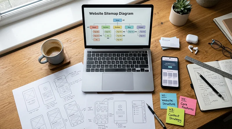
Heading structure and on-page hierarchy (H1-H3)
Think of headings as the page outline, not as styling.
If someone strips out the design, headings are what tell them what the page is about and how it is organised. Search engines read them in a similar way. Not as a ranking trick. More as a clue to structure and intent.
A simple rule that keeps you out of trouble: one clear H1 per page, then use H2s for the main sections, and H3s for the points inside those sections.
H1 is the page title. It should match the topic and intent of the page. A service page H1 wants to be the service, in plain terms. A case study H1 wants to be the project or outcome, again in plain terms. If the H1 is vague, everything underneath has to work harder.
H2 headings are the big steps in the story. They break the page into chunks that make sense when scanned. Think “What is this?”, “Who is it for?”, “How does it work?”, “Examples”, “FAQs”, “Next step”. The exact labels vary, but the job is the same.
H3 headings are for sub-points. They are useful when a section has multiple ideas that deserve their own signpost, like different deliverables, industries, or stages of a process.
Keep headings descriptive. Avoid cute or clever labels. “How we work” is fine. “The magic” is not. If a heading would make no sense in a browser tab, it is probably too vague for a heading as well.
Do not create multiple H1s just because it is convenient in a design system. Yes, some modern themes handle this in different ways, but as a website designer you want clarity. One H1 keeps the page topic unambiguous and avoids template oddities later.
Also avoid skipping heading levels for styling reasons. Going from H2 straight to H4 because the H3 “looks wrong” is a common mistake. Fix it in the style settings instead. Hierarchy is not decoration, it is meaning.
Consistency across templates matters more than people think. If all service pages follow the same heading pattern, Google and your users can compare them more easily. It also stops you forgetting key sections. The same goes for case studies: keep a repeatable set of H2s like “The brief”, “What we did”, “Results”, “Stack”, “Next project”, then add project-specific H3s where needed.
My judgement call: if you have to choose between a “clever” layout and a clear outline, pick the outline. You can still make it look good. Clear structure is the bit that keeps paying off, especially as the site grows.
Internal linking: navigation, context links, and ‘next steps’
Links guide people through the site and help search engines find what matters, so placement and wording count.
Internal links are the connections between your own pages. They shape how users move, and they also shape how search engines crawl and understand the site. You do not need to touch code to get this right, but you do need to design for it.
Start with the primary navigation. Keep it readable and stable. A small set of clear labels usually beats a crowded menu with lots of drop-downs. If the main nav changes on every page type, people lose their bearings and important pages get missed.
Avoid hiding key links behind icons with no labels. A burger menu can be fine on mobile, but important destinations still need plain text labels once the menu opens. If someone has to guess, they often will not click.
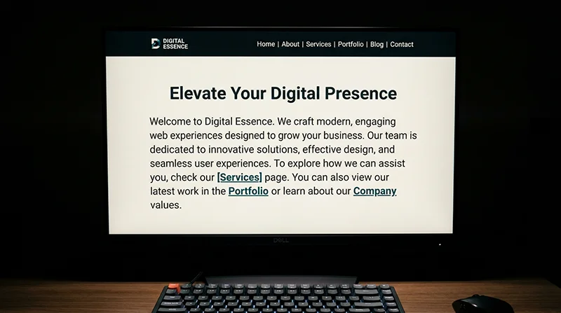
Contextual links inside the copy are often more useful than menus. They appear at the moment someone is thinking about a related topic, so the click makes sense. For example, on a service page you can link to a relevant case study right after you describe that part of the work.
Anchor text is the clickable words in a link. It should say what the page is about. “Website redesign case study” is helpful. “Click here” is not. Good anchor text helps users scan, and it gives search engines a clear clue about the destination.
Do not over-link every phrase. It looks messy, it is harder to read, and it dilutes attention. Link when it genuinely helps someone take the next step or understand a term. If you are adding links just to add links, stop.
Design obvious ‘next step’ paths. A common pattern that works well is service -> case study -> contact. On a service page, show a few related case studies with a short line explaining why they are relevant. On a case study, add a clear route back to the related service and a simple contact prompt for people who want something similar.
Avoid broken journeys. Important pages should be reachable in a few clicks from anywhere sensible, not buried behind layers of categories, sliders, and “more” buttons. If a page matters for the business, it should not require detective work to find it.
Skip the footer link dump that repeats everything. A footer is useful for secondary items like privacy, terms, and a short set of key pages. When the footer becomes a second sitemap, it tends to be ignored by users and it is a sign the main navigation and on-page links are not doing their job.
My judgement call: if you can only improve one thing, improve the on-page contextual links and “next steps” on your core pages. They usually do more for real users than adding another level to the main menu.

URLs, page naming, and avoiding duplicate routes
Decide the page names and URL pattern early, so a redesign does not turn into a messy clean-up later.
Designers shape SEO more than they realise here. Not by tweaking code, but by deciding what pages exist, what they are called, and how people move through them. If you leave URLs and naming until the end, you often end up renaming things in a rush, then wondering why traffic and enquiries wobble.
A good URL is readable and matches the site structure. If you have a services section, use a clear pattern like /services/service-name. It helps users understand where they are, and it makes the site easier to maintain as it grows.
Keep naming consistent. Choose singular or plural and stick to it. For example, decide whether the top level is /services or /service and do not mix both. The same goes for page titles and menu labels. Small inconsistencies create duplicated pages and confusing navigation, especially once you have several people working on the site.
Avoid overly long URLs stuffed with modifiers. You do not need /services/award-winning-affordable-bespoke-wordpress-web-design-london. Keep it tight. A short, specific name usually wins because it is easier to read, easier to share, and less likely to be edited again later.
Watch out for multiple pages competing for the same topic. This happens when you have, say, “Web Design”, “Website Design”, and “WordPress Web Design” as separate service pages, but they all say roughly the same thing. Search engines then have to guess which one matters, and people land on slightly different versions of the same pitch.
If the services are genuinely different, separate pages make sense. If they are not, combine them and use sections on one strong page. You can still mention related terms naturally in the copy without splitting everything into thin pages.
When you do restructure, plan redirects. A redirect is a signpost that sends old URLs to the new ones. You may not implement them yourself, but you should still provide a clear redirect list to whoever does. Old URL on the left, new URL on the right. No guessing.
What to avoid is renaming pages late with no redirect plan. That is how you end up with broken links, lost rankings, and “page not found” errors showing up in analytics and enquiries.
My judgement call: lock the URL structure before high-fidelity design starts. It is much easier to design clean navigation, headings, and internal linking when the page map and naming are stable, and it saves painful migration work later.
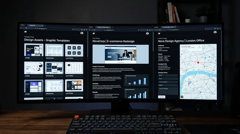
Template decisions that affect SEO: category pages, case studies, and location pages
These are the WordPress templates that quietly control what pages exist, how they read, and whether people can actually find useful content.
A lot of SEO problems start as template problems. Not keywords. Not code. It is usually that the site is generating pages nobody planned for, and the ones that matter have no structure.
In WordPress, an archive is a page that lists posts, like a category page or a blog index. These can rank and they can help users, but only if you treat them as real pages.
Design archives as landing pages, not dumping grounds
If your category pages are just a grid of cards with no context, they are weak for search and frustrating for humans. Give each archive a clear intro at the top. Two or three short paragraphs is enough. Say who it is for, what is included, and what to do next.
Where it makes sense, add filters that match real intent. For example, for a knowledge base you might filter by topic or by product area. For a blog, heavy filtering is often unnecessary and can create messy URLs, so keep it simple unless there is a clear need.
Aim for consistent snippets. Date, reading time (optional), and a plain summary help. So does a clear visual difference between guides, announcements, and case studies, if you publish more than one type of content.
Avoid endless tag and category archives that exist because someone ticked a box in the editor. If a tag does not have a purpose and a plan, do not use it. Or noindex it later, which means telling search engines not to index that page.
Case studies need a repeatable structure
Case studies often do the heavy lifting for service SEO because they show proof and detail. The mistake is making them pretty but vague. Use a structure that repeats across projects, so users can skim and search engines can understand what the page is about.
A strong case study template usually includes:
- Problem – what was broken, missing, or unclear before.
- Approach – what you did and why, in plain language.
- Outcome – what changed after launch (keep it honest and specific, even if it is qualitative).
- Relevant service links – link to the service page that matches the work, and any supporting page like maintenance, hosting, or SEO.
Those service links matter. They connect the evidence (case study) to the commercial intent (service page). Designers control this by deciding what modules appear in the template, and where they sit in the flow.
Also watch the heading structure. One clear H1, then logical H2s like “The brief”, “What we did”, “Results”, “Related services”. It makes the page easier to scan, and it reduces the chance the copy turns into one long wall of text.
Make supporting content easy to discover from services
Blog posts and guides rarely perform well when they live in a separate “Blog” island. People land on a service page and still have doubts. That is where supporting content helps, but only if it is visible.
Build a repeating component for service pages that surfaces relevant articles, FAQs, or case studies. Keep it curated. Automated “related posts” can be fine, but they often pick weak matches. A manual selection field is usually worth it for core services.
Do the reverse too. On guides, include a clear “Relevant services” block, or at least one contextual link in the copy. That is how informational traffic turns into enquiries without forcing it.
Location pages only when there is real local relevance
Location pages can work when you genuinely have something different to say for that area. For example, you have an office there, you regularly work with businesses in that city, or you offer something location-specific like on-site workshops.
What does not work is copying the same page twenty times and swapping place names. Thin location pages tend to look spammy, they do not help users, and they are a pain to maintain when services change.
If you do build a location page, it needs real content. Mention the type of clients you work with there, the practicalities (remote-first vs in-person), and link to relevant case studies where the location is genuinely connected.
My judgement call: if you are not sure you can write a location page that would still be useful without the city name, do not build it. Put the effort into one strong service page and better case studies instead.

Media choices: images, video, and performance trade-offs
Design decisions on media files can make a site feel sharp and trustworthy, or slow and frustrating, and that affects both SEO and conversions.
Designers often end up deciding what goes on the page and how heavy it is. That matters because page speed and usability influence how people behave. Search engines pay attention to that behaviour, but speed is not the only ranking factor. It is just one of the things that can quietly drag a good site down.
Start with intent. Use images that support the content, not just fill space. If an image does not add context, proof, or clarity, it is usually just weight. A well chosen screenshot, a real project photo, or a simple diagram often does more for trust than another generic office shot.
Alt text is simple when you treat it as accessibility first. Alt text is the short description screen readers use for images. Describe the image when it adds meaning, like a chart, a before-and-after, a product detail, or a photo that supports the point. If the image is decorative, skip it so assistive tech is not forced to read noise.
Avoid text baked into images for key messaging. Headings, value propositions, and calls to action should be real text in the page, not pixels. Real text scales better on mobile, can be translated, can be selected and searched, and is much easier for search engines and assistive tools to interpret.
Be cautious with heavy video backgrounds and sliders. They can look impressive in a mock-up, then feel sluggish on real devices and real connections. Sliders also tend to hide your best content behind an interaction many people never make. If you want movement, a single lightweight animation or a short, user-triggered video is often a better trade-off.
Design with performance in mind. That means fewer large assets, sensible dimensions, and predictable layouts. Do not upload a 5000px wide image to display it at 900px. Export close to the maximum display size, compress it properly, and be consistent with aspect ratios so the page does not jump around while loading.
My judgement call: if a media element is there mainly to decorate the fold, remove it and put the effort into one strong, relevant image and better copy. It usually reads cleaner, loads faster, and does a better job of guiding people to the next step.
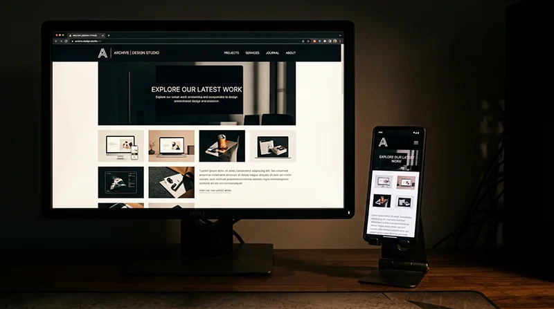
Mobile-first layout and interaction (without sacrificing content)
Mobile layouts often hide the very things people and search engines need, so the goal is to keep the meaning and pathways intact at every screen size.
Mobile-first should not mean content-light. It should mean readable, focused, and easy to move through. When a design collapses down, it is tempting to cut sections, remove internal links, or push important details into tabs. That often makes the page feel tidy, but it also makes it harder for a visitor to understand the offer and take the next step.
Start by deciding what the primary content is on each key page. On a service page, that is usually the main promise, who it is for, proof, what is included, and how to enquire. Make sure those sections are visible and reachable on mobile without hunting.
Keep primary links accessible too. If the desktop header shows five important pages, the mobile menu still needs to expose them clearly. Avoid a mobile nav that turns into a single “Menu” link with everything buried inside three levels of submenus. People do not explore that far, and important pages end up isolated.
Be careful with hiding critical sections behind multiple interactions. Accordions, tabs, and “read more” blocks are fine for secondary detail, but do not use them to hide the main explanation, pricing approach, service areas, case studies, or key FAQs. One interaction is acceptable. Two or three in a row is usually where you lose people.
A simple rule: if a section answers “should I trust you?” or “is this for me?”, it should not be locked behind a toggle. That content does the heavy lifting on both SEO and conversions.
Navigation needs to be touch-friendly and still purposeful. Touch-friendly means comfortable tap targets and enough spacing so people do not mis-tap. It also means avoiding hover-based behaviour for key content, because mobile does not have hover. If something only appears on hover on desktop, make sure it is visible or tappable on mobile without guesswork.
Keep headings consistent across breakpoints. The headings are the signposts of the page, for readers and for search engines. If the desktop version has clear H2 and H3 headings but the mobile version swaps them for styled text, or changes the order, the page becomes harder to scan and easier to misunderstand.
Reading order matters as well. When columns stack, check that the story still makes sense. For example, do not let a sidebar call to action appear before the actual explanation on mobile, unless that is a deliberate choice and the page still reads naturally.
A practical way to test this is to view the mobile page and scroll without using the menu. If you can understand what you do, who it is for, and what to do next, you are close. If the page feels like a teaser with missing steps, it will underperform.
My judgement call: I would rather ship a slightly longer mobile page with clear sections and internal links than a short, “clean” one that hides everything in accordions. Long pages are not the problem. Confusing pages are.

Trust and clarity signals designers can support
Good SEO is easier when people can quickly work out who you are, what you do, and why they should believe you
Search engines do not buy from you. People do. But the signals that help a person feel confident often overlap with the signals that help search systems understand a business.
This is a design job as much as a content job. You are reducing ambiguity. You are making proof easy to see. You are making it simple to take the next step without second guessing.
Start with clear business details. Put a real contact route in the header or footer, not hidden behind a form only. Include a phone number if the business actually answers calls, and a contact page with address details where relevant.
If the service area matters, say it plainly. “Based in London, serving the UK” is clearer than a vague “Worldwide”. You can still work internationally, but most visitors want to know whether you can help them, in their context, before they read further.
Do not skip the boring legal pages when they apply. Privacy policy and cookie information are expected in the UK, and terms can matter for service businesses. Even if nobody reads them end to end, their presence reduces friction for cautious buyers.
Then make trust elements visible, but not noisy. Testimonials work best when they are specific and attached to a real outcome, even if it is a small one. Case studies are even stronger because they show the situation, the approach, and the result in context.
Credentials can help too, but only if they are real and understood. If a badge needs a paragraph of explanation to mean anything, it is usually not pulling its weight. Avoid fake badges and invented awards entirely. They backfire fast.
For informational content like guides and articles, add author and company context where it makes sense. A short author line with role and relevant experience can be enough. It helps readers judge the advice, and it gives the page a clear source.
Branding and tone matter more than many people admit. If the site looks premium but the copy reads like a bargain listing, trust drops. If the design is playful but the service is high-stakes, the mismatch creates doubt. Keep the visual language aligned with what the business actually offers.
One practical warning: do not overload every page with trust blocks. Three different testimonial sliders, a wall of logos, and five “as seen in” strips can drown out the message. Place proof near moments of decision, like next to a call to action or after you explain the core offer, and let the page breathe.
My judgement call: I would rather show fewer, stronger trust signals in the right places than scatter weak ones everywhere. Clarity beats clutter, and it usually converts better too.

What to think about before build: a practical checklist for designers
A pre-build checklist that keeps design, content, and structure aligned, so SEO is not an afterthought
Most SEO problems I see in new sites are not “SEO issues”. They are planning issues. The design looked good, but the pages did not have clear jobs, the content arrived late, and the templates did not guide people through the site.
This is the part designers can influence heavily, without touching code. It is about deciding what exists, what it is for, and how a visitor moves from one step to the next.
1) Agree the page list and the purpose of each page
Start by writing down the pages you are actually building. Then add one plain-English purpose per page. Not features. A job.
Examples: “Service page – explain what’s included and get an enquiry”, “About – prove you’re credible and human”, “Case studies – show outcomes and reduce risk”, “Contact – give a clear route to reach you”.
If two pages have the same job, you probably only need one. That matters for SEO because search engines prefer clear, non-overlapping pages that each cover a topic properly.
2) Draft page outlines and heading hierarchy
Before design, sketch a rough outline for each key template. List the sections in order, and write a first-pass set of headings.
Heading hierarchy means H1, H2, H3 are used in a sensible structure, like an outline. The H1 is the page topic. H2s are the main sections. H3s support the H2 above them.
This helps SEO because it makes the topic and subtopics obvious. It also helps users who scan, which is most people.
Practical tip: aim for one clear H1 per page. If the hero area needs a big line of copy, make sure the actual page heading is still a real heading, not an image or a random styled paragraph.
3) Plan internal links and calls to action per template
Internal links are links between your own pages. They guide visitors, and they help search systems understand what pages matter and how topics relate.
For each template (service, location, case study, blog post), decide:
- What are the 2-3 most important next steps from this page?
- Where will those links sit in the layout?
- What will the link text say?
Try to avoid vague buttons everywhere like “Learn more”. Sometimes it is fine. Often it is not. “View pricing options” or “See our web design process” sets better expectations and usually gets better clicks.
Also check the flow. If a service page explains the offer but never links to relevant proof (case studies, testimonials, FAQs), you are making people hunt. That is bad for conversions and it can increase bounce, which is a sign the page did not meet expectations.
4) Decide what content you need from the client and when
Designing without real content is where many projects drift. You can create strong structure with placeholder copy, but you still need to plan the inputs.
Be specific about what you need, and put a date on it. For example:
- Service list and how each service is described in plain English
- Business details: address, service area, opening hours, phone number, company number (if applicable)
- Proof: testimonials, case study notes, before and after photos, certifications
- Brand assets: logo files, colours, fonts, photography style
- FAQs you know you answer on calls
If they cannot supply something, decide the fallback. Will you write it, simplify the page, or delay that section? Do not design a page that relies on six case studies if the client has none.
My judgement call: I would rather launch a smaller site with complete, accurate pages than a bigger site full of “coming soon” gaps. Thin pages rarely age well.
5) Flag performance risks early
Performance is part of SEO because slow pages frustrate users, and speed is a known ranking factor in some contexts. You do not need to code to influence it. You just need to design with it in mind.
Call out these risks before anyone falls in love with them:
- Heavy media: large background videos, lots of uncompressed images, autoplay sections
- Complex animations: scroll effects on every block, parallax layers, multi-step reveals
- Overloaded pages: too many sliders, galleries, or embedded widgets
- Third-party extras: chat popups, booking tools, map embeds on every page
A simple rule that holds up: use motion to support understanding, not to decorate. If the content reads fine without the effect, you probably do not need the effect.
If you handle these five areas before build, the site usually ends up clearer. For visitors, for search systems, and for the client who has to maintain it after launch.

Working with developers and SEO specialists without stepping on toes
Share clear rules, ask the right questions, and do a calm staging check before anything goes live
Good SEO outcomes usually come from good collaboration. Designers control structure and flow. Developers control how it is built. SEO specialists often cover measurement, migrations, and search-specific settings. If everyone knows what they own, work moves faster and there is less rework.
The easiest way to keep it friendly is to document decisions early, then ask a small set of sensible questions. Not to catch anyone out. Just to avoid avoidable mistakes.
What to document before build
Even if you are not coding, you can hand off a useful spec. Keep it short and specific. A one page doc per template is often enough.
- Templates: what blocks appear on each page type (home, service, case study, blog post, contact), and the order they appear in.
- Content rules: heading hierarchy (one H1 per page), how long intros should be, where key proof sits (logos, testimonials, FAQs), and what can be optional.
- Linking rules: what the primary calls to action are, where internal links should sit, and how link text should read (clear and specific).
- URL patterns: how pages should be structured. Example: /services/service-name/ or /case-studies/client-name/. Pick a pattern and stick to it.
That last point matters more than people think. Changing URLs later often means redirects, extra checks, and lost time.
Questions worth asking (without going deep into code)
These are basic alignment questions. They help you understand how the site will behave in search, and what needs verifying on staging.
- How are canonicals handled? A canonical is the preferred version of a page if there are duplicates or variations.
- What is the redirect plan? Especially if there is an old site, changed slugs, or a move from HTTP to HTTPS.
- How is indexation controlled? Indexation is whether search engines are allowed to list a page. Ask how they will handle noindex for thin utility pages like thank you pages, internal search, and test content.
- What is the structured data approach? Structured data is extra context for search engines, like organisation details or breadcrumbs. Keep it high level and template based, not hand-written per page unless there is a reason.
If you get vague answers, it does not mean there is a problem. It just means you should agree who is responsible for those settings before launch.
What to verify on staging
Staging is a private preview site used to test before launch. This is where designers can spot issues quickly because you know the intended layout and content flow.
- Headings: one clear H1, sensible H2s, no skipped levels just for styling.
- Navigation: main menu matches the agreed structure, and important pages are not buried.
- Internal links: key template links are present, link text makes sense, and there are no “click here” habits everywhere.
- Performance basics: pages load quickly on mobile, images are not obviously huge, and you are not stacking heavy sections back to back.
My judgement call: do this review with real content, even if it is not final. Placeholder text hides problems. Real words show where layouts break, where headings get messy, and where links are missing.
When to bring in SEO early
Some projects are simple brochure sites. Others have risks where early SEO input saves a lot of pain later.
- Complex migrations: changing domain, moving from another platform, merging sites, or removing lots of old pages.
- Multi-location businesses: multiple service areas, branches, or practitioners, where page structure and duplication need careful planning.
- International sites: multiple languages or countries, where URL structure and targeting decisions are hard to change later.
In those cases, a short planning session early on can set rules for URLs, templates, and content scope. It keeps design and build aligned, and it prevents last minute “SEO changes” that really mean rebuilding pages.
FAQ

Words from the web design experts
We often see designs that look tidy but get messy once real content lands, and the issue is nearly always the same. Before anything else, we check headings in order, because if the structure is unclear to a reader, it is usually unclear to search engines too.
If you have to choose between a clever layout and a clear content flow, choose clarity. Search visibility tends to hold up better when pages read well from top to bottom, links have obvious purpose, and the design supports the order people actually scan and decide in.
You might like these too
These sit in the same category as the one you are reading. They follow the same thread and offer a bit more depth. Have a look if you want to go further.