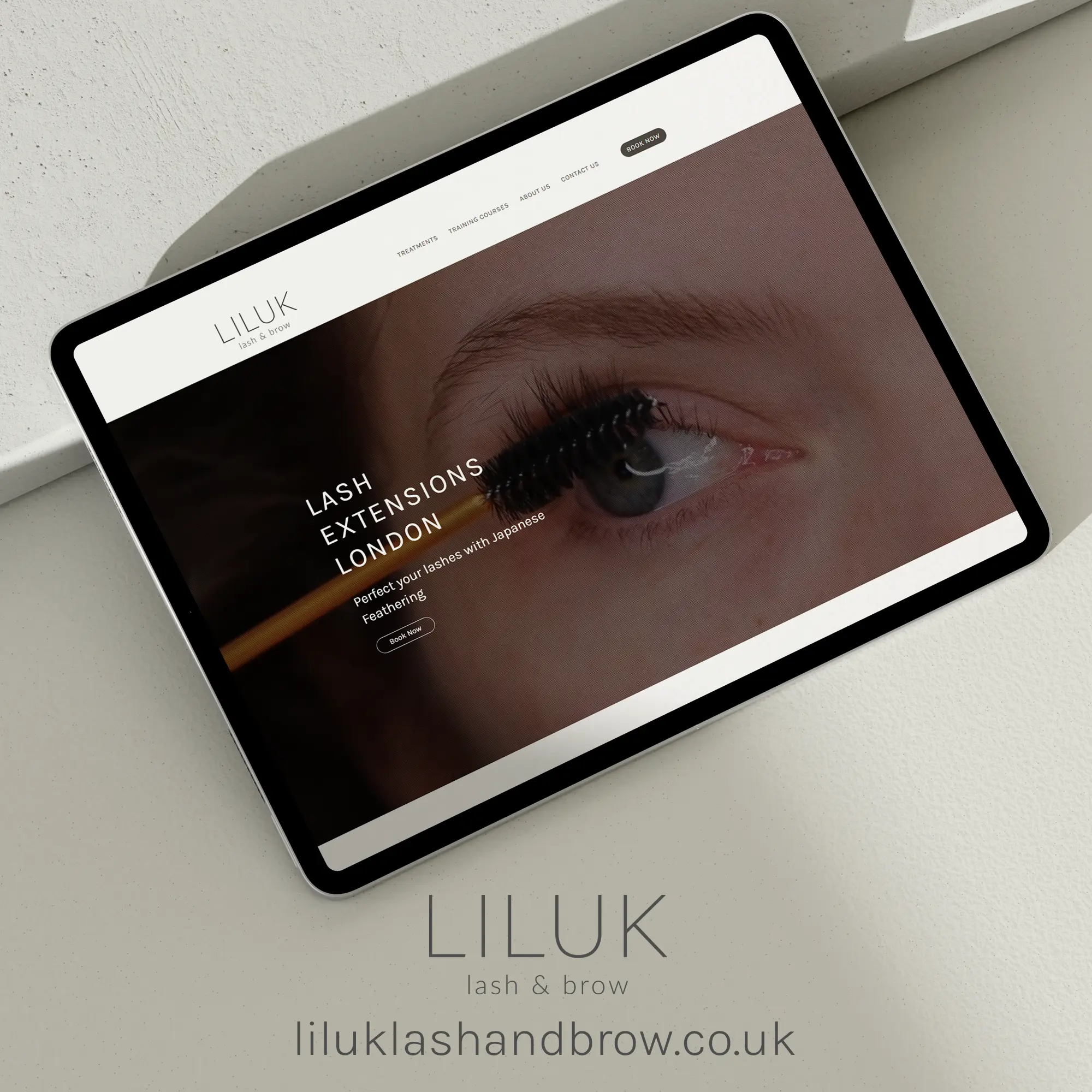
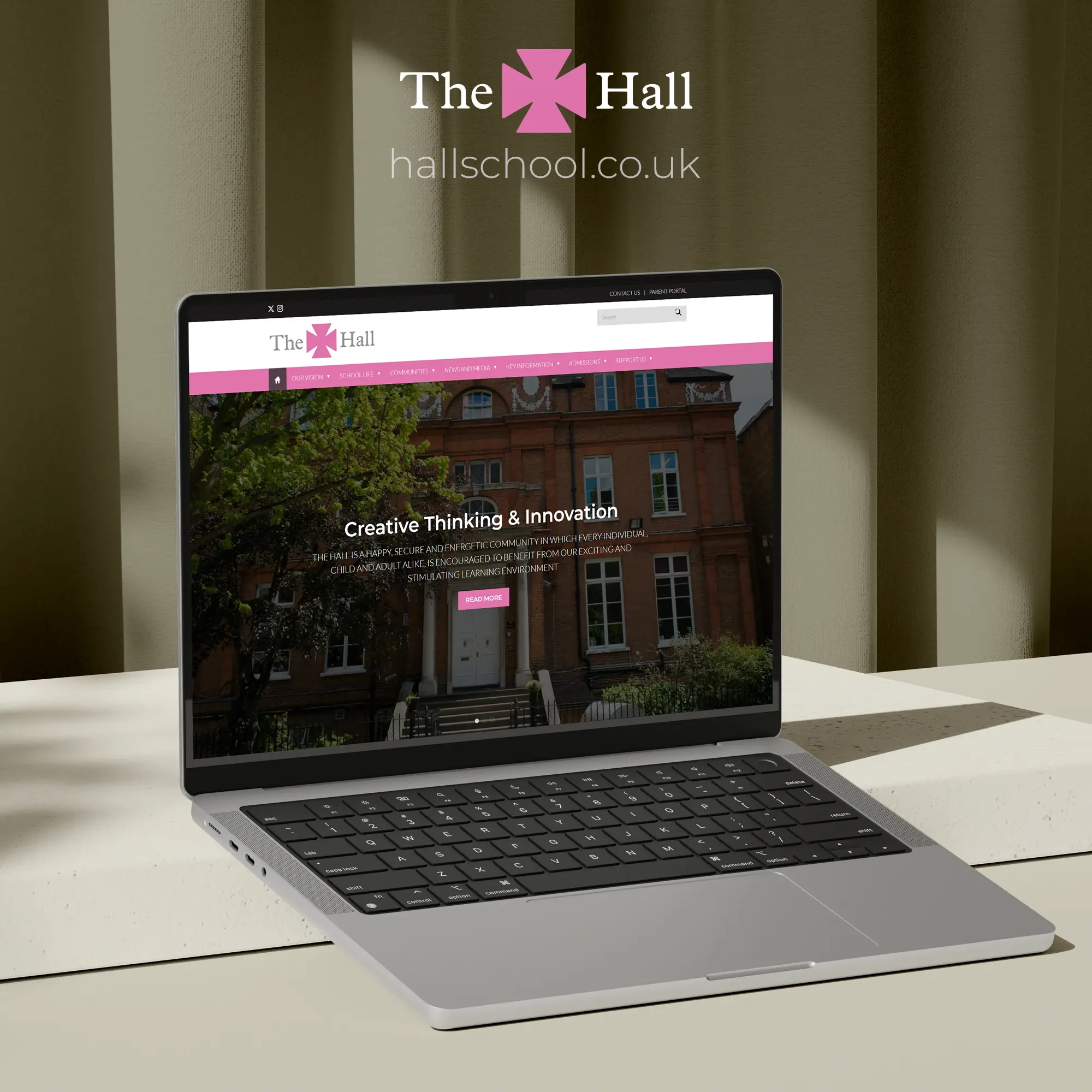
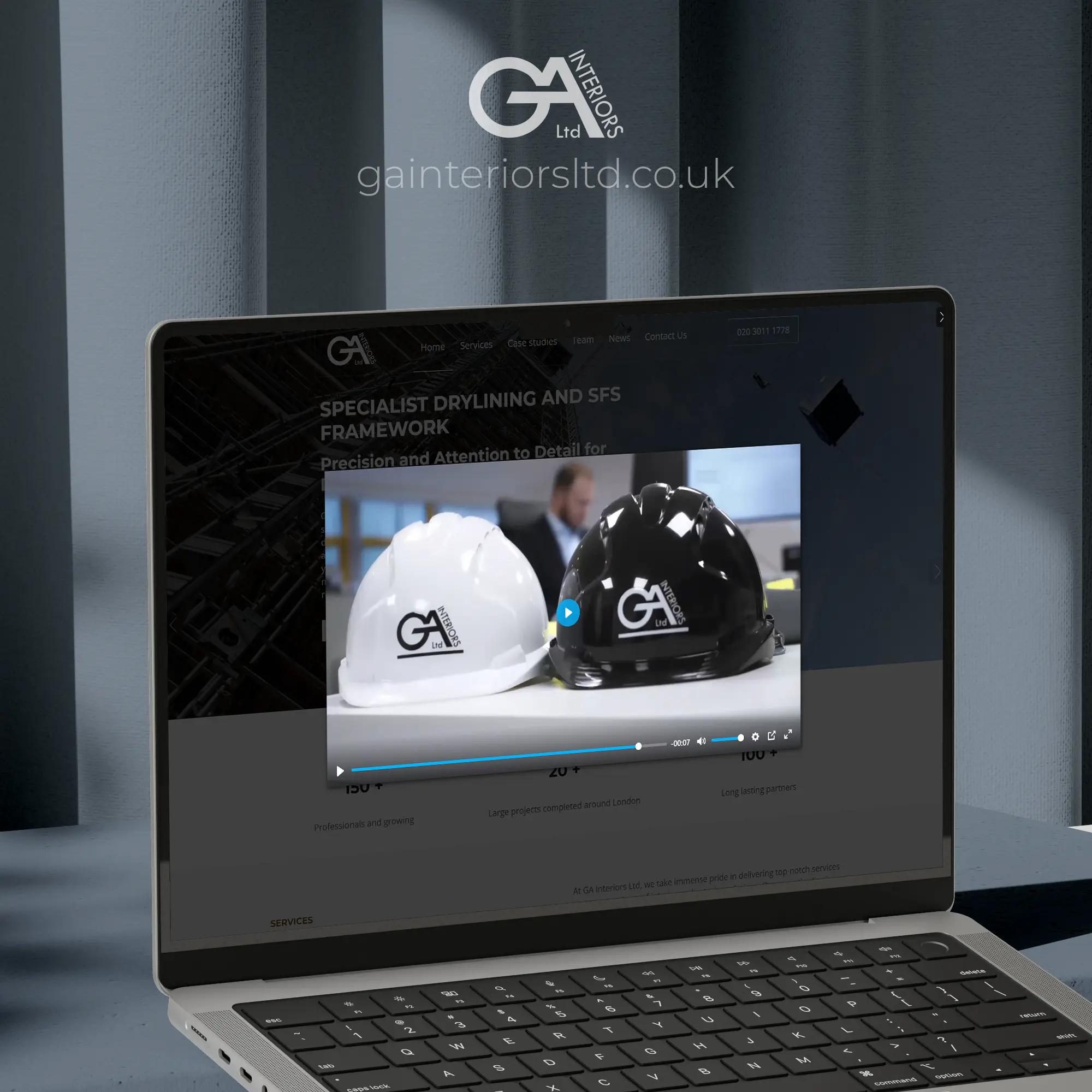
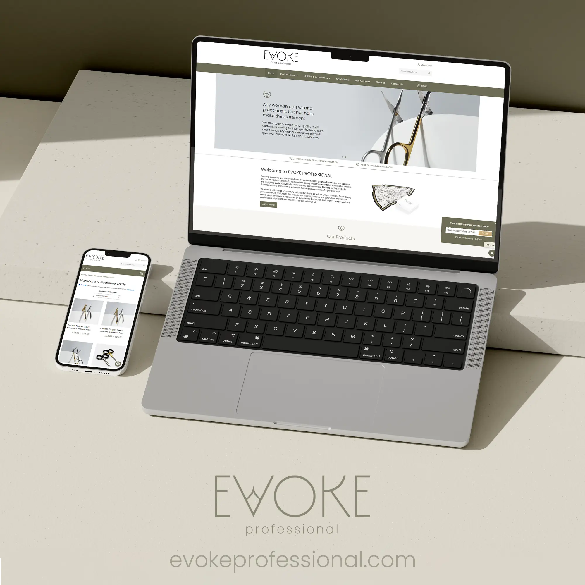
HOME / PROJECTS
Web Design Showcase
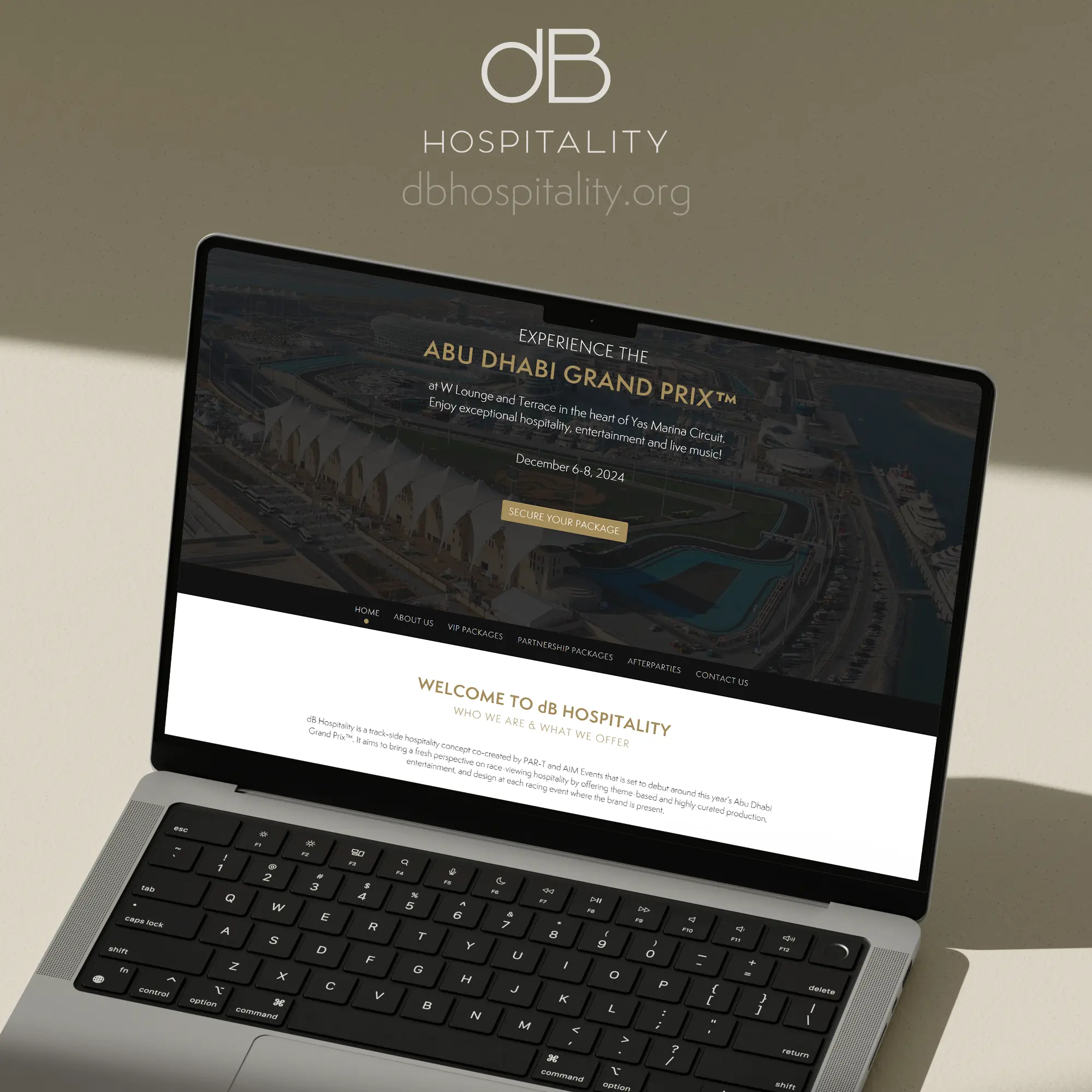
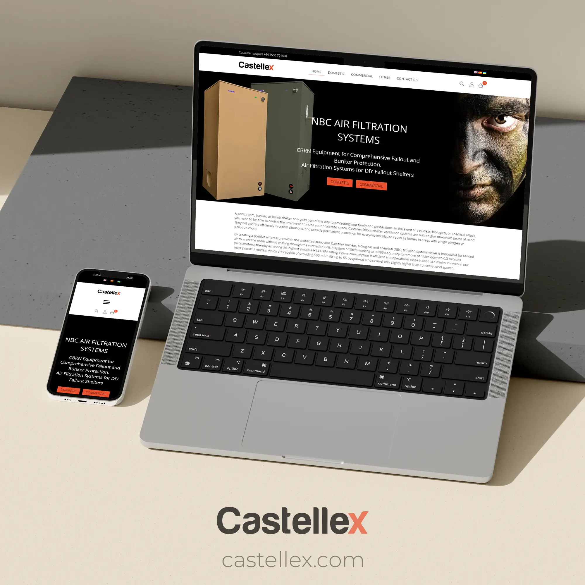
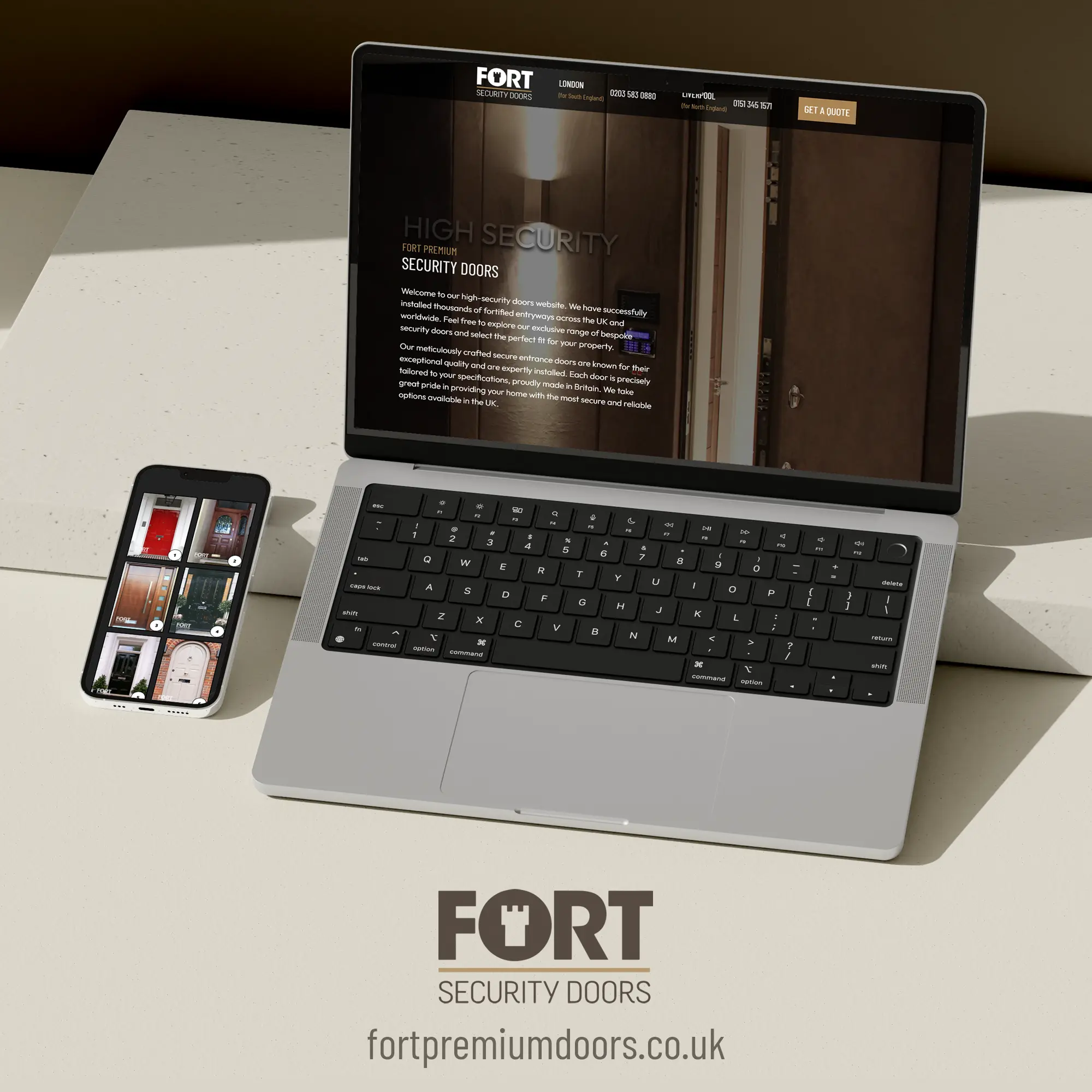
We design and build bespoke websites that load fast, look sharp and support daily business needs. Our team focuses on clear structures, clean code and layouts that help visitors understand your offer in seconds. This showcase page presents a mix of our recent builds. Each one is designed for smooth editing, strong visibility and long-term use.
OUR WORK