How Web Design Affects SEO – A Real Expert Guide

How Web Design Affects Seo A Real Expert Guide

This guide is not about keyword tricks, blog schedules, or chasing whatever Google update is trending this month. It is about the quieter, more reliable stuff – whether search engines can crawl your site, render it (load and interpret the page like a browser), understand what each page is for, and trust that it works well for real people. Web design sits right on that line. It shapes how your content is organised, how it loads, how it behaves on mobile, and whether the important information is easy to find and hard to misread.

We will look at the design choices that affect indexing and rankings without turning this into an SEO checklist. Things like information architecture (how pages are grouped), template structure, navigation, performance, rendering choices, accessibility, and basic technical hygiene. If you run a business, this is the stuff that keeps your site understandable and stable over time. It is also the part that is painful to fix later if you get it wrong at the design stage.

Good Web Design Design Decisions Create Clear Crawl Paths, Predictable Internal Links, And Pages That Can Be Rendered And Understood Without Guesswork

SEO starts with what your design makes possible

Good design decisions create clear crawl paths, predictable internal links, and pages that can be rendered and understood without guesswork.

Search engines do not rank your site because it looks modern. They depend on structure. That means consistent headings, clear page purpose, sensible navigation, and HTML that describes what things are. The visual layer matters for users, but Googlebot is not impressed by spacing and colour. It is trying to fetch pages, read them, and work out how they relate.

This is why design choices turn into technical outcomes. A layout is not just a layout. It is a template, a set of components, and a pattern for how content is placed on the page. If those patterns are messy, your site becomes harder to crawl and easier to misunderstand.

There is also a big difference between content existing and being discoverable. A page can be published and still effectively invisible if nothing links to it, if it sits behind awkward filters, or if it is only reachable through a search box. Discoverable means a crawler can reach it by following links, and can see enough context to understand why it exists.

Crawl path is the route a search engine takes through your site by following links. Your design controls that route more than most people realise. Navigation, related links, category pages, service listings, and footer links all create paths. If your navigation is shallow and clear, the crawler does less work. If it is buried inside drop-downs, sliders, or heavy scripts, you are relying on the crawler to do extra rendering and extra interpretation.

Renderability is another quiet one. Rendering means loading and interpreting the page like a browser would. Most modern sites use JavaScript, and that is fine, but some designs lean on it for basic content. When the main text, headings, or internal links only appear after scripts run, you add uncertainty. Sometimes it still works. Sometimes it delays or breaks what the crawler can see, especially on large sites.

Templates and components can help here, or they can make things worse. A well-built WordPress setup uses a small set of templates that enforce consistency. Your service pages share the same structure. Your case studies share the same structure. Headings stay in order. The main content is not pushed below three hero sections and a carousel. Over time, that consistency makes the site easier to maintain, and easier for search engines to interpret.

The opposite is when every page is designed as a one-off. Different heading styles, different layouts, different blocks used for the same job. It looks flexible, but it usually creates thin internal linking, repeated sections that do not say much, and pages where the important information moves around. That is harder to crawl, harder to summarise, and harder to trust.

Practical advice: decide early what your core page types are, then design web templates for those. For most service businesses, that is usually service pages, location pages (if relevant), case studies, and articles. Give each template a clear place for the main heading, supporting sections, and internal links to related pages. Keep your navigation simple and predictable.

One judgement call from experience: I would rather ship a slightly plainer template that is consistent and fast than a more “creative” one that depends on complex interactions to reveal basic content. You can still make it feel premium. Just do it with good typography, spacing, and hierarchy, not with fragile mechanics.

A Clear Website Structure Helps Search Engines Reach Your Important Pages Quickly And Understand What You Do Without Guessing

Information architecture: making pages easy to find and hard to duplicate

A clear site structure helps search engines reach your important pages quickly and understand what you do without guessing.

Information architecture is just the way your pages are organised, named, and linked. It affects crawl efficiency (how much of your site a search engine can get through) and topical clarity (what your site appears to be about).

Most service businesses do best with a simple hierarchy. Think in three main groups: services, locations (only where you genuinely operate and can describe your work), and resources like articles or guides. When those groups are clear, both people and crawlers stop wandering.

A practical structure might look like this:

  • Services – one page per real service line, with supporting subpages only when they add something distinct
  • Locations – a small set of pages that explain coverage, process, and examples relevant to that area
  • Resources – articles that answer common questions and link back to the relevant services

That hierarchy should show up in your navigation. Not every page needs to be in the main menu, but every important page should be reachable through normal links. An orphan page is a page with no internal links pointing to it, so crawlers and users can struggle to find it.

To avoid orphans, design internal linking into the templates, not as an afterthought. Service pages should link to related services, relevant case studies, and a couple of useful resources. Articles should link to the most relevant service page when it genuinely helps the reader. Case studies should link back to the service used and, if appropriate, the location served.

URL structure matters here as well. A URL is the page address, like /services/wordpress-development/. Keep it stable and meaningful. If you change URLs often, you create extra redirects and more chances for search engines to waste time on old paths or miss updated ones.

A good rule is to use folders that reflect your hierarchy. For example, keep service pages under /services/, resources under /resources/ or /insights/, and case studies under /work/ or /case-studies/. Do not over-optimise it. The main win is consistency, not cleverness.

The harder part is handling similar pages without creating near-duplicates. Near-duplicate pages are pages that are mostly the same, with only minor changes. They can dilute internal linking, confuse relevance, and make the site feel bloated.

This often shows up with locations. It is tempting to spin up lots of near-identical location pages. In practice, it usually adds little value unless you have something specific to say about that area. If your process, pricing approach, and examples are the same everywhere, you are better off with one strong service page and a smaller set of location pages that are genuinely different.

Ways to keep similar pages distinct without inflating the site:

  • Write location pages around real delivery details – meeting options, response times, typical project types, and relevant case studies
  • Use one strong core service page, then add subpages only where the service meaningfully changes (for example, “WordPress support” versus “WordPress build”)
  • If two pages would share most sections, merge them and use clearer headings on a single page instead

Sometimes you do need similar pages, like separate services that share a process. In that case, make the differences explicit early on. Change the structure, not just a few nouns. Different FAQs, different examples, different deliverables, and different internal links based on what the page is actually for.

My judgement call: I would rather have fewer, stronger pages with obvious roles than a large site full of slight variations. It is easier to maintain, it is easier to navigate, and it usually produces cleaner signals for crawling and ranking.

Menus, Breadcrumbs, And In Page Links Help Search Engines Find Pages And Understand How They Relate

Navigation and internal linking: giving crawlers a reliable map

Menus, breadcrumbs, and in-page links help search engines find pages and understand how they relate

Search engines crawl your site by following links. If your navigation is messy, or important pages are only reachable through odd routes, you make their job harder. You also make it harder for real people to move around, which tends to show up in weaker engagement and fewer enquiries.

Good internal linking is not about tricks. It is about being consistent and obvious. If a page matters to your business, it should be linked in a way that feels natural from the pages people actually land on.

Primary navigation that matches real user intent

Your main menu should reflect what visitors are trying to do. For most service businesses, that means a small set of clear options like Services, Work (or Case studies), About, Resources, and Contact. If you serve specific areas, Locations can make sense too, but only if the pages are genuinely useful.

Avoid mega menus stuffed with every page. They do not just overwhelm users. They can also dilute attention by flattening your structure, so everything looks equally important. Better is a tight primary menu, with secondary links inside the relevant sections and templates.

Practical check: can a new visitor get from the homepage to your main service page in one click? Can they get to a proof page like a case study in two clicks? If not, you are probably hiding the pages that do the persuading.

Breadcrumbs for hierarchy and internal linking support

Breadcrumbs are the small trail of links, usually near the top of a page, like Home > Services > WordPress development. They give users an easy way back up the structure, and they give crawlers extra internal links that confirm where the page sits.

They work best when your site hierarchy is real, not invented. If everything is thrown into one level, breadcrumbs add little. If your pages are grouped sensibly, breadcrumbs reinforce that structure without adding clutter.

One note: breadcrumbs should be links, not just text. And they should reflect the actual parent pages you want to strengthen, not a random category system that no-one uses.

Contextual links within copy, not just menus

Menus are not enough on their own. The strongest internal links are often in the body copy, because they are placed right where the question comes up. That is what I mean by contextual links.

For example, if a service page mentions ongoing maintenance, link to your support service page. If a resource article discusses site speed, link to the relevant performance section of your build service, or to a case study that shows the result. Keep it honest. Link when it genuinely helps the reader take the next step.

Avoid hidden links or manipulative patterns like stuffing lists of keyword-heavy links into paragraphs that do not need them. It reads badly, and it creates a site that feels engineered rather than useful.

My judgement call: I would rather add three well-placed links inside a page than twenty links in a sidebar nobody reads. The first approach supports understanding. The second usually becomes noise.

Footer links: when they help and when they become noise

Footer links can be useful for utilities and reassurance. Things like Contact details, Privacy policy, Accessibility statement, and a short list of key services are sensible. If you work internationally, a link to a Locations overview can work too.

Where footers go wrong is when they turn into a second sitemap, crammed with every service variation and every location. At that point, most users ignore it, and crawlers get yet another set of weak, repetitive links. You are better off keeping the footer curated and letting section pages and internal content do the discovery work.

If you want one simple rule: your navigation should help a person who is in a hurry. If it does that, crawlers usually get a clearer map as well.

Your Website Layout Should Make It Clear What The Page Is Really About, Both To Google And To A Busy Reader

Page templates and content layout: keeping the main content obvious

Your layout should make it clear what the page is really about, both to Google and to a busy reader.

Good website design is not just about how a page looks. It changes what a crawler can find quickly, what it treats as the primary content, and how easily a person can scan and trust what they are reading.

In practice, most SEO problems I see on otherwise decent sites come down to two things. The main content is buried. Or the heading structure is a mess because design decisions overruled structure.

One clear H1 per page, then headings that match the content

Every page should have one H1 that says, plainly, what the page is. That is usually your page title. From there, use H2s for the main sections and H3s for subsections. Keep it logical.

A simple way to sanity check this is to read only the headings in order. If they tell a coherent story, you are in good shape. If they feel like a random set of slogans, the structure is probably not helping anyone.

Avoid using heading levels just to get a certain font size. It is tempting, especially when a template looks better with a bigger line. But it breaks the outline of the page and makes it harder for machines and humans to understand what matters.

If you need a big visual line, style a paragraph or use a custom class in your theme. Keep headings for headings.

Keep the primary content high in the DOM where you can

The DOM is the order the page is written in the code. It is not always the same as what you see on screen, especially with modern layouts.

As a rule, put your core content early. That means the H1, a short intro that confirms the topic, and the first meaningful section of copy should appear before lots of sidebars, related posts blocks, or heavy interactive elements.

This helps crawling and indexing because the important content is discovered quickly. It also helps users because they get reassurance fast that they are in the right place.

Do not let sliders, tabs, and clutter drown the point

Some layouts look impressive but hide the substance. The usual culprits are big hero sections, sliders, tabbed content, and pages that start with three rows of badges, animations, and calls to action before saying anything specific.

Sliders and carousels are not a good default hero solution. They often push the real message down the page, add weight, and split attention. If you truly have one strong message, put it in a single hero with one clear next step.

Tabs can be fine for secondary detail, like pricing inclusions or technical specs, but they should not be the only place your key content lives. If the main sales points and the main explanation are hidden behind interactions, many users will not see them.

My judgement call: if the top of the page does not clearly answer “what is this, who is it for, and what happens next” within a few seconds of scrolling, the layout is getting in the way.

Use consistent templates for services, case studies, and articles

Templates are not about making every page identical. They are about making pages predictable, so users can scan and so search systems can reliably interpret what each section means.

For service pages, I prefer a steady structure. Clear summary near the top, what you deliver, who it is for, how the process works, proof (case studies or examples), then the next step. It reduces bounce because the reader can find the bit they care about without hunting.

For case studies, keep the narrative consistent. What the client needed, what you did, and what changed. Add specifics that are true and useful, not vague before and after claims. If you do not have numbers, do not invent them. Explain outcomes in plain terms instead.

For articles, make the reading experience calm. Strong headings, short paragraphs, and a layout that prioritises the article body over distractions. Related content is fine, but it should not compete with the reason the page exists.

When templates are consistent, you also avoid accidental SEO issues. Like missing H1s on some pages, repeated blocks that take over the top of every URL, or “clever” layouts that look good in design review but confuse the content hierarchy.

If you keep the main content obvious, early, and well structured, you usually get two benefits at once. Google can understand the page faster, and real people are more likely to read it and take action.

Rendering matters: JavaScript, WordPress builders, and what Google actually sees

Heavy front end code can hide or scramble your content, even when the page looks fine to you

A page can look perfect in your browser and still be awkward for search engines to process. The difference often comes down to how the content is rendered.

Server-rendered HTML means the main content is already in the page source when it arrives from the server. Client-side rendering means the browser runs JavaScript after load to inject or build parts of the page.

Google can handle JavaScript, but it is not the same as reading plain HTML. It can take longer, it can fail in edge cases, and it adds another layer where things can go wrong. That is the practical risk. Not that JavaScript is “bad”, but that your core content becomes dependent on it.

For most business sites, you want the important stuff to be server-rendered. Headline, introductory copy, primary service information, and internal links should not rely on a script running successfully.

This is where some WordPress page builders can cause trouble. Not because they are inherently wrong, but because they often output more complexity than you expect.

  • Bloated markup – lots of extra HTML wrappers, repeated elements, and non-semantic divs that add weight and noise.
  • Deeply nested containers – content ends up buried under multiple layout layers, which can make the structure harder to interpret and harder to maintain.
  • Unpredictable heading order – you see a “big title” visually, but in the code it might be a div styled to look like a heading, or headings might skip levels (H2 to H4) because of how blocks are stacked.

None of those points is a ranking factor on its own in a simple, direct way. But they all affect clarity. Clarity is what helps crawling and indexing, and it also helps users who skim and scan.

JavaScript is usually fine when it is used for progressive enhancement. That means the page works without it, then JavaScript improves the experience. Things like an accordion for FAQs, a filter on a list, a map embed, or a “load more” button can be fine if the core content is still present in the HTML.

It becomes a risk when JavaScript is required to reveal the main copy, generate internal links, or load key sections that explain what the page is about. If the script fails, or loads slowly, or is blocked, the page can effectively become thin content from a crawler’s point of view.

There are two simple checks I use when reviewing a page.

  1. View source (the raw HTML sent by the server). Look for your H1 and the first meaningful paragraphs. If they are not there, the page is likely relying on client-side rendering.
  2. Inspect the DOM (what the browser built after scripts ran). If the DOM looks nothing like the source, or headings appear in a strange order, you are looking at a page that is heavily modified after load.

What that tells you is simple. If the source already contains a clean content structure, Google has an easier job. If the source is mostly scaffolding and your real content appears only after rendering, you have added complexity for no clear gain.

My judgement call: for service pages and landing pages, I avoid designs where the main content is injected after load. You can still use JavaScript for interaction, but the page should stand on its own without it. It is a calmer, more dependable setup over the long term.

Performance and Core Web Vitals: design choices that make sites slow

Good-looking pages can still be heavy, and that extra weight can delay what Google and users see first

Performance is not just “nice to have”. It affects crawling efficiency, user behaviour, and how reliably your pages render on real devices. Core Web Vitals are Google’s set of user experience measures. In plain terms, they focus on how quickly the main content appears, how responsive the page feels, and whether the layout jumps around while loading.

The design choices that hurt performance are usually the ones that add the most bytes, the most requests, or the most late-loading changes. The good news is that you can often keep the same look, but build it in a calmer way.

Images: the biggest wins, and the most common mistakes

Images are often the largest files on a page. They also tend to sit at the top, which means they can directly affect LCP (Largest Contentful Paint). LCP is the time it takes for the main visible element, often a hero image or headline area, to appear.

Three practical rules I stick to:

  • Always set image dimensions (width and height). This helps the browser reserve space so the layout does not shift while the image loads. That shift is CLS (Cumulative Layout Shift).
  • Use modern formats where sensible. WebP is widely supported. AVIF can be even smaller, but you need a solid fallback plan. In WordPress, the right setup usually comes from your image pipeline and how you output images, not from a plugin that “optimises everything” with unknown side effects.
  • Lazy load below-the-fold images, but do it properly. Lazy loading means off-screen images load later, when the user scrolls. Do not lazy load the main hero image or anything that is clearly part of the first screen, because it can slow LCP instead of helping.

One small judgement call: if a hero image is decorative and not doing real work, I often remove it or reduce it. A clean headline, a short intro, and a smaller supporting image usually loads faster and converts better anyway.

Fonts: small design choices that create big delays

Custom fonts can improve a brand feel. They can also add multiple extra files that must load before text looks “right”. That can delay the first meaningful paint, and it can cause visible swapping or shifting when the font finally arrives.

What tends to work well:

  • Limit weights. Many sites load 6 or 8 weights without noticing. Most business sites can get away with 2 weights, sometimes 3.
  • Consider system fonts for body text. A system stack loads instantly because it uses fonts already on the device. You can still use a custom font for headings if you want a distinct look without paying the full cost across the whole page.
  • Preload carefully. Preloading tells the browser “this file is important, fetch it early”. Done well, it helps. Done badly, it steals bandwidth from more important resources like the main CSS or the hero image. Preload only the fonts you know are used above the fold.

If you are not sure, the safe approach is fewer font files and fewer weights. It is rarely worth trading responsiveness for a slightly different bold.

Third-party scripts: where performance goes to die

Most slow sites I audit are not slow because of WordPress itself. They are slow because of third-party scripts. Tracking tags, chat widgets, booking tools, marketing popups, and embedded video players can all add heavy JavaScript, extra network calls, and work on the main thread. INP (Interaction to Next Paint) is the Core Web Vital that reflects how responsive the page feels when someone clicks or types.

The trade-off is real. Analytics and ads can be valuable. Live chat might help sales. But each script competes with your content for attention and resources.

  • Tracking: keep it minimal. One analytics platform is usually enough. Be cautious about piling on extra “insight” tools that duplicate what you already measure.
  • Chat widgets: many load early and stay active on every page. If you need chat, consider loading it after a short delay, or only on key pages, or behind a click.
  • Video embeds: a standard embed can load a lot of code even before anyone presses play. If the video is not essential above the fold, use a lightweight preview image and load the player only when clicked.

From an SEO point of view, the risk is not “Google penalises you for having scripts”. The risk is that users get a sluggish page, bounce, or never reach the content because it keeps moving and loading. That behaviour feeds back into performance and engagement signals, and it makes your site feel less trustworthy.

Design habits that quietly damage LCP, INP, and CLS

Some patterns look modern, but they carry predictable costs:

  • Oversized hero sections. Full-screen images or videos are a common LCP killer. If you want impact, focus on copy and spacing first, then add imagery that is sized for the job.
  • Animated layouts. Animation is fine when it is subtle and does not affect layout. It becomes a problem when elements slide in and push content down, or when large sections animate in late. That can create CLS and it can feel jittery.
  • Late-loading banners (cookie bars, promo strips, “book a call” ribbons). If they appear after the page is visible and they push content, they cause layout shift. Reserve space for them, or overlay them without moving the page.
  • Too much happening on first load. Carousels, counters, scrolling effects, and big libraries can make the page unresponsive. That is where INP gets worse, even if the site “looks loaded”.

If you want a simple way to think about it, prioritise stability. Make sure the first screen loads fast, stays put, and responds instantly. Then enhance the page after that. That approach usually gives you the best balance between design and long-term search visibility.

Mobile-first web design: it is not just responsive, it is prioritisation

On a phone, what you hide or move changes what gets read, clicked, and crawled first

People often say “it’s responsive” as if that settles it. Responsive just means the layout rearranges itself to fit the screen. Mobile-friendly is stricter. It is about what the mobile version actually shows, and what it makes easy to use.

From an SEO point of view, the big risk is not that Google “can’t see” mobile pages. It is that the mobile layout quietly demotes important content and links. A desktop page might show your key services, proof, and internal links straight away. On mobile those same items often end up lower down, behind accordions, or removed to keep things “clean”. That changes how users move through the site, and it can change how search engines understand page relationships.

Keep the essentials consistent between desktop and mobile. That means the same core service copy, the same trust signals that matter (reviews, accreditations, case studies if you have them), and the same internal links that help people go deeper. It is fine to shorten supporting text on mobile, but be careful about stripping out the parts that explain what you do and who it is for.

Be wary of “collapsed” content. Tabs and accordions have their place, especially for long FAQs or technical specs. But hiding the main value proposition, pricing approach, service areas, or primary calls to action behind a tap usually reduces engagement. It also reduces the chance that a visitor will spot the next relevant page to click. My rule of thumb: collapse details, not meaning.

Internal linking is part of design, not just SEO. On mobile, your navigation often becomes a hamburger menu and your sidebar disappears. If your only useful internal links live in the desktop header or sidebar, mobile users will miss them. Bring key links into the body where they make sense. A short “Related services” block under a section, or a clear next-step link after explaining a service, tends to work better than hoping people open the menu.

Tap targets, spacing, and readable typography are indirect SEO support. They affect whether people can use the site without friction. If buttons are too small, links are too close together, or text is cramped, people mis-tap, get annoyed, and leave. Search engines do not reward “nice fonts”. They do care about sites that are usable and satisfy intent, because that shows up in behaviour.

Practical checks that make a difference:

  • Make primary buttons easy to hit with a thumb. Leave space around them.
  • Keep body text comfortably readable without zooming. If in doubt, slightly larger beats slightly prettier.
  • Do not stack multiple competing buttons above the fold on mobile. Pick one main action.
  • Ensure link styling is obvious. Mobile users scan fast and do not hunt.

Finally, test on real devices. Browser resizing is useful, but it lies in small ways. Real phones have different font rendering, real scroll behaviour, and real touch input. Test at least one iPhone and one Android device if you can, even if it is just borrowing a colleague’s for ten minutes. Check the pages you care about most: home, service pages, pricing or enquiry, and any high-traffic blog or guide pages.

If you only take one thing from this section, make it this: mobile design is prioritisation. Decide what matters, show it clearly, and make it easy to click. The rest can follow.

Accessibility and semantics: search engines like clarity too

When your pages are easy to use with assistive tech, they are usually easier for crawlers to interpret as well

Accessibility is not a “nice to have”. It is part of building a site that works, and it tends to push you towards cleaner structure. Clean structure helps search engines because it reduces guesswork about what a page is, what matters most, and how sections relate to each other.

A quick term: semantic HTML means using the right element for the job, so meaning is baked into the page, not implied by styling.

Start with headings. Use one clear H1 for the page topic, then H2 for main sections, then H3 for sub-sections. Do not pick headings based on size. That is what CSS is for. A page full of random heading levels forces screen readers and crawlers to infer structure from context, which is slower and sometimes wrong.

Lists and tables are the same story. If you have steps, use an ordered list. If you have a set of related points, use a bulleted list. And only use tables for data that is actually tabular, like a comparison of features or opening hours by day. Do not use tables to “line things up”. It looks fine, but it is messy for accessibility, and it makes machine parsing harder than it needs to be.

Images need the same discipline. Add alt text for informative images that carry meaning, like a diagram, a labelled screenshot, or a photo that shows the product in use. Keep it plain and specific, as if you are describing it to someone on the phone. Do not stuff it with keywords. If the image is purely decorative, leave alt empty so screen readers can skip it. Decorative flourishes do not need a verbal description.

Forms are a common weak spot, especially on brochure sites. Every input needs a proper label, not just placeholder text. Placeholders disappear as soon as you type, and they are not a reliable label for assistive tech. Also make sure error messages are clear and tied to the field that needs fixing. “Something went wrong” wastes time for users and gives you unclear signals in analytics when people abandon forms.

Navigation landmarks matter too. Landmarks are signposts in the code, like header, main content, and footer. They help screen reader users jump around quickly. They also help crawlers and other machines understand where the primary content lives, versus repeated elements like menus and footers. If everything is just a pile of generic containers, you create ambiguity.

This is the key SEO link: accessibility improvements often reduce ambiguity. When a page has a logical heading outline, meaningful links, proper labels, and clear content regions, it becomes easier for machines to extract meaning. That supports better indexing and more accurate understanding of what each page is about and how it connects to the rest of the site.

One judgement call I make on most projects: I would rather simplify a layout than keep a clever interaction that hides content or breaks keyboard navigation. If a feature is hard to use without a mouse, it is often hard to crawl and understand too. Keep the structure boring and dependable, then make it look good with design, not tricks.

Indexation control built into the design system

Decide which pages deserve to exist, because WordPress will happily generate hundreds you did not plan.

Most SEO problems I see on WordPress sites are not about “keywords”. They are about volume and mess. A site ends up with lots of URLs that look like pages, but add little value. Google still has to crawl them, decide what they are, and work out which version is the main one.

This is where design systems help. Not visual design. The system of templates, components, and content rules that decides what gets published and how it links together.

Indexing just means a page is stored in a search engine’s database. Crawling is the process of fetching pages to see what is there. You want crawling focused on your useful pages, not the stuff WordPress generates by default.

Avoid indexing low-value pages (without going overboard)

There are a few common culprits that are rarely useful as landing pages for a business site.

  • Internal search results (like ?s=term). These are thin by nature and can explode into near-infinite combinations. In most cases they should not be indexable.
  • Thin tag archives. Tags can be fine when they are curated and genuinely help people browse a library of content. But on many sites they become a pile of one-post pages. That is clutter.
  • Attachment pages. WordPress can create a page for every uploaded image. Sometimes that page is useless and competes with the real content. Sometimes it is fine if you have a reason for it, like a media library that needs its own context. It depends.

My judgement call on most service business sites: keep categories, be strict with tags, and turn off or redirect attachment pages unless there is a clear content need. It reduces noise fast and it makes the content model easier for everyone to work with.

Pagination and faceted navigation: avoid crawl traps

Pagination is normal. Page 2, page 3, and so on. Faceted navigation is filtering, like “Location: London” plus “Service: Plumbing” plus “Open now”. Filters are useful for users, but they can generate huge numbers of URL combinations.

Design choices can prevent this becoming a crawl trap. If you are building filters, decide which combinations are real pages and which are just a temporary view. Real pages should have stable URLs, unique content, and a place in navigation. Temporary views should not produce indexable URLs, and they should not be linked across the site in a way that multiplies endlessly.

For blogs and basic listings, keep pagination sensible and avoid “load more” patterns that hide content behind scripts. A crawler can struggle to reach items if the next batch only appears after a button click. If you want that UI, it is still worth keeping normal paginated URLs underneath.

Canonical basics and duplicates caused by templates

A canonical URL is the “main version” of a page you want search engines to treat as the original. It is a simple hint, but it matters when duplicates exist.

Duplicates happen on WordPress more often than people expect. Not because of anything shady, but because templates can publish the same content in multiple places.

  • A post appears on the blog page, a category page, a tag page, and an author page.
  • A service description is reused across several location pages with only minor changes.
  • Query parameters create multiple URLs that show the same list in a different order.

The fix is mostly structural. Make sure every content type has one primary URL that is clearly the “home” for that content. Then keep archive templates tidy, with clean excerpts and clear linking, rather than accidentally creating pages that look like full alternatives.

Most good SEO plugins handle canonical tags for standard WordPress setups. The design system still matters because custom templates and filtering can create duplicates the plugin cannot guess your intent for.

Clean 404s and helpful routing to prevent dead ends

A 404 is the “page not found” response. It is normal to have some. What you want to avoid is turning them into dead ends for users, or worse, returning the wrong status code.

From a design point of view, a good 404 page does three things. It confirms the page is missing, it offers a clear next step (main navigation, search, or key pages), and it keeps the experience consistent with the rest of the site. You are guiding a real person back to somewhere useful.

From a technical point of view, it must actually return a 404 status. Some themes display a friendly “not found” message but still return a 200 OK code. That confuses indexing because it tells Google the page exists when it does not.

Also be careful with redirects. Redirecting every missing URL to the homepage sounds neat, but it creates a soft mess where nothing truly resolves and users land somewhere unrelated. I would rather keep a proper 404 with helpful links, and only add redirects for pages you deliberately moved or renamed.

If you bake these decisions into templates and content rules early, you end up with a smaller, clearer set of URLs. That is good for users, and it makes crawling and indexing more predictable. It also keeps your future marketing and content work on solid ground, because you are not fighting the platform’s defaults.

Trust signals that come from design decisions (without being ‘salesy’)

Clear business details and transparent pages reduce doubt for both people and search engines.

Trust online is often just the absence of unanswered questions. Good design makes it easy to confirm who you are, what you do, and how someone can reach you. That reduces ambiguity, which matters for users and helps search engines feel more confident they are showing a real business, not a thin lead-gen site.

Start with the basics and make them easy to find. An About page that actually says who runs the company, what you do, and how you work. A Contact page with a working form, email address, phone number if you take calls, and your location or service base. If you are a limited company or have formal company details, include them in the footer or contact page where they are expected in the UK.

On content pages, be consistent about attribution. If blog posts are written by a person, show the author name and link to an author page with a short bio and role. If content is written as the company voice, use the company name consistently and avoid a random mix of “Admin”, “Editor”, and unnamed posts. It sounds minor, but inconsistency looks sloppy and can make a site feel anonymous.

Policies and practical information help too, even when they are not exciting. A clear privacy policy and cookie information if you are using analytics or tracking. Terms and cancellation details where it is relevant to how you sell. Service areas if you only work in certain parts of London or the UK. If you take deposits, have minimum terms, or have lead times, state them. That is not “sales”. It is removing friction.

One judgement call I make often: put the important stuff in plain sight, not buried in a tiny footer link. A footer is fine for legal pages, but service area, contact options, and who you are should also be obvious in the header, navigation, and page templates where people look first.

Avoid design patterns that feel deceptive, even if they convert in the short term. Fake scarcity messages, countdown timers for services, and “only 2 slots left” banners are usually easy to spot and they can damage confidence fast. Same for intrusive popups that block reading, especially on mobile. If you do use a popup, keep it polite, easy to close, and not constant on every page.

None of this guarantees rankings. But it does mean that when someone lands on your site from search, they can quickly verify you are legitimate, understand your offer, and take the next step without second guessing. That is the kind of clarity that tends to age well.

Content management and technical hygiene: design for long term SEO

Stable SEO usually comes from a maintainable setup you can keep improving, not a string of one-off fixes.

Most SEO problems I see after a website redesign are not “Google changed something”. They are usually structural. The site becomes hard to update without breaking internal links, creating duplicates, or changing URLs without a plan.

If you want long term search visibility, design has to include the content system. That means templates, navigation rules, and sensible defaults that keep working when you add your next ten pages.

Start with a simple design system. In practice, this is a set of reusable page layouts and components, plus rules for headings, CTAs, and page types. When you add a new service page, it should automatically sit in the same structure as the existing ones, with the same breadcrumbs or navigation, the same header hierarchy, and a clear place in the URL pattern.

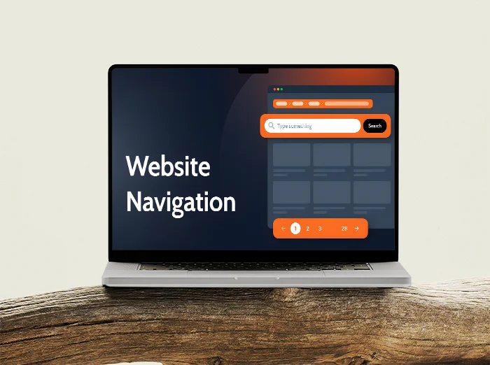
This matters for crawling. Crawling is when search engines follow links to discover and revisit pages. If your new pages are orphaned or buried in random blocks, they get found later and treated as less important.

A practical approach that works well for service businesses is to define a small set of content types. For example: core services, industries, case studies, insights, and company pages. Then design templates for each type and keep the navigation consistent. You end up with a site that grows without getting messy.

When you redesign, assume some URLs will change. That is fine, but you need a redirect strategy. A redirect is a rule that sends visitors and search engines from an old URL to the new one.

Use 301 redirects for permanent changes. Map old URLs to the closest new equivalent page, not just the homepage. If a page has been removed, redirect it to the most relevant parent or alternative, or return a proper 404 if there is genuinely nothing comparable. Blanket redirects can keep numbers looking tidy while quietly throwing away relevance.

One small judgement call: if you are planning a big tidy-up, do it in one controlled release rather than changing URLs bit by bit for months. A short period of adjustment is easier to monitor than constant churn, and it reduces the chance you forget an old path that still has links pointing at it.

WordPress makes it easy to add plugins. That is both a strength and a risk. Plugin overload is a common cause of bloated code, slow pages, duplicated features, and random conflicts that break things like schema, caching, or image loading.

You do not need endless SEO add-ons. Prefer a smaller stack where each plugin has a clear job, is well maintained, and does not overlap with something else. If a feature is central to the site, it is often better handled in the theme or a small custom plugin rather than five different tools competing for control.

Staging and QA are where you protect SEO from accidents. A staging site is a private copy of your website used for testing before changes go live. It lets you update templates, plugins, and content without risking a broken live site.

On staging, you usually block search engines on purpose. The trap is when that “noindex” setting gets pushed to production. Noindex is a tag that tells search engines not to include a page in search results. It is useful for staging, but it can wipe out visibility if it ships to the live site.

Before launch, run a basic QA checklist. Check that key pages are indexable, that your robots.txt is not blocking important sections, and that CSS and JavaScript are not blocked. Blocked resources can stop Google from rendering the page properly, which can affect how it understands layout and content.

Also check for broken links and missing images, especially after moving content into new templates. Broken internal links waste crawl time and create dead ends for users. Fixing them early is one of the cheapest wins you can get.

The goal is not perfection. It is a setup you can maintain. If your structure is repeatable, your redirects are deliberate, your plugin stack is lean, and your staging process catches mistakes, your SEO becomes far more stable over time.

What to check on a real site: a practical audit list

A short, prioritised set of checks that links design decisions to whether Google can crawl pages, understand them, and trust them enough to rank.

If you only do one thing, do this in order. Start with crawlability, then renderability, then templates, then performance, then indexation. That sequence matches how search engines and users experience the site. It also stops you polishing speed scores on a site Google cannot properly read.

1) Crawlability: can bots move through the site without getting stuck?

Internal links: check that key pages are linked from somewhere sensible, not just in a footer or a carousel. If a page matters for ranking, it should be reachable in a few clicks from the main navigation or a clear hub page.

Navigation paths: click your main menu, your mobile menu, and any sticky header links. Make sure nothing is hidden behind hover-only interactions that do not exist on touch devices. Broken navigation is both a user problem and a crawl problem.

Broken links: look for 404s and redirect chains (a redirect that redirects again). A 404 is a “page not found” response. A few are normal, but broken links in templates waste crawl time and weaken internal signals.

XML sitemap: confirm there is a sitemap and it includes the pages you actually want indexed. A sitemap is a list of URLs you provide to search engines. It does not replace internal linking, but it helps discovery and monitoring.

Robots rules: check robots.txt and any page-level “noindex” settings. Robots.txt controls crawling. Noindex controls whether a page can appear in results. A common mistake is blocking a whole folder that contains services, blog posts, or CSS and JS files needed for rendering.

2) Renderability: can Google see the main content without running lots of scripts?

Key content in HTML: your main heading, intro copy, and primary body content should exist in the initial HTML, not only after JavaScript runs. Google can render JavaScript, but it is slower and less reliable, especially on heavier sites.

Core links visible: important internal links (services, case studies, contact) should be real links in the markup. Avoid designs where links are injected late by scripts or hidden inside non-link elements that need a click handler.

Content that “loads in”: if your testimonials, FAQs, or case studies appear only after scrolling or filtering, check that there is still crawlable text and links on the page. Some interactive patterns accidentally turn useful content into something search engines barely see.

3) Template structure: does every page follow a clear, repeatable pattern?

One H1 per page: the H1 is the main page heading. You usually want one. Multiple H1s often happen when templates stack “hero” components, and it muddies the topic of the page.

Sensible headings: scan the page and check headings step down in order (H2, then H3). Do not use headings just to make text bigger. Use CSS for styling and headings for structure.

Consistent components: service pages should share the same layout logic. Same for case studies. When templates are consistent, Google sees stable patterns and users learn how to scan the page. When every page is a one-off design, internal linking and hierarchy usually degrade over time.

Primary content first: make sure the actual page content is not pushed below huge banners, sliders, or autoplay video. It is not a ranking “penalty” as such, but it often reduces engagement and it can delay meaningful content being rendered.

4) Performance: is the design fast in the real world, not just in a mock-up?

Image sizes: check that images are served at the right dimensions and compressed properly. Full-width images uploaded at 4000px for a 1400px layout are a silent performance tax, especially on mobile.

Fonts: keep font families and weights tight. Each extra weight can add requests and delay text rendering. Also check that fallback fonts are defined so text stays readable while fonts load.

Third-party scripts: review analytics, chat widgets, heatmaps, video embeds, social feeds, and booking tools. These often cost more than your whole site. If something is not clearly helping the business, remove it or load it only on the pages that need it.

Layout shifts: watch the page as it loads and see if buttons and headings jump around. This is usually caused by images without set dimensions, late-loading fonts, and injected banners. It makes the site feel cheap and it harms user experience, which feeds into performance signals.

5) Indexation: are you accidentally creating lots of pages that should not exist?

Duplicates: look for the same content accessible on multiple URLs, like with and without tracking parameters, or multiple category paths. Duplicates dilute signals because search engines have to pick one version to trust.

Thin CMS pages: WordPress can generate tag archives, author archives, date archives, attachment pages, and search result pages. Thin means there is not much unique value on the page. If these get indexed, they can crowd out your better pages and waste crawl budget.

Pagination and filtered views: if you have a blog, case studies, or listings, check what happens when users filter or sort. Some setups create near-infinite URL combinations. Decide what should be indexable and block the rest deliberately.

One judgement call: most service business sites do better with fewer, stronger pages than dozens of near-identical ones. If you are publishing pages just to “cover” every variation, step back and improve the main service pages, then support them with genuinely useful case studies and insights.

If you want a simple way to run this audit, pick five money pages (two services, two case studies, your contact page) and apply the checks above. If those five pages are clean, the rest of the site usually follows. If they are messy, your templates need work before you publish more content.

FAQ

Yes. A redesign can hurt SEO even if the words stay the same, because Google is responding to the underlying page signals. The big risks are URL changes without proper 301 redirects, template changes that alter headings and on-page structure, and internal linking shifts that move link equity around or bury key pages. Even small navigation tweaks can change which pages look most important.

Performance is another common cause of drops. New themes, heavier scripts, bigger images, and layout shifts can slow real-world load and reduce engagement. The practical fix is planning and QA: map old to new URLs, keep templates consistent, check core pages before launch, and run a crawl and speed tests after deployment to catch issues while they are still easy to undo.

No. WordPress can be excellent for SEO when it is kept lean and set up properly. Plugins are not automatically a problem, they are just code, and many sites need a few to handle basics like redirects, caching, forms, and SEO metadata.

The risk is uncontrolled plugins and heavy page builders. Too many add-ons can slow the site, inject scripts, create duplicate URLs, and make templates inconsistent. In practice, pick a small set of well maintained plugins, remove anything you do not use, avoid stacking builders, and test performance and indexation after changes.

Yes, mostly indirectly. Animations and sliders often add JavaScript, heavy images, and third-party libraries that slow down real load time, delay the main content rendering, and increase layout shifts when elements resize late. That hurts usability and can weaken performance signals, and sliders also tend to hide key copy behind rotation so both users and crawlers get less clear, stable content up front.

I usually avoid sliders on service pages. If you genuinely need motion, keep it small and purposeful: use CSS where possible, set fixed dimensions for media to prevent jumping, lazy-load offscreen slides, and make sure the first view contains the real heading and copy. Also respect reduced-motion settings so the site stays readable and calm.

In most cases, content inside tabs or accordions can still be crawled and indexed, as long as it is in the HTML on load and not hidden behind something that requires user interaction to fetch it. The bigger risk is prominence and usability – if you tuck key messaging, service specifics, or internal links away by default, users often do not see it, engagement drops, and search engines may treat it as less central to the page.

My rule is simple: keep the core promise, primary headings, and the main answers visible, then use tabs for secondary detail like FAQs, specs, pricing notes, or long lists that would otherwise make the page hard to scan. If you have to use accordions heavily, make sure they work without JavaScript, and double check that the hidden content is still present in the source and not being loaded only after a click.

If I had to pick one design choice that moves the needle most consistently, it is information architecture. A site that makes sense in the menu, in the page hierarchy, and in its internal links is easier to crawl, easier to index, and clearer to rank because Google can see what each page is for and how the pages relate.

That choice carries everything else with it. Solid IA usually means you can use proper headings, predictable templates, and content-first layouts, which leads to cleaner HTML, fewer orphan pages, and faster pages because you are not relying on heavy design to explain structure.

Start simple. Open the page, right click and choose View page source, then search for a few distinctive lines from your main content, plus your H1 and internal links. If it is not in the source, Google may only see it after JavaScript runs, so do a quick sanity check by disabling JavaScript in your browser and reloading. If the page turns into a shell with missing headings, copy, or links, you are relying heavily on client side rendering and you should confirm Google is actually getting the rendered version.

Then verify it properly in Google Search Console. Use URL Inspection, run a live test, and open the rendered HTML or screenshot to confirm the key content appears there, not just in your browser. I look for the main headings, body copy, and primary internal links in the rendered output, because that is the safest indicator that Google can crawl and index what matters.

Words from the web designers

We often see the same pattern: a page looks polished, but its meaning is fuzzy because the structure is doing too much work. A common problem is sections that read like they could belong anywhere, so nothing feels primary and the internal links do not point clearly to what matters.

If you are choosing between an inventive layout and a predictable one, I usually favour predictable. Search visibility tends to improve when pages behave consistently, because intent is easier to infer and the important content is less likely to be pushed out of view or buried behind design decisions.