How to Structure Content for Search Engines and Humans
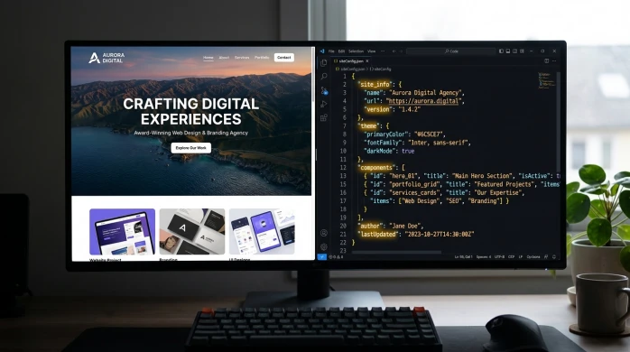
Most websites do not struggle because the design is ugly. They struggle because the content is not structured. People cannot quickly tell if a page answers their question, and search engines cannot confidently place it in the right category. The aim is simple: build pages that are easy to scan, easy to understand, and easy to classify.
Good structure starts before you write a single sentence. You map intent first – what the visitor is trying to do, and what a sensible next step looks like. Then you plan headings and sections that match that intent, in plain language, with one clear job per section. Only then do you write the copy, filling in the gaps without burying the important bits (we have all seen that happen).
Start with intent, not keywords
Plan the page around what the visitor is trying to achieve, and the one job you need the page to do.
Intent is just the reason someone is on the page. What are they trying to do right now? Find an answer, check they can trust you, work out if you are a fit, or get in touch.
When you start with intent, the structure becomes much easier. You stop guessing what to write and you stop stuffing in extra sections “just in case”. The page gets a clear shape because it is built around a decision the visitor is trying to make.
For most service businesses, intent usually falls into a few common types:
- Learn – they want to understand something (process, pricing approach, timelines, what is involved).
- Compare – they are weighing options (you vs another provider, or two approaches you offer).
- Decide – they are close to choosing and want reassurance (proof, examples, what happens next, risks).
- Contact – they want a clear way to start (a form, a call, an email, what you need from them).
A good page usually serves one primary intent. It can still answer supporting questions, but those questions should help the main outcome, not pull the visitor in four directions.
For example, a page built for decide can include a short section that helps people learn (your process) and a short section that helps them compare (why your approach is different). But it should not turn into a full guide, a portfolio dump, and a pricing debate all on the same page. That is when people stop scanning and start bouncing around.
A simple rule I use in planning sessions: if the intent is unclear, the structure will be messy. You will argue about headings, repeat yourself across sections, and keep adding “one more thing” because nothing feels settled.
Make the call early. Pick the primary intent, write it as a one-line goal, and let that goal decide what earns a section and what gets cut. In most cases, cutting is the better choice because it makes the page easier to read and easier to trust.

Choose the right page type before you plan the sections
Different pages do different jobs, so the shape of the content needs to match.
One of the quickest ways to end up with a messy page is to plan sections before you decide what kind of page you are building. A service page is not a guide. A case study is not a location page. If you try to force them into the same structure, you either repeat yourself or hide the important details.
Start by naming the page type in plain terms. Then write down what it needs to achieve in one sentence. That sentence becomes your filter for what belongs on the page, what belongs somewhere else, and what does not need to exist at all.
Here are common page types I plan for, and the one thing each needs to do well:
- Service page – explain what you do, who it is for, and how to take the next step.
- Location page – confirm you genuinely serve that area and make the service feel locally relevant.
- Case study – show a real problem, what you did, and what changed as a result.
- Guide – teach someone how to understand a topic well enough to make a better decision.
- FAQ – remove friction by answering common questions quickly and clearly.
- Contact page – make it easy to get in touch, with clear expectations about what happens next.
Notice how each one has a different main outcome. That is why copying the same set of sections across every page rarely works. A guide needs a clear flow and definitions. A contact page does not. A case study needs evidence and context. A location page needs reassurance without pretending you have an office on every street.
The next question is whether the content should live on one page or be split. I usually split when the page is trying to serve two primary intents. For example, a detailed guide and a sales-focused service pitch do not sit comfortably together. People reading a guide want clarity and depth. People close to hiring you want proof, scope, and a simple next step.
I also split when sections start to compete for attention. If you find yourself writing long explanations under a service page just to cover every edge case, that is often a sign you need a separate FAQ or a guide. Keep the service page decisive. Put the supporting detail somewhere it can breathe.
On the other hand, keeping things on one page can be the better choice when the sections genuinely support the same decision. A service page can include a short process section, a few examples, and a small FAQ, as long as each part earns its place and you can still scan the page in under a minute.
One thing to watch is thin pages that repeat the same points with minor wording changes. They do not help users, and they do not help search engines either. If two pages would say essentially the same thing, merge them and make one strong page. If they are meaningfully different, give each page a clear purpose and write to that purpose properly.
A practical judgement call: if you cannot explain why a page exists in one sentence, it probably should not exist yet. Decide the page type, decide the job, then plan sections that do that job without drifting.
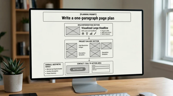
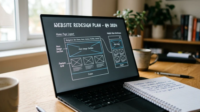
Write a one-paragraph page plan (before headings)
Plan the page in plain English first so you do not drift or waffle
Before you touch headings, write a single paragraph that explains the page from start to finish. Not a mini essay. More like a tight note you could hand to a colleague. If you cannot write this paragraph clearly, the page will usually ramble once you start adding sections.
Start with a short page brief. Who is it for, what problem does it solve, and what happens next? For example: “This page is for business owners comparing web design partners. It answers what ‘SEO-ready’ actually means in practice and what you get from our process. The next step is to request a call or send a brief.” That is enough to keep you honest.
Then write the promise of the page in one line. What will the reader get by the end? A clear definition, a shortlist of options, a confident yes or no, or a better question to ask. If you cannot state the promise without adding “and also”, you are probably mixing intents.
Next, list the proof the page needs. Proof is what makes the promise believable. It might be a short process outline, a couple of real examples, relevant experience, or outcomes you can describe plainly. Outcomes do not need to be numbers. They can be things like fewer enquiries going to the wrong place, faster sign-off because the scope is clear, or a site that is easier to update without breaking pages.
Finally, sketch the path. This is the order you will walk someone through so they can move from question to decision. Usually it is: clarify the situation, explain the options, show what you do and how it works, back it up with proof, answer the obvious concerns, then make the next action simple. Practical judgement call: if the “path” needs more than about six steps, split the topic into two pages rather than forcing everything into one long scroll.
Build a heading structure that matches how people scan
Use headings as signposts so someone can skim, pick a route, and still understand the page.
Most people do not read a web page top to bottom. They scan, pause, and then decide where to go next. Your headings are the signposts that make that scanning feel easy, and they also tell search engines what each part of the page is really about.
When the heading structure is right, the page feels calm. When it is wrong, people miss key points, or they end up in the wrong section and bounce. This is one of those areas where small choices make a big difference.
Think of it like this. The H1 is the page topic in plain, human language. The H2s are the main questions the reader has. The H3s are the supporting detail that answers one of those questions properly, without turning the page into a wall of text.
H1 is simple. It tells someone they are in the right place. It should sound like something a real person would search or hope to find. For example: “WordPress website design for service businesses” or “How we run a website redesign”. Not a slogan.
H2s are where you map intent. Intent just means what the person is trying to achieve on this page. Each H2 should reflect a genuine reader question, like “What is included?”, “How does the process work?”, “Is this right for my business?”, or “What happens next?”. If you cannot turn an H2 into a question, it is often a sign it is vague.
H3s handle the specifics. Use them for steps, definitions, edge cases, and the bits people often want to confirm before they enquire. They let you add detail without making the H2 section feel heavy. Example H3s might be “What you need to provide”, “Typical timelines”, “If you already have a site”, or “What we do not include”.
A simple test: read the headings only, in order, without the paragraphs. If you can understand the page and the journey, your structure is probably doing its job. If it reads like a list of vague labels, the page will feel vague too.
Keep headings specific. Avoid labels like “Overview”, “What we do”, or “More information”. They do not help scanning because they do not tell anyone what is inside. A better heading names the decision the reader is trying to make, or the concern you are addressing.
One judgement call I make a lot: if you need an H3 under every paragraph, you might be forcing too much onto one page. Sometimes the right fix is not more headings. It is splitting a chunky section into its own guide or FAQ so the main page stays decisive.
Design sections around decisions, not paragraphs
Plan each section to answer one real question, then make the next move obvious
A lot of pages go wrong because they are built like a document. Big blocks of text. Loose subheadings. A bit of everything “just in case”.
A better approach is to plan in sections that match decisions. Each section does one job: it answers one question the reader is holding in their head right now.
A good section usually has three parts.
- The point – the answer in a sentence or two.
- The explanation – enough detail to make it believable and useful.
- A next step or takeaway – what to do with that information, or what to consider next.
If you skip the point, people have to work too hard. If you skip the explanation, it sounds like a claim. If you skip the next step, the page feels like it stops mid-thought.
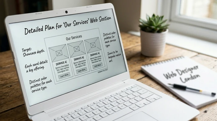
For service pages, a clean pattern helps because the reader is trying to decide whether to enquire, not study. This is the shape I find works most often.
- Who it’s for – name the fit, and also who it is not for.
- What you get – the deliverables in plain language, not a shopping list of features.
- How it works – the stages, what you need from the client, and what happens when.
- Timelines – a typical range, plus what tends to slow things down.
- Pricing approach (if relevant) – how you price and what affects cost, even if you do not publish numbers.
- FAQs – answer the predictable objections once, clearly.
- Next step – what you want them to do, and what happens after they do it.
Notice what is not on that list: a long “About” section. Keep “About” for the About page, or a short proof-based snapshot where it supports a decision. On most service pages, people mainly want clarity, not a biography.
For guides, the reader has a different intent. They want to understand and apply something, often quickly. A practical guide pattern looks like this.
- Definition – what the thing is, in one short line.
- Context – when it matters and when it does not.
- Steps – the process, in a sensible order.
- Examples – one or two that make it concrete.
- Mistakes – common misreads, edge cases, what to avoid.
- Summary – the key takeaway and what to do next.
The main discipline is keeping sections focused. One job per section. If you find yourself saying “while we’re here” or “also worth mentioning”, you are probably starting a second section by accident.
A small judgement call: if a section needs more than about two screens to do its job, split it. Either turn part of it into a separate guide, or move the deep detail into FAQs. Long pages are not a problem, but unfocused pages are.
Also watch for repeated reassurance. If you explain your process clearly once, you do not need to restate “we make it easy” three more times in different words. Use the space for the specific answers people are actually scanning for.
Use internal logic: answer the obvious questions in the right order
Good sequencing lowers friction, because people and search engines both try to work out what a page is “for” as they go.
A page can be well written and still feel confusing if it answers the right questions in the wrong order. Readers have to backtrack. They lose confidence. Search engines can also struggle to understand the main focus if key details are scattered or buried.
The fix is simple. Use a clear question order, then build sections that follow it. You are not trying to be clever. You are trying to make the next step feel obvious.
For most service buyers, the question sequence looks like this:
- What is it? A plain description. One idea per sentence.
- Is it right for me? Who it is for, and who it is not for.
- How does it work? The stages, what you need from the client, and what happens when.
- Why you? Proof and judgement. Not a life story.
- What does it cost? A pricing approach, ranges, or at least what affects cost.
- What next? The call to action and what happens after the enquiry.
If you jump straight to “why us” before you have explained what the service is, it reads like a pitch. If you talk about pricing before you have set scope, it creates anxiety. If you leave the process until the end, people assume it is complicated.
One practical tool here is a short summary near the top. This is for busy readers who are scanning to decide whether to keep going. Two to five lines is enough: what the service is, who it is for, and the main outcome. Keep it factual. Treat it like a signpost, not a sales paragraph.
Objections deserve their own handling, but the tone matters. You want to sound calm, not defensive. The best approach is to name the concern and answer it as a normal constraint. For example: timelines depend on feedback speed, or price depends on content readiness. That is not an excuse. It is context.
A small judgement call: if an objection is common and affects the decision, it belongs in the main flow, not hidden away. If you know people worry about migration risk, say how you manage it in the “How it works” section. Do not push it into an FAQ just because it is awkward.
FAQs still have a role. They should support the core sections, not replace them. FAQs are for the smaller, predictable questions that would otherwise interrupt the main narrative. Things like “Do you work with existing branding?” or “Can you use our hosting?”. Useful, but not the spine of the page.
Also avoid dropping key details at the bottom “for SEO”. If it matters to a buyer, it needs to appear where the buyer is thinking about it. The page should read like a decision path, not a storage cupboard.
Make it easy to trust: where to place proof
Trust signals are part of the page structure, so people can check your claims as they read.
Most service pages fail on trust for one simple reason. They ask the reader to believe a lot, then save all the evidence for the bottom. By the time someone reaches it, they have already made up their mind.
Proof is not marketing fluff. It is the supporting detail that helps a sensible person decide if you are a safe choice. If you treat it as part of structure, it reads naturally and it reduces doubt without turning the page into a sales pitch.
Use a few clear types of proof, and match them to what you are claiming:
- Case studies – short stories showing the problem, the approach, and what changed.
- Examples of work – specific pages, screenshots, or snippets that show the standard of output.
- Client quotes – one or two lines that confirm the experience, not a sweeping endorsement.
- Process – a simple outline of how you work, which reduces perceived risk.
- Credentials – relevant qualifications, certifications, or memberships, where they genuinely matter to the buyer.
The key is placement. Put proof near the claim it supports. If you say “fast turnaround”, show the process steps and what you need from the client right there. If you say “work with regulated industries”, mention the relevant experience and constraints in that section, not buried in a generic footer strip.
A practical pattern that works well is: claim, brief explanation, then one piece of proof. That might be a two sentence mini case study, a quote, or a link to a relevant example. Small, but specific.
How much proof is enough depends on price, risk, and audience. If the job is high value, touches revenue, or involves migration from an existing site, people need more reassurance. They will look for more examples, clearer process, and stronger evidence that you have done it before. If the service is small and low risk, a couple of solid examples and a clear process can be enough.
One judgement call: prioritise proof that reduces the biggest fear. For many business owners that is not “will it look nice?”, it is “will this go smoothly, and will I be left with a mess?”. In that case, lead with process clarity and a relevant case study, then add portfolio examples after.
Avoid vague claims with no support. Phrases like “high quality”, “bespoke”, or “results driven” do not mean much on their own. If you cannot back up a claim with an example, a quote, or a clear explanation of how you work, either tighten it into something concrete or remove it.
Also be careful with proof that is impressive but irrelevant. Name dropping, overblown testimonials, and implied guarantees often create suspicion rather than trust. Specific, modest proof placed in the right spot does more work than a long wall of praise at the end.
Keep language and structure aligned
Clear headings only work if the writing underneath is just as clear
Structure is not just headings and sections. It is also the language inside them. If your headings are plain but the content is vague, the page still fails. People cannot tell what you actually do, and search engines struggle to match the page to real queries.
Start with the words your clients use. Use plain, specific terms. “WordPress website rebuild” is clearer than “digital transformation”. “Monthly support” is clearer than “ongoing optimisation”. If a client would not say it out loud in a call, think twice before using it as a key phrase on the page.
Pick your terms and stick to them. Define a term once, then use it consistently. For example, if you say “support”, do not switch to “maintenance”, then “care plan”, then “managed service” unless you explain the difference.
A quick definition can be one short line. Like this: “Support means updates, security checks, and small content changes.” Now the reader knows what you mean, and you can stop re-explaining it in every section.
Use short sentences for key points. They land better. Then use a slightly longer sentence when you need to explain the why, or set a boundary, or add context. That rhythm makes pages easier to scan, and it also makes them easier to trust.
One practical check for fluff: remove the sentence. If nothing changes, it is fluff. Lines like “We pride ourselves on quality” often add no meaning, no proof, and no decision support. Replace them with something concrete, or delete them.
Watch for vague claims hiding inside tidy headings. A section called “Our approach” can be useful, but only if it includes specifics. What steps happen. What you need from the client. What the output looks like. Without that, it reads like filler and people skip it.
A small judgement call that usually improves a page: choose clarity over coverage. It is better to explain three things properly than list ten services with blurry descriptions. If a service matters, give it a clean heading and a plain explanation. If it does not, leave it out or park it on a separate page.
Do not write for algorithms instead of readers. The goal is simple language that matches real intent. If the headings are accurate and the paragraphs say something real, you usually end up with content that works for both.
Intent mapping: connect each section to a search goal
Make sure every section earns its place by answering one real question people bring to Google
Intent mapping sounds formal, but it is just this: what is the person trying to do when they land on this page?
Intent means the goal behind a search. One short line is enough as a definition. Are they trying to choose a supplier, compare options, understand a term, or take a next step like booking a call?
If you map intent to structure, your page stops being a loose collection of paragraphs and starts behaving like a helpful route through a decision.
A lightweight intent map is usually enough. I use three layers.
- Primary intent – the main reason someone searches and clicks.
- Supporting intents – the follow-up questions they need answered before they trust you.
- Nice to have questions – useful, but not essential to the decision on this page.
Here is what that can look like in practice for a service page.
- Primary intent: “Do you offer this service, and are you a good fit for my type of business?”
- Supporting intents: “What is included?”, “How does the process work?”, “What will you need from me?”, “What does success look like?”
- Nice to have: “Can you work with my existing site?”, “Do you support international clients?”, “How do you handle ongoing updates?”
Now map each H2 to one intent or one question. One. If a heading is trying to do two jobs, it usually becomes vague.
A simple check: write the question under each H2 in the margin. If you cannot write a clear question, that section is probably clutter.
Example mapping:
- H2: What we do – “Do you actually offer what I need?”
- H2: Who it is for – “Is this built for businesses like mine?”
- H2: What is included – “What am I getting, in plain terms?”
- H2: Process – “How will this run, and what will you need from me?”
- H2: Examples or case studies – “Have you done this before, and can I see it?”
- H2: FAQs – “What are the sticking points people ask about before they decide?”
- H2: Next step – “What do I do now?”
Once you have the mapping, you can spot two things fast: gaps and clutter.
Gaps are questions your reader needs answered but you have not covered. They show up as awkward jumps, or as enquiries that start with “Just checking…” because the page did not say it clearly. Add a section only when the gap blocks a decision.
Clutter is a section with no intent attached. Common culprits are headings like “Our approach” or “Why choose us” that do not lead to any specific question. You can keep them, but only if you rewrite them into something concrete, like “How we run a rebuild” or “What makes a project a good fit”.
One small judgement call that helps: if a section does not support the primary intent, be strict. Cut it, or move it to another page where it can be primary.
Also accept a limit. One page cannot win every query, and that is fine. Trying to cover everything usually makes the page longer without making it clearer. If a “nice to have” question keeps expanding, that is a sign it deserves its own page, with its own primary intent.
When every H2 has a job, the page reads better. It also becomes easier to plan, easier to edit, and easier to keep consistent as the business changes.
A simple review checklist before you publish
A quick structure check to make sure the page is clear, complete, and easy to act on.
Before you hit publish, do one calm pass focused on structure. Not wording. Not polish. Just: does this page make sense to a real person who is busy and slightly sceptical?
I use a short checklist. You can do it in ten minutes. It catches most of the issues that cause confusion, drop-offs, or enquiries that start with “just checking”.
1) Can you understand the offer in 10 seconds?
You should be able to answer three things without scrolling much: what you do, who it is for, and the shape of the outcome. If you have to read three paragraphs to work it out, your intro is doing too much work and not enough signalling.
2) Do the headings tell the story of the page?
Scan just the H2s (your main section headings). If they are good, you get a clear narrative: what it is, who it helps, what is included, how it works, proof, common questions, next step. If the headings are vague, the page will feel vague, even if the writing is fine.
3) Does each section earn its place?
Be strict here. Every section should answer a real question the reader has at that moment. If a section is only there because “service pages usually have one”, it is probably taking attention away from what matters. A small judgement call that helps: if you would not miss it when it is removed, cut it or move it to another page.
4) Is the next step clear without being pushy?
People should know what to do next, and what happens after they do it. A simple “Book a call” is not always enough. Add one line that removes friction, like how long it takes, what you will ask for, or whether it is a fit check. Keep the tone neutral. You are guiding, not cornering.
5) Are there obvious unanswered questions?
Read it once as a buyer. Then read it once as someone trying to avoid a mistake. Look for missing basics: timelines, what is included and not included, what you need from them, and how you handle common edge cases. If you keep getting the same question in real conversations, it belongs on the page, even if it feels “obvious” to you.
If you pass all five, you usually have a page that reads cleanly and makes decisions easier. Then you can polish sentences if you want. Structure first, always.
FAQ
Words from the web design experts
We often see good businesses lose clear enquiries because the page reads like a brochure, not an answer. We often see headings that sound fine in isolation but do not line up with what the reader came to decide. One practical habit that catches this early is a headings-only scan, where you read just the H2s and H3s and check the page still makes sense.
If you have to choose, prioritise the human reading flow over squeezing in every related keyword. A page that matches intent with clean sections and plain language is easier to trust, easier to act on, and usually easier for search engines to interpret as well.
You might like these too
These sit in the same category as the one you are reading. They follow the same thread and offer a bit more depth. Have a look if you want to go further.