How a Professional Web Designer Plans a Site
The hardest part of a good website is rarely the visuals. It is deciding what the site needs to do, who it needs to persuade, and what information has to be in place for that to happen. If you skip that thinking, you usually end up with a site that looks fine but feels vague, is hard to navigate, and does not support the business properly.
Professional planning is a sequence because each step depends on the last. You start with discovery and goals, then get specific about audience, content, structure, and constraints like time, budget, approvals, and technical limits. This article walks through that order and explains why it matters, in plain language, so you can see what should happen before anyone opens a design file.
1) Start with the business problem, not the website
Get clear on why the site exists and what “good” looks like in business terms, not personal preferences.
Before anyone talks about pages, layouts, or features, I want to know what problem the business is trying to solve. “We need a new website” is not a problem. It is a possible response to a problem.
This part of planning is mostly conversation and straight thinking. You define success in plain terms so later decisions are easy to justify. If you cannot explain what the site is meant to change, you will end up debating opinions like they are requirements.
Common real goals I hear from UK service businesses and founders include:
- More enquiries from the right kind of client
- More bookings or consultation requests
- More qualified leads (people who fit your criteria, not just any traffic)
- Credibility, so prospects trust you enough to get in touch
- Recruitment, usually better candidates and fewer unsuitable applications
- Reducing support load by answering repeat questions properly
Notice those are outcomes. They describe what changes for the business.
Then you separate goals from features. A feature is a thing the website has. A goal is the business result you want. “Add a blog” is a feature. “Generate qualified leads from search over time” is a goal. “Add live chat” is a feature. “Reduce support emails” is a goal. Features are optional. Goals are not.
A practical way to test this is to ask: if we achieved the goal without that feature, would we still build it? If the honest answer is no, it was never a requirement. It was just an idea.
You also need a single primary goal. One. Everything else becomes secondary. A clear primary goal might be: “Increase qualified enquiry submissions for our London-based service by making it easier for prospects to understand the offer, trust us, and contact us.” That can still support recruitment and credibility, but it tells you what the site is mainly for.
Too many “top priorities” breaks decisions later. If enquiries, ecommerce sales, hiring, press coverage, and newsletter growth are all treated as equally urgent, the homepage cannot do its job. Navigation gets bloated. Calls to action compete. Content becomes vague because it is trying to speak to everyone at once.
This step sets direction for the rest of planning:
- Content – what needs to be explained, proved, and answered to move someone towards the primary goal
- Structure – which pages exist, what goes in the main navigation, and what can sit deeper
- Measurement – what you track to know if the site is doing its job (a “conversion” is a completed action like a form submission or booking request)
One judgement call: if you cannot choose a primary goal, pause the project and sort that out. It is cheaper to spend an extra week clarifying priorities than to redesign later because the site “isn’t working” when nobody agreed what working meant.
2) Define success criteria and constraints early
Turn the goal into something you can judge, and be honest about what time, money, and capacity allow.
Once the business goal is clear, the next job is to make it measurable and buildable. That means agreeing what “success” looks like in practice, and what the real limits are. Not as a mood. As inputs to the plan.
Constraints are not bad news. They are information. If you name them early, the plan gets simpler and the site usually ends up stronger.
Here’s what I want decided up front, before anyone starts sketching layouts.
Timeline. When does this need to be live, and why? A fixed date changes decisions. It affects how much can be written, reviewed, approved, and implemented without rushing.
Budget range. Not a penny-perfect quote, just a sensible range. It stops the project drifting into “we might add…” territory with no trade-offs. It also helps you choose between doing fewer things properly, or more things thinly.
Internal capacity for content. Who is writing, gathering case studies, sourcing photos, and getting approvals? Content is not just words. It includes services, proof, FAQs, team bios, and anything people need to trust you. If nobody has time, the plan has to reflect that.
Legal and compliance constraints. This varies by sector. Think privacy, cookies, claims you can and cannot make, regulated wording, accessibility expectations, and anything your industry requires. If your business has a compliance person, involve them early. Late changes here are slow and expensive.
Hosting or platform constraints. Some businesses already have a setup they must keep. Others have IT rules, existing email systems, or a parent company standard. You do not need to get technical. Just confirm what is fixed and what is flexible, so the site is planned around reality.
Then you turn the goal into success criteria. This is where you write down what the site must do to count as “working”. For a service business, that might include things like: people can understand the offer in under a minute, key pages answer common objections, contact options are obvious, and enquiries contain enough detail to qualify leads.
Constraints change the plan in straightforward ways. If content is limited, you keep the structure tighter. Fewer pages. Stronger pages. You avoid page sprawl where every service variation gets its own thin page that nobody maintains. It is better to publish a clear core set and expand later than launch a bloated site full of placeholders.
If the timeline is short, you prioritise. You may launch with the essentials, then add secondary sections once the core is stable and measured. If compliance is heavy, you build review time into the schedule instead of pretending it will “fit in somewhere”.
This is also the moment to sort must-have vs nice-to-have. A must-have is required to meet the primary goal or to operate legally and safely. A nice-to-have is beneficial, but the business still functions without it.
It matters before design because design decisions are really prioritisation decisions. If everything is treated as a must-have, nothing is. The homepage becomes a noticeboard. Navigation turns into a dumping ground. And the site stops guiding people towards the main action you actually care about.
A practical way to do this is to ask two questions for each idea: does it directly support the primary goal, and do we have the content and time to maintain it after launch? If the answer is no to either, it is probably a nice-to-have.
One small judgement call: if budget, timeline, and scope do not line up, adjust scope first. Trying to “keep everything” and just move faster usually produces a messy site that costs more to fix later.
3) Understand the audience in decision-making terms
Plan for how people choose, what they worry about, and what they need to see to move forward
Most websites fail the same way. They talk about the business as if the reader is already convinced. Planning fixes that by focusing on the moment someone is deciding whether to trust you, contact you, or leave.
I avoid demographic deep dives for this stage. Age and job title rarely tell you what someone needs from the site. What matters is context: why they are here, what problem they are trying to solve, and what would make them confident enough to take the next step.
Think of the audience as a few decision-making groups. Keep it simple. If you create ten segments, you will build a site that tries to speak to everyone and lands with no one.
A practical approach is to list 3-5 key segments based on what changes the buying decision. For a web design and development service, that might be:
- People who need a new site because the current one is slow, outdated, or not converting.
- People launching something new and needing credibility fast.
- People who have had a bad experience before and are wary of agencies and freelancers.
- Teams with internal marketing but no reliable technical support.
Those segments are not about identity. They are about the situation and the risk they feel. That is what shapes the questions they ask.
Next, define user intent for each segment. User intent is just the outcome someone is trying to achieve when they land on a page. Not what they are reading, but what they are trying to get done.
Examples of intent you can plan for:
- Check if you build the type of site they need (service fit).
- Work out if you are credible and experienced enough (trust).
- Understand rough scope and constraints (time, budget, internal capacity).
- See what the process is like and what they would need to provide (risk reduction).
- Find a clear next step that does not feel like a trap (contact without hassle).
This is where structure starts to matter. If most visitors arrive from search on a service page, the service page has to do more than list features. It needs to answer the decision questions in a sensible order, with links to deeper proof where needed.
Then you map typical objections. These come up in almost every project, regardless of sector. They are not “sales objections”. They are normal business risk checks.
Trust. “Can you actually deliver?” Planning addresses this by deciding what proof exists and where it will live. Case studies, specific examples of work, a clear explanation of how projects run, and who does what. If proof is thin, the plan should not pretend otherwise. It should prioritise getting one or two solid examples written properly.
Price. “Are you in my range?” You might not publish pricing, and that is fine. But planning still decides how you will signal positioning. For example, by being explicit about what is included, what is out of scope, and what affects cost. Vague pages create low-quality enquiries and waste time on both sides.
Risk. “What if this goes wrong?” This is where the process content matters. How discovery works. How content is handled. How approvals happen. What happens after launch. People do not need a novel, but they do need to feel there is a method and a safety net.
Fit. “Are you right for my situation?” Planning should make space for boundaries. Who you work best with. Typical project sizes. What you will not do. Counter-intuitively, being clear about fit can increase trust because it reduces the fear of a mismatched project.
One useful planning exercise is to write down the top 10 questions a sensible buyer would ask before contacting you, then decide which page answers each one. If you cannot place a question anywhere, the site will feel incomplete no matter how good it looks.
Also decide, early, when “you are not the target” is a helpful decision. This is not about being exclusive. It is about building a site that is clear.
If you take on projects where performance, structure, and long-term search visibility matter, you might not be the right option for someone who wants the cheapest build in a week with minimal input. Trying to appeal to that person usually damages the message for the clients you actually want, because you start hiding the parts of the process that keep quality high.
My judgement call: it is better to lose a few enquiries by being specific than to attract lots of enquiries you cannot serve well. The plan should protect that clarity before design starts, because once pages are being laid out, it is hard to resist adding “just one more” line for the wrong audience.
4) Review the existing situation (or baseline)
Use what you already have to spot patterns and gaps, or set a starting point so changes are not based on guesswork.
If there is an existing website, it is your best source of reality. Not because it is “right”, but because it shows what has actually been published, how people are being directed, and where the cracks are. If there is no site yet, you still do a version of this step. You just write down the baseline you are starting from, so later decisions have context.
Start by looking at what pages exist and what job each page is meant to do. You are not judging design here. You are checking whether the structure matches how someone would decide to contact you. Most older sites have a few common issues: important pages are missing, key information is buried, and old pages hang around because nobody is sure if they still matter.
Outdated content is not always obvious. It can be old service descriptions, team members who are no longer there, industries you do not serve anymore, or location wording that does not match how you work now. It can also be subtle, like a page that talks about “quick turnaround” while your current process is more careful and structured. When those messages clash, people hesitate.
Then look for what is missing. This is usually the stuff a sensible buyer needs to reduce risk. Clear service boundaries. A simple explanation of how projects run. Proof that matches the work you want more of. If you are based in London but work across the UK and internationally, the site also needs to make that obvious without turning into a list of place names.
Also watch for confusion. Confusion is often created by small things that add up: multiple contact options with different promises, pages that overlap, inconsistent naming of services, or a navigation that forces people to guess. A common one is mixing audiences. For example, speaking to “any business” on the homepage, then writing very specific content elsewhere. That mismatch makes the site feel less confident, even if the work is strong.
At a high level, you also want a sense of existing search visibility and content gaps. Search visibility just means: are you currently being found for the things you actually sell, or only for your name. You do not need tools to think this through. List the main services you want enquiries for, then check whether your site has a page that properly answers each one. If it does not, you are relying on people to work it out, and most will not.
Content gaps are not only about blog posts. They are often “money pages” that are missing or too thin. If you offer WordPress builds, performance work, technical SEO setup, ongoing support, or rebuilds, each of those needs a clear home and a clear explanation of what it includes. If you try to squeeze everything into one generic services page, it is hard for search and humans to understand what you do.
Now the part that gets skipped too often: what happens after someone enquires. Planning a site without understanding the sales and enquiry process creates bad hand-offs. If someone submits a form, who sees it. How quickly do they get a reply. What information do you need to give a useful response. Do you book a call, send questions, or send a proposal first. If the real process is “we will get back to you when we can”, do not write copy that implies a slick, immediate system.
This step also affects what the site should ask for. A long form can be sensible if you genuinely use the details and respond properly. If not, it just adds friction and you will get lower quality information anyway. My judgement call: it is usually better to ask for fewer, clearer details and follow up with the right questions, unless your projects are complex enough that pre-qualifying saves everyone time.
Finally, check who will maintain the site and how often. Maintenance is not just “updates”. It includes adding or changing pages, keeping case studies current, updating staff bios, posting vacancies, and making sure key messages do not drift. If nobody owns this, the site will slowly become inaccurate, and accuracy is one of the main things that builds trust.
Be honest about capacity. If you know you will only touch the site quarterly, the plan should favour a structure that stays true with minimal edits. If you have someone internal who can update content weekly, you can plan for more active publishing. Either way, deciding this early stops you designing a site that depends on maintenance you will not do.
5) Map the customer journey and key paths
Plan how different visitors move from first contact, to trust, to taking a sensible next step
Before you design anything, you need to know how people will actually use the site. Not in an ideal world. In the messy real one, where they land on a random page, skim for 15 seconds, then decide whether to keep going.
This is how you avoid a site that feels like a collection of pages, each shouting “contact us”, with no clear reason for anyone to believe you are the right fit.
Start with entry points. Most visitors do not arrive on your homepage. Common ones are:
- Search – looking for a service, a location, or a specific problem.
- Referrals – someone has been told your name and wants quick reassurance.
- Social – curiosity, often low intent, and easily distracted.
- Email links – from an intro, a newsletter, or an existing thread.
- Returning visitors – they have been before and are picking up where they left off.
Each of those needs a sensible next step. That next step is usually one of four paths: learn, compare, verify, contact.
Learn is where you explain what you do in plain terms. For a web design service, that might be how a WordPress build works, what “SEO-ready” means (set up so search engines can crawl and understand your pages), and what you do differently when performance and structure matter.
Compare is where people work out whether you are the right approach for them. This is not about trashing alternatives. It is about being specific on scope, who you work best with, and what you do not do. Boundaries help buyers feel safe.
Verify is proof. Case studies, examples, testimonials, and a clear process. For many service businesses, verification is the make-or-break step. They are not looking for perfection. They are looking for signs you have done this before and you communicate well.
Contact is the point where the site asks for something. It could be a call booking, an email, or a short form. Whatever it is, it needs to match how you actually handle enquiries, otherwise you create a bad first impression.
The key is what happens before you ask for an enquiry. People usually need a minimum set of answers first:
- What you do, in one sentence, without buzzwords.
- Who it is for, so they can self-qualify.
- What the process looks like at a high level.
- Examples that match the type of work they want.
- Any constraints that affect them, like lead times, platforms, or what you will not take on.
If that information is missing, the contact button becomes a leap of faith. Most people will not take it. They will go back to search and click the next result.
You also need to handle high-intent and low-intent visitors without clutter. High-intent people want a straight line to contact, but they still want reassurance on the way. Low-intent people are not ready, but they can become ready if you give them a clear next step that does not feel like a commitment.
A practical way to do this is to keep one primary call to action consistent, usually “Enquire” or “Book a call”, and support it with lighter options nearby like “See examples” or “How the process works”. That gives low-intent visitors somewhere useful to go, without turning every page into a menu of competing buttons.
My judgement call: do not add extra navigation items just to cover every possible journey. It usually makes the site feel more complicated, not more helpful. Map the paths first, then check whether the content you already plan actually supports them. If it does, navigation can stay simple.
Finally, accept that journeys vary. A referral might jump straight to your work and then contact. A search visitor might read two service pages, scan your process, then leave and come back a week later. Planning these paths upfront keeps your pages connected, and stops calls to action from feeling random or premature.
6) Content discovery: what you already have and what you need
Get practical about content early, because assumptions here derail timelines and force awkward design choices.
This is the step where we stop talking in abstracts and look at what the site will actually say. Not the design. Not the features. The words, images, proof, and basics that make a service site credible.
A lot of projects stall because everyone assumes “content will sort itself out”. It rarely does. Content has dependencies. Layout depends on copy length. Case study structure affects navigation. Photos change how professional the work feels. If you do not plan this, you end up designing around blanks.
Start with an inventory of what already exists
I ask for everything that might end up on the site, even if it is rough. Then we sort it into what is usable, what needs editing, and what is missing.
A practical inventory usually includes:
- Current website copy, brochures, pitch decks, and proposals
- Existing service descriptions and pricing notes (even if they are internal)
- Case studies or project write-ups, including any results you are comfortable sharing
- Photos – team, office, work in progress, and finished work
- Testimonials – emails, LinkedIn recommendations, review screenshots (we can rewrite them into clean quotes with permission)
- Policies – privacy policy, cookie information, terms, refunds, accessibility statement if you have one
- FAQs – questions you get on calls, by email, and in proposals
- Brand basics – logo files, colours, fonts, and any guidelines
This is not busywork. It tells us what we can build around. It also exposes risks early, like having no decent project photography, or testimonials that are too vague to help.
List what needs creating, and decide who owns it
Once we know what exists, we write a simple “content needed” list per page. Then we assign an owner to each item. Owner means the person responsible for supplying it, not the person who vaguely agreed it would happen.
Typical content that needs creating for a service business site:
- Homepage headline and intro that match what you actually sell
- Service page copy that explains scope, approach, and what you do not include
- Proof items – a small set of strong testimonials and a few relevant examples
- About page content that explains credibility without turning into a life story
- Contact page text that sets expectations for response time and next steps
- FAQ answers written in plain English
- Basic legal pages that match how you operate (often done with your solicitor or a reputable template you already use)
In most projects, the business owner must own the raw material. Only you know what is true, what you will stand behind, and what you are willing to commit to. A website designer or copywriter can shape it, but they cannot invent substance without risk.
One short technical term you might hear here is “content model”. It just means the consistent structure for a type of page, like what fields every case study needs (problem, approach, outcome, tech, quote).
Define “good enough” for launch
You do not need a perfect library of content to go live. You do need enough to make the site coherent, credible, and easy to understand.
Good enough to launch usually looks like:
- Clear homepage copy that says what you do, who it is for, and what happens next
- Solid service pages for your core offer, not every niche variation
- At least a few proof points that match the work you want more of (examples or case studies, plus testimonials)
- A straightforward About page with relevant experience and a human voice
- Contact page with a form or email, and clear expectations
- Privacy and cookie basics in place
What can often wait:
- Extra case studies beyond the first strong set
- Long FAQ lists that repeat what the service pages already cover
- Secondary services that you do not really want to sell
- Polished photography for every page (as long as what you use is genuine and acceptable)
My judgement call: launch with fewer pages if those pages are real and specific. Thin content spreads attention and makes the whole site feel uncertain.
Why “we will write it later” causes delays and weak compromises
When content is missing, decisions get made on placeholders. Headings become generic. Sections get padded to fill space. Layouts are built to look balanced, not to communicate. Then, when real copy arrives, it does not fit. You either cut important detail, or the design breaks and needs rework.
It also affects structure. Without knowing what proof you have, we cannot decide whether case studies belong in the main navigation, on service pages, or both. Without knowing your FAQs, we cannot tell whether people need reassurance before they enquire, or whether it is better handled on the call.
Content “later” usually means content during build. That is the most expensive time to discover missing information, because every change ripples through page layout, internal linking, and sometimes SEO basics like titles and headings.
If you want the project to move smoothly, treat content like a first-class input. Get the inventory done. Decide what is missing. Assign owners. Then design becomes much simpler, because it is supporting something real.
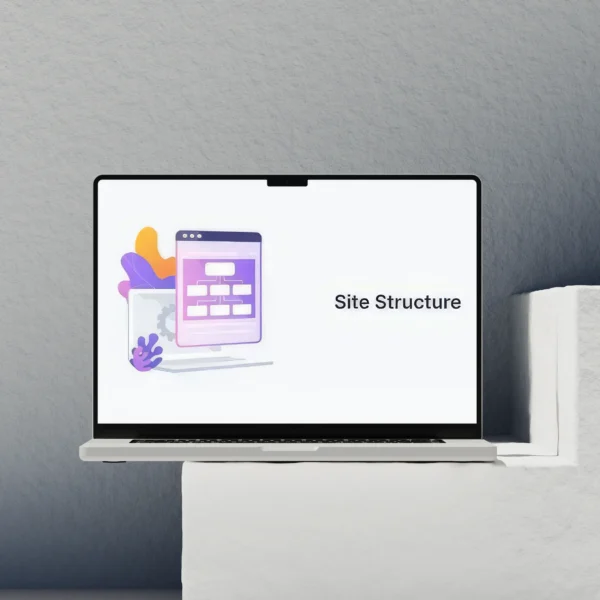
7) Decide the site’s information architecture (structure)
Translate what people need into a small, logical set of pages that link together cleanly.
This is the point where the site stops being a list of ideas and becomes a map. You take the goals, the real content you can stand behind, and the constraints, then turn them into pages and relationships.
Information architecture is just the organised structure of pages, navigation, and internal links. It matters for humans first. It also sets you up for tidy SEO later, because search engines can only understand what you have clearly separated and clearly connected.
I start with the user questions. Not your internal org chart. Not your team structure. Not the way you talk about yourselves in meetings.
Good top-level navigation is usually built around things like: What do you do? Who is it for? How does it work? Can I trust you? How do I get in touch? If your menu answers those, people move forward without effort.
A common mistake is mirroring departments or job titles. Visitors do not think “Operations” or “Solutions”. They think “I need a new site”, “I need more enquiries”, “I need to know if this fits my budget and timeline”. If they cannot spot their problem in the first few seconds, they bounce or they call a competitor.
Service pages need special care. They are doing two jobs at once: helping a person understand what you offer, and giving search engines a stable, specific page to index for that topic. No tricks, just clarity.
A solid service page structure often looks like this: who it is for, what you actually deliver, what the process looks like, examples or proof, common questions, and what to do next. Keep it honest. If something depends on scope, say so. That usually builds more trust than trying to sound definitive.
On the SEO side, the main discipline is avoiding overlap. Each key service should have one “home” page that owns that topic. Supporting pages can exist, but they should support, not compete.
Deciding between separate pages and sections on one page is mostly about intent and depth. If someone would search for it as a distinct need, or if it needs its own proof and FAQs, it is usually a separate page. If it is a minor variation, or it only makes sense in the context of the main service, keep it as a section.
For example, “WordPress website design” and “WordPress website maintenance” are often separate pages because the buyer questions are different. But “Speed optimisation” might be a section within a broader “Performance” or “Technical SEO” service, unless you genuinely sell it as a standalone engagement with clear boundaries.
Be careful with duplicate pages that say almost the same thing. Things like “Web Design”, “Website Design”, “Bespoke Web Design”, and “Professional Web Design” all as separate services. It looks busy, but it usually confuses visitors and makes it harder for search engines to tell which page matters.
If you do need similar pages, they must earn their place. Different audience, different use case, different content, different proof, and clear internal linking that explains the relationship. Otherwise consolidate and make one page stronger.
My judgement call: keep the top-level navigation small. If you cannot explain why a menu item exists in one sentence, it probably belongs one level down, or it does not need to exist yet.
Once the structure is agreed, everything gets easier. Content writing becomes more focused. Design becomes simpler because you know what each page is trying to do. And SEO foundations improve because each important topic has a clear page, a clear purpose, and clear links to related content.
8) Plan page purpose and hierarchy before layout
Decide what each key page needs to do, and what a visitor must see first, so the design work later is almost mechanical.
Before I think about layout, I decide the job of each page. One job first. Supporting jobs second. If you skip this, you end up with pages that try to do everything, which usually means they do nothing well.
This is also where calls to action get sensible. A call to action is simply the next step you want someone to take. There is usually a primary one (the main goal) and a secondary one (a lower-commitment option for people who are not ready yet).
Start with page-by-page purpose
Homepage. The homepage is a router. Its main purpose is to confirm the visitor is in the right place and send them to the right next page quickly. It is not the place for every detail.
Service pages. A service page is for someone with a specific need. Its job is to explain what you do, who it is for, how it works, and what “done” looks like. It should also reduce risk by answering the obvious worries: budget range (if you can), timelines (if you can), and what is included vs not included.
About page. The about page is mostly about trust and fit. People use it to check you are real, experienced, and aligned with how they want to work. It should support the decision, not be a biography for its own sake.
Case studies. Case studies exist to prove outcomes and show your thinking. They help a buyer imagine the process and the result in a context like theirs. If you cannot share numbers, that is fine, but you can still be specific about constraints, decisions, and what changed.
Contact page. The contact page is a conversion page. Its job is to help a serious enquiry happen with minimal friction and fewer back-and-forth emails. It should set expectations about what happens next and what information you need.
Choose primary and secondary calls to action
Primary CTAs are for visitors who are ready. On a web design service site, that is usually “Book a call” or “Request a quote”. Put it where it makes sense, but do not force it onto someone who is still figuring out whether you are right for them.
Secondary CTAs are for visitors who need more confidence or more detail before they commit. Good secondary options are “View case studies”, “See how the process works”, or “Read pricing approach” (even if you cannot publish fixed prices). These move people forward without making them feel trapped.
When to use which depends on intent. If someone is on a specific service page, a primary CTA can appear earlier because they have already self-selected. If they are on the homepage or about page, a secondary CTA is often the better first step because they are still orienting.
Set hierarchy: what must be seen early vs later
“Above the fold” just means what a visitor sees before they scroll. You cannot guarantee an exact fold on every screen, but you can decide what must be understood immediately.
Early on a page, I want three things to be clear: what you do, who it is for, and what the next step is. If a visitor has to work to answer those, you have already created friction.
Things that can usually sit lower: detailed methodology, full FAQs, long lists of features, deep technical explanations, and extended background. They matter, but they are supporting information for people who need it.
One practical check: if a page starts with a mission statement, I move it down. Not because mission is unimportant, but because most visitors arrive with a problem to solve, not a desire to learn your philosophy.
Place trust elements where the doubts appear
Trust elements are anything that reduces perceived risk. Proof, process, credentials, relevant experience, and clear boundaries all count. The key is placement. Put the reassurance close to the moment the doubt happens.
On the homepage, I like a small amount of proof early. A couple of client names, a short statement of what you are known for, or a tight list of outcomes you focus on. Then a clear route into services and case studies.
On service pages, the biggest concerns tend to be “Will this work for my situation?” and “What will this be like to work through?”. So I place process and relevant examples near the top third of the page, not buried at the end. If you do performance, structure, and SEO foundations, say what that means in plain terms and why it matters for the client’s business.
On the about page, the concern is usually “Can I trust you?”. This is where credentials, background, and how you work belong. It is also a good place to be clear about what you do not do, like shortcuts that harm long-term search visibility, because the right clients respect that.
On case studies, trust comes from specificity. The useful parts are context, constraints, decisions, and results you can stand behind. A simple “what we did” list is less convincing than explaining why you chose that approach and what trade-offs you accepted.
On the contact page, the concern is often “What happens after I click send?”. So I include what you need from them, what happens next, and typical response times if you can commit to them. If you cannot, do not guess. Just set a reasonable expectation in words.
My judgement call: if you only have time to do one thing here, do the service pages first. They carry the most intent, they are easiest to rank for cleanly, and they make every other page simpler because you are no longer vague about what you actually sell.
9) Address technical and operational requirements early
Make key decisions now that protect performance, search visibility, compliance, and day-to-day running
This is the part many projects leave until “after the design”. Then the build starts, and suddenly there are awkward compromises. Pages get heavier than they need to be. Tracking is bolted on without a plan. Someone realises too late they need a careers page, a cookie banner, or a better way to handle spam.
I prefer to surface these requirements early, while the site structure and content are still flexible. You are not choosing tools here. You are agreeing what the site must do, what “good” looks like, and who owns what after launch.
Performance expectations should shape the plan
Performance is not something you sprinkle on at the end. It comes from decisions about what you put on a page and why. If every page tries to do everything, you usually end up with slow pages and unclear messaging.
Set expectations in plain terms. For example: pages should load quickly on mobile, key pages should feel snappy, and the site should stay fast as content grows. Then use that as a filter for content and layout decisions.
One practical planning input: limit “heavy” elements unless they earn their place. That includes large videos, big image carousels, animations, and anything that exists mainly for decoration. Clear page goals make restraint easier. If the goal is “get a qualified enquiry”, you do not need five competing interactive sections above the first scroll.
SEO starts with structure and content, not tricks
SEO fundamentals are mostly planning fundamentals. You decide what topics the site covers, how pages relate to each other, and whether a search engine can understand the structure.
Keep the plan focused on indexable pages. “Indexable” means a page that search engines can find and include in results. If a service matters commercially, it usually deserves its own page with a clear purpose, not a paragraph buried on the homepage.
Agree the primary topics early. For a service business, that is usually a small set of services, a set of supporting pages that build trust, and optional content that answers common questions. Then plan internal links on purpose. Internal links are simply links between your own pages, and they help visitors and search engines find the right next step.
Skipping this step often leads to pages that overlap, compete, or stay vague. The site looks fine, but it is hard to describe what each page is actually for. That makes writing harder, navigation messy, and search visibility weaker over time.
Accessibility and compliance belong in planning
Accessibility is about making the site usable for more people, including users with disabilities. It also tends to improve clarity for everyone. The planning angle is simple: make content easy to understand and journeys easy to complete.
Start with plain language. Short sentences. Clear headings. Avoid jargon unless it is necessary, and if it is, define it once. Plan forms so they are not a barrier. Few fields, clear labels, helpful error messages, and no “clever” questions that confuse people.
Also list the legal and trust pages you need, and make sure they are part of the structure. In the UK, most business sites need at least a privacy policy and a way for users to understand cookies if you use them. You may also need terms, accessibility statements, or sector-specific information depending on what you do. If you are not sure, treat it as a requirement to confirm, not an afterthought.
Operational needs: what happens after someone clicks
This is where a website becomes part of your business, not just a brochure. Agree what you need to measure, how you will handle unwanted messages, where leads go, and who is responsible for updates.
Tracking requirements should be defined in business terms. What counts as a meaningful action? A form enquiry, a phone click, an email click, a brochure download, a booking request. If you define those up front, the site structure and calls to action stay consistent. If you do it later, you often discover the site does not support the reporting you actually need.
Spam handling is another early decision. Contact forms attract junk. Plan how you will reduce it and how you will cope when some still gets through. That includes choosing what information you really need, and setting expectations for response times so genuine leads are not left hanging.
Lead routing sounds boring, but it matters. Decide where enquiries go, what happens if the main person is away, and how you want to prioritise. A simple rule set is usually enough, but it needs to exist.
Finally, be honest about who updates what. If you want to publish news, add case studies, or change service details regularly, plan a structure that supports that and agree ownership. If nobody will maintain a blog, do not build the plan around one. My judgement call: fewer, well-maintained pages beat a large site that slowly goes stale.
10) Identify risks, unknowns, and decision points
Write down what is uncertain now, so it does not cause late surprises.
Before any design starts, I like to make uncertainty explicit. Not to slow things down. To stop small unknowns turning into big delays once pages are being built and everyone has opinions.
The most common unknown is content. Not just “do we have it?”, but “is it usable?”. A site can stall because the key pages exist only as rough notes, or because the person who knows the details is too busy to review drafts. If content is missing, we need a plan for who will write it, who will review it, and what “good enough for launch” looks like.
Positioning is another one. If it is not clear who you help, what you do, and why you are a good choice, the design stage becomes a guessing game. You can still launch without perfect copy, but you cannot launch without a clear idea of the offer and how it is different from alternatives. Even a simple statement is better than vague wording that tries to please everyone.
Multiple stakeholders and approvals are also worth naming early. If three people need to sign off the homepage, that is fine. It just changes how we plan reviews. It helps to agree one owner who collects feedback and makes the final call, otherwise you get conflicting edits and the site drifts.
Once the unknowns are listed, the next step is to identify the decision points that need sign-off. These are the things that shape everything else.
- The page list. What pages exist at launch, and what waits until later.
- Messaging. The headline promise, the service descriptions, and the words you use for your audience.
- Service scope. What is included, what is not, and what gets its own page.
- Contact methods. Form, phone, email, booking request, and what you want people to do next.
Getting these agreed early keeps the build stable. It also keeps costs under control, because changing your mind later often means reworking several pages, not just one sentence.
You still want room to iterate. The way I handle that is to separate “structural decisions” from “tuning decisions”. Structural decisions should be settled before design because they affect navigation, internal links, and SEO. Tuning decisions can keep evolving as you see drafts.
Structure means things like the page hierarchy and the content model. Content model is just the repeatable pattern for a type of page, like what sections every service page needs. If you change that late, it ripples through the whole site. Key messaging is similar. If you rewrite the main positioning after pages are laid out, you often have to revisit headings, calls to action, and even which pages exist.
Some changes are simply expensive later. Changing the structure is one. Changing which services you offer is another. Switching from “one general service page” to “separate pages per service” affects navigation, content writing, and search visibility because each page needs a clear purpose. If you think that change might be needed, it is better to decide up front and build the site around it.
Other changes are cheaper and should be expected. Refining wording, improving examples, adjusting the order of sections, and tightening calls to action are normal. You can plan for that by agreeing a baseline first, then improving it in rounds rather than rewriting from scratch every time someone has a new idea.
A practical way to keep scope under control is to set a clear launch version. What must be true on day one? Then keep a simple list of “next” improvements that are valid, but not required. That gives you momentum without pretending the first release is the final one.
My judgement call: if a decision changes the page list, the content model, or the core message, pause and agree it properly. Those are foundation choices. If you keep them fluid, the project becomes a loop of rework, and nobody feels confident about what they are signing off.
11) Why skipping steps causes expensive problems
Each missing piece creates a specific kind of rework later, usually when changes are hardest to make.
Most project pain is not caused by “bad design”. It comes from decisions being made in the wrong order. The site still gets built, but it gets built on guesses. Then the guessing shows up as rewrites, redesigns, and awkward compromises.
None of this is about blaming anyone. Businesses are busy. Deadlines are real. The point is simply that each planning step protects you from a predictable failure mode.
Skipping goals leads to subjective design debates and weak calls to action. If you do not agree what success looks like, every review turns into opinions about style. One person wants “premium”, another wants “friendly”, another wants “more modern”. Those can all be valid, but they are not goals.
It also makes calls to action vague. A call to action is the next step you want someone to take, like “request a quote” or “book a call”. Without a clear goal, you end up with safe buttons like “learn more”, and the homepage becomes a brochure instead of a decision path.
Skipping audience work leads to generic copy and poor conversion. If you have not defined who you are speaking to, you write for everyone. That usually means you say less, not more. You avoid specifics, remove useful detail, and the site reads like it could belong to any firm.
Conversion just means turning visitors into enquiries or sales. Generic copy is a common reason sites get traffic but not enquiries, because people cannot quickly tell “this is for me” and “they understand my situation”.
Skipping content planning leads to delays, filler text, and messy page structure. Content is the material the design has to hold. If you start design without knowing what pages need to say, you either wait for content (and the schedule slips) or you design around placeholder copy.
Placeholder copy has a habit of becoming real copy. Then you launch with thin pages, repeated wording, and sections that exist because they filled space, not because they help the reader decide. Later, when proper content arrives, it does not fit the layout and you end up changing both.
Skipping structure leads to navigation bloat and SEO cannibalisation. Structure is how pages relate to each other: the hierarchy, internal links, and what each page is responsible for. If you do not decide that early, pages multiply as problems appear. You get “Services”, “What We Do”, “How We Help”, and three near-identical service pages because nobody wanted to delete anything.
SEO cannibalisation is when multiple pages compete for the same search intent, so none of them is clearly the best answer. It can make rankings and internal linking messy because Google and users cannot tell which page is the main one for that topic.
Skipping constraints leads to rebuilds or compromises that hurt quality. Constraints are the real limits of the project: time, approvals, budget, technical requirements, legal needs, and what you can realistically maintain. If these are not clear, you can design something that is not buildable within the project, or not sensible to run day to day.
A common example is performance. If “fast” is a requirement but nobody names it early, the build can drift into heavy layouts and lots of moving parts. You can often fix it, but it is cheaper to avoid it from the start than to pull it apart later.
Practical advice: if you are short on time, do not skip steps. Shrink them. A 30 minute decision on goals, audience, and page responsibilities will save hours of back-and-forth once the site is being reviewed.
My judgement call: the one step I will not “rush past” is structure. If the page list and responsibilities are unclear, design feedback becomes noise and SEO planning becomes guesswork. Get the bones right, and everything else becomes easier to improve in rounds.
12) What a ‘ready to design’ plan looks like
Before anyone talks about colours and layout, the important decisions should already be made and agreed.
“Ready to design” does not mean you have perfect copy or every detail signed off. It means the thinking is done. The design has something solid to respond to, so you are not using layout to solve strategy problems.
If you can answer the questions below without guessing, you are usually in a good place to start visual work. If you cannot, the project will still move, but you will pay for it later in rewrites, page reshuffles, and subjective review cycles.
A concise checklist of decisions
- Primary goal – the main outcome the site should drive (enquiries, bookings, sales, applications, support reduction).
- Audience segments – the main types of people you want to reach, and what they care about.
- Page list – the pages you will launch with, plus what each page is responsible for.
- Key messages – the few points that must come across quickly (what you do, who it is for, why you are a safe choice, what to do next).
- Content owners – who is writing or providing what, who can approve it, and who can unblock decisions.
- Constraints – time, budget, compliance, approvals, technical needs, performance targets, and anything you cannot change.
- Success criteria – how you will judge if the site is working after launch (not just “it looks good”).
Success criteria just means the signs you will look for, like quality of enquiries, booking rate, or fewer “can you do X?” emails because the site answers it clearly.
What can still be flexible
Some things can stay loose at this point, and that is normal. You can refine tone of voice as you write. You can adjust section order on pages once you see how the story flows. You can decide on exact imagery later, as long as you know what the images need to communicate.
You can also leave room for a couple of “phase two” pages. Just do not pretend they are launching if they are not. Put them on a backlog and move on.
What should be locked before design starts
Other things need to be stable, otherwise the design keeps getting pulled apart.
- The primary goal and the main call to action for key pages.
- The audience you are prioritising (you can serve more than one, but you cannot speak to all of them at once).
- The page responsibilities – what belongs where, and what does not.
- Non-negotiable constraints like performance, legal requirements, or integrations that affect layout and content.
My judgement call: lock the page list and responsibilities earlier than you think. It is the difference between useful feedback like “this page needs to prove credibility faster” and unhelpful feedback like “can we add another page for this?”.
Why this makes design faster, clearer, and more consistent
When the decisions are made, the designer is not guessing what matters. Layout choices become practical. You place the most important messages where people will actually see them, and you can justify decisions without leaning on personal taste.
It also makes the site more consistent. If every page has a job, you stop repeating the same sections everywhere. If the audience is clear, the wording stays specific. If constraints are known, you avoid designing something that is hard to build, hard to maintain, or slow to load.
Most importantly, reviews get calmer. Instead of debating style in a vacuum, you can ask a better question: “Does this help the right person take the next step?” That is the point of planning, and it is what keeps the design work focused.
FAQ

Words from the website creators
We often see the same pattern, and we often see it for the same reason – people jump into layouts before anyone has agreed what each page is meant to do. A common problem is that pages end up trying to cover everything, then nothing lands. In our own planning, we start by locking the purpose of each page, so it has one clear job and you can tell if it is working.
If you are tempted to skip planning because you feel pressure to move fast, it is usually worth slowing down for a short beat and making the structure decisions first. You can change colours and spacing later without much damage. Changing goals, audiences, or page responsibilities after design has started tends to create rework, messy content, and a site that feels busy but unclear.
You might like these too
These sit in the same category as the one you are reading. They follow the same thread and offer a bit more depth. Have a look if you want to go further.