Core Web Vitals and Why They Matter for SEO (Explained Simply)
Google tends to reward pages that feel fast and stable for real people. That is the key word – feel. It is not just “how quickly the page loads” as one number, because a page can start showing something quickly but still jump around, delay the main content, or lag when you try to tap a button. Core Web Vitals is Google’s way of measuring that experience in a few simple signals, and they matter because they affect how users behave, which then feeds into SEO.
We have seen a very specific pattern with older websites. A business can be doing the same work, with the same offer, but the site brings in fewer enquiries each year. When we review it, the issue is often not “bad SEO”, it is that expectations and scoring have moved on and the site has slowly fallen behind on performance. After updating the site to meet current requirements and fixing the bottlenecks flagged by PageSpeed, traffic and leads can recover surprisingly quickly. This guide is not a deep technical dive. It is a clear explanation of what Core Web Vitals are, why they matter, and where to start if you want practical improvements.
What Core Web Vitals are (in plain English)
They are user experience checks that measure how a page feels as it loads and when someone tries to use it.
Core Web Vitals are a set of measurable signals about real user experience. Not what we think the site is doing, but what people’s browsers actually experience out in the wild. Google uses this kind of data because it lines up with what users notice, especially on mobile and slower connections.
At a high level, there are three Core Web Vitals:
- LCP (Largest Contentful Paint) – how quickly the main content appears.
- INP (Interaction to Next Paint) – how responsive the page feels when someone clicks, taps, or types.
- CLS (Cumulative Layout Shift) – how stable the layout is, so things do not jump around.
You do not need to memorise those names. The plain English version is: show the important stuff quickly, respond when a person interacts, and keep the page steady.
This is also where many older sites fall down. “My site loads” just means the page eventually appears. “My site feels fast” means the user can see the key content quickly, scroll without lag, and click without the page stuttering or shifting under their finger.
Core Web Vitals sit alongside other ranking factors. Google still needs to understand what the page is about, whether it matches the search intent, and whether the site has authority and trust signals (often reflected through links and brand mentions). Strong content can still rank with average vitals, and great vitals will not rescue weak content.
But in practice, when two results are similar on relevance and trust, the smoother page tends to win more clicks and keep more people on the site. That behaviour matters. It is also why performance work often pays back quickly once you fix the obvious blockers.
A small judgement call: do not obsess over a perfect score. Aim for “good and consistent” across your main pages, especially landing pages that bring in leads. Chasing the last few points can cost time and features without much real-world gain.
Why they matter for SEO and for leads (not just for scores)
They influence what people do on your site, and that behaviour is what turns rankings into enquiries.
Core Web Vitals are not a vanity metric. They are a proxy for whether a page feels quick, stable, and usable. That affects SEO in two ways: how Google compares pages, and how real people react when they land.
On the Google side, page experience is often a tie-breaker. If two pages answer the same query equally well, the one that loads cleaner and behaves better is the safer result to show. It is not the only factor, but it can be the difference between sitting just below a competitor and edging past them.
On the user side, poor performance can quietly cut conversions even if rankings stay stable. You might still show up in the same positions, but fewer people will fill in the form, call, or buy. Common causes are slow first render (LCP), lag when someone tries to scroll or tap (INP), and buttons shifting as the page loads (CLS). Those are simple terms for a simple reality: if the site feels awkward, trust drops and people leave.
Mobile experience usually decides the outcome. Most visitors are on phones, often on 4G, sometimes on busy networks, and usually while multitasking. A desktop site that feels fine in the office can still be frustrating on a phone. Google also primarily evaluates the mobile version of a page for indexing, so mobile issues have a habit of showing up everywhere.
There is also a knock-on effect. If more people hit the back button, do not scroll, or abandon a form halfway through, you lose the enquiry even though the “SEO” part technically worked. This is where we see older sites struggling. They still rank for the same terms, but the on-page experience has fallen behind modern expectations, so the traffic is worth less.
A practical note: improving Core Web Vitals will not fix weak content or an unclear offer. If the page does not answer the question, or it is not obvious what you do and who it is for, speed will not save it. Think of performance as removing friction, not creating demand.
One judgement call that tends to pay off: prioritise your money pages first. Home, key service pages, and lead landing pages. Make those fast and stable before you worry about scoring 100 on every blog post. That is where you will see the business impact, even if you never chase perfection.
The three metrics that matter, explained simply
Think of them as “does it show up quickly, does it react when I touch it, and does it stay put while it loads?”
Core Web Vitals can sound like a technical checklist, but the experience is very human. People land on a page and make a quick judgement. Is this working? Is this trustworthy? Can I use it without friction?
The three metrics are just Google’s way of measuring those feelings at scale. You do not need to memorise numbers. You do need to know what “good” looks like on a real phone, on a normal connection, at a busy time of day.
LCP (Largest Contentful Paint) is about the main content appearing quickly. In plain terms, it is when the page stops feeling blank and starts feeling real. If LCP is poor, users notice a blank hero area, a missing headline, or a big image that takes ages to appear while everything else looks half loaded. The page feels slow, even if the rest finishes in the background.
Conceptually, “good” LCP means your key message and primary content are visible fast enough that someone does not wonder if the page is broken. Practical advice: keep your above-the-fold area simple. A giant slider, heavy video background, or oversized images often look nice in a design review, but they can be the reason the page feels empty for too long.
INP (Interaction to Next Paint) is about responsiveness when people do something. Tap a menu. Click a button. Type into a form. Open an accordion. If INP is poor, users feel lag. The menu opens late. The page freezes for a moment when they scroll. A button highlights but nothing happens, so they tap again and now they do not trust it.
Conceptually, “good” INP means the site reacts immediately, even when there is a lot going on. The judgement call here: be careful with too many add-ons that run scripts on every page. Chat widgets, pop-ups, tracking, fancy animations, and some page builder effects can all compete for attention on the same device, and the user feels that as sluggishness.
CLS (Cumulative Layout Shift) is about stability. Things should not jump around as the page loads. If CLS is poor, users see buttons moving just as they go to tap, the text shifts down when images load, or a banner appears and pushes the page mid-read. It is not just annoying. It breaks trust because it feels sloppy, and it can cause mis-clicks which is the fastest way to make a site feel unsafe.
Conceptually, “good” CLS means what you see stays where it is. Practical advice: reserve space for images and embeds, and be cautious with late-loading banners and cookie notices that shove the layout. If you must show something after load, try to overlay it rather than reflow the whole page.
One final practical point: these three metrics work together. A page can “load” quickly but still feel bad if the menu lags or the layout jumps. That is why we look at the experience, not just the score.
A quick story from real client work: why older sites can quietly lose customers
It is often not a sudden Google penalty, but a slow drift as the web gets heavier and search and users expect more.
We have built hundreds of sites over the years. And we have also been asked to review older WordPress sites that had been running for 5-10 years without much change.
The pattern is usually the same. The business says, “We used to get steady enquiries, but it has been dropping for a while.” No dramatic crash. Just fewer calls, fewer form fills, and less momentum.
When we dig in, the surprise is that it is rarely a single thing that “broke”. It is more that expectations changed. Google started measuring experience more directly, and people got less patient on mobile.
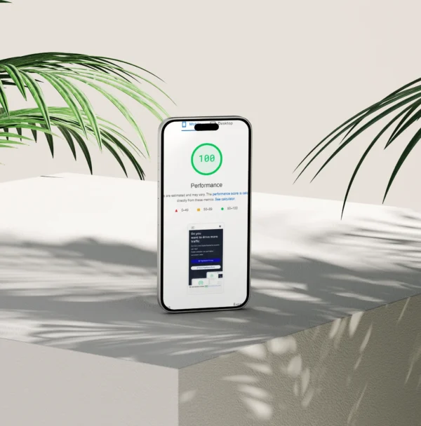
PageSpeed is the simplest way to describe it. It is a set of checks Google and other tools use to estimate how fast and usable a page feels, especially on a phone.
On older builds, we often find avoidable weight and friction. Big images. Old plugins adding scripts everywhere. Layout elements that shift on load. All normal for the time the site was built, but not ideal now.
Once we update the structure and performance to match current requirements, some sites recover surprisingly quickly. You might see visibility stabilise, then clicks pick up again, sometimes within a week or two. Not because we “tricked” anything, but because the site is easier to crawl, faster to render, and less frustrating to use.
Important caveat: results vary. It depends on the market, the competition, the content, and what else has changed around the business. But the underlying pattern is common enough that we now check performance early, not as an afterthought.
Practical advice if your site is older: do not wait for a redesign to look at this. Run a couple of key pages through PageSpeed Insights and check the “Core Web Vitals” section. If it is consistently “needs improvement”, it is worth fixing, even if you keep the same design. My judgement call: you will usually get more value from tightening performance and structure than from adding new features that make the site heavier.
Common reasons WordPress sites fail Core Web Vitals (what we see most often)
These are usually stack choices and small setup issues, not “bad sites” or bad owners
When a WordPress site misses Core Web Vitals, it is rarely because WordPress is “slow”. More often it is a few predictable things adding weight, delaying interaction, or causing the page to jump around as it loads.
Core Web Vitals is Google’s way of measuring how a page feels to use. Think loading speed, responsiveness, and whether the layout stays stable.
Heavy themes and page builders shipping unused CSS and JavaScript
Many themes and builders load large CSS and JS files on every page, even when a page only uses a small part of them. CSS controls styling. JavaScript (JS) adds interactive behaviour.
This can hurt both load time and responsiveness, because the browser has more to download and process before the page feels “ready”. Practical fix: keep the theme lean, use a builder only where it adds real value, and avoid stacking multiple layout systems (for example a heavy theme plus a heavy builder plus extra animation plugins).
Too many plugins doing overlapping jobs
On business sites we often see three different plugins touching the same area, like forms, popups, sliders, SEO, or analytics. Each one can add its own scripts, styles, database queries, and admin overhead.
Practical fix: audit plugins every few months. If two plugins overlap, pick one and remove the other. My judgement call: fewer, well maintained plugins beats a long list of “just in case” tools every time.
Unoptimised images
Images are still the most common source of unnecessary weight. We see oversized uploads, the wrong file format, and pages that load every image immediately.
Practical fix: size images to how they are actually displayed, use modern formats where appropriate (like WebP), and use lazy loading for images that start below the fold. Lazy loading means the browser waits to load an image until it is close to being visible. Do not lazy load your main hero image though, because that can slow the first meaningful paint.
Third-party scripts that slow interaction
Chat widgets, booking tools, heatmaps, tracking tags, and cookie consent tools can be surprisingly expensive. They often load extra files, run code early, and compete for the main browser thread. That can make taps and scrolls feel laggy.
Practical fix: be selective. If a tool is not actively used, remove it. If you need it, load it only on the pages that benefit, and delay non-essential scripts until after the first load. Cookie tools are a common pain point, so choose one that is light and does not rebuild the layout when it appears.
Cheap or misconfigured hosting, poor caching, slow TTFB
Hosting quality and configuration matter, especially for WordPress which builds pages dynamically. If the server is slow, everything else starts late.
TTFB means Time To First Byte. It is how long it takes before the server sends the first response. Practical fix: make sure page caching is set up properly (server-level if possible), keep PHP and WordPress up to date, and check for slow database queries caused by heavy plugins. A cache plugin can help, but it cannot fully fix weak hosting or a messy stack.
Layout shifts from missing image dimensions and font loading
Layout shift is when the page moves as it loads. It is one of the quickest ways to make a site feel untrustworthy.
The most common causes are missing width and height on images (so the browser does not reserve space) and web fonts that swap in late. Practical fix: make sure images have correct dimensions set, reserve space for embeds and banners, and configure font loading so text appears consistently. If you use custom fonts, limit the number of font weights and styles, and avoid loading fonts you do not use.
If you recognise a few of these on your site, that is normal. Most performance wins on WordPress come from removing friction, not adding another layer of tooling.
How Google measures it: lab tests vs real users (and why the numbers disagree)
Use reports to spot patterns, not to chase a single “good” number.
Most people look at PageSpeed Insights and assume it is one test with one answer. It is not. It mixes two different kinds of data, and they often disagree.
Lab data comes from Lighthouse. It runs a simulated test on a single device and connection, in a controlled environment. Useful for debugging because it is repeatable, but it is still a model of reality, not reality.
Field data comes from the Chrome User Experience Report (CrUX). That is aggregated data from real people using Chrome, over time. It reflects the messy real world: different phones, networks, locations, and behaviour.
This is why the numbers can look “wrong”. They are measuring different things, in different ways.
A page can score poorly in the lab but be fine for real users. Common reasons are heavy third-party scripts that Lighthouse penalises in its run, but many real visitors never trigger. Or the lab test is simulating a slower device than your actual audience uses.
The opposite happens too. A page can look great in the lab but fail in the real world. That is usually down to variability. Real users hit peak traffic, slower mobile networks, older devices, cookie banners, A/B tools, or a slow server at certain times. Lab tests do not capture that spread very well.
One short term to know: CrUX is averaged over a period, so improvements may take time to show up. If you make a change today, the lab score might move instantly, but the field data can lag behind.
Practical advice: use Lighthouse to find what is heavy and what is blocking the page. Use CrUX to confirm whether real people are actually having a problem. If they point in different directions, trust neither blindly. Investigate what is different about the test versus your real visitors.
Also, do not only test the homepage. On business sites, the money pages are usually service pages, location pages, booking pages, and contact forms. They often run different plugins and layouts, which means they can behave very differently.
Test key templates instead. For example: one service page template, one blog post, one case study, one contact page, and any page that uses a heavy form or booking widget. That gives you a truer view of your site’s “normal” performance.
Finally, care about consistency across the site more than a single perfect score. Google and users both experience your site as a journey, not a one-off. A fast homepage does not help if the service pages are jumpy, slow to respond, or delayed by scripts.
My judgement call: aim for stable, repeatable “good enough” results on your core templates, then keep them that way. Chasing 100/100 tends to waste time and can push you into changes that make the site harder to maintain.
What to fix first: a sensible priority order for business websites
A pragmatic checklist that respects time and budget.
If your site feels slow, the worst thing you can do is chase lots of tiny “optimisations” while the big issues stay in place. On business websites, a few common problems cause most of the pain.
Here is the order we normally work in when a site has slipped over the years and search and enquiries have started to tail off.
1) Start with above-the-fold speed (LCP)
LCP means Largest Contentful Paint. In plain terms, it is how long it takes for the main visible bit of the page to appear, usually the hero area at the top.
This is where first impressions happen. If the headline, hero image, or primary call to action takes ages to show, people bounce. Google sees that too, because it is a consistent sign the page is heavy.
Practical fixes tend to be boring, but effective: make the hero image the right size, compress it properly, and avoid loading a huge video background unless it is genuinely doing work for you. Also check that the server is not slow to respond, because a delayed start makes everything else worse.
2) Reduce JavaScript and third-party scripts (INP)
INP means Interaction to Next Paint. It is a measure of how responsive the page feels when someone clicks, taps, opens a menu, or submits a form.
The usual culprit is JavaScript doing too much work. Often it is not even your site code. It is third-party scripts: chat widgets, cookie tools, pop-ups, analytics add-ons, marketing tags, A/B testing, embedded social feeds.
Be strict here. If a script does not support a real business need, remove it. If it does, delay it or load it only on the pages that need it. A booking widget on the booking page is reasonable. The same widget on every blog post is usually a tax you pay for no benefit.
3) Eliminate layout shift from images, banners, and fonts (CLS)
CLS means Cumulative Layout Shift. It is the jumpiness you see when text moves, buttons slide away, or the page shifts just as you try to tap something.
This often comes from missing image dimensions, late-loading cookie banners, and web fonts swapping in after the page has already laid out. The fix is normally straightforward: set width and height on images, reserve space for banners, and load fonts in a way that does not cause reflow. If you have a rotating promo bar, be careful with it. These are notorious for shifting layouts.
4) Fix the basics before fine-tuning
Before you spend time shaving milliseconds, make sure the foundations are solid. That means hosting that can handle your traffic, sensible caching, and consistent image handling across the site.
It also means working from your critical templates, not one “nice” page. Focus on the pages that earn money or create leads: service pages, location pages, booking pages, and contact forms. If those templates are fast and stable, most of the site will follow.
My judgement call: if the server response is slow, do that first. You can optimise front end assets all day, but you will still be waiting for the first byte.
A note on balancing performance with needed functionality
Some features cost performance. Booking systems, CRMs, complex forms, and tracking are common examples. That does not mean you cannot use them. It means you should be intentional.
Ask two questions for each heavy feature: does it increase conversions, and can it be limited to the pages where it matters? In many cases, keeping the site lean on informational pages and accepting a slightly heavier booking page is the right trade-off.
The aim is not perfection. It is to remove the drag that has built up over time, so the site feels fast again and your key pages are reliable for real users.
A practical measurement plan (what to check, and how often)
Treat performance like routine maintenance, so you catch issues early instead of doing a big rescue later.
You do not need to measure everything, all the time. You do need a simple routine that tells you when the site is drifting off track.
Start by picking 5-10 key pages and templates. These should represent how people actually use the site:
- Home page
- One or two main service pages
- One location page (if you use them)
- A typical blog post template
- Contact page
- Any high value landing page (for ads or a key offer)
The point is to measure patterns, not one perfect page. If the service page template is fast and stable, most service pages will be too.
Next, take a baseline. Write it down in one place. Keep it simple and track three areas:
- Core Web Vitals (speed, responsiveness, and layout stability, based on real user data where available).
- Crawl and indexing health (can Google find and include the right pages).
- Conversions (form submissions, calls, bookings, or whatever counts as a lead for you).
This avoids a common mistake: improving scores while leads quietly drop because a form breaks, tracking stops recording, or a key page is no longer indexed.
For tools, keep it light. For most small business sites, two are enough:
- Google Search Console – use the Core Web Vitals report and check indexing.
- PageSpeed Insights – test your key pages, especially the ones that generate enquiries.
Search Console is your ongoing view. PageSpeed Insights is your spot check when you want to see what changed on a specific page.
How often should you check? Monthly is usually fine for a small site that is not changing much. If you publish regularly, check every couple of weeks. Do not fall into daily testing unless you are actively working on the site and making changes.
More important than a schedule is this rule: re-test after each meaningful change. That includes theme updates, plugin installs or removals, major plugin updates, adding a new tracking tag, changing cookie tools, swapping fonts, or redesigning a key section.
These are exactly the changes that can quietly push CWV over the line, or introduce layout shift, or make a page feel laggy on mobile.
Keep a change log. Nothing fancy. A simple note like “updated slider plugin”, “added new chat widget”, “changed hero image”, with the date and the pages affected. Then, when you see a drop in Search Console’s Core Web Vitals report, you have a short list of suspects.
My judgement call: be strict with anything that runs on every page. Site-wide scripts and banners are the most common cause of slowdowns over time, and they are easy to forget once they are live.
If you keep to this plan, you are not chasing perfect scores. You are protecting the pages that bring in work, and making sure small changes do not slowly turn into a performance problem.
When Core Web Vitals work is worth it, and when it is not the main issue
Use this to decide if you should fix speed and stability now, or put your energy into content and conversion first.
Core Web Vitals (CWV) are Google’s user experience signals for loading speed, responsiveness, and layout stability. In plain terms: does the page feel quick, does it react when you tap, and does it stop jumping about while it loads.
In real projects, performance work is sometimes the fastest route to better results. Other times it is a distraction. The key is knowing which situation you are in.
When it is worth investing in CWV
It is usually worth it when you are already close to the line and small friction costs you leads.
- Competitive niches where several firms offer similar services and the top results are tightly packed. If two sites look equally credible, the faster, cleaner experience often keeps the visitor moving.
- High paid traffic spend. If you are paying for clicks, you do not want to waste them on a page that feels heavy or laggy on mobile.
- Mobile-heavy audiences. Lots of service businesses are mostly mobile now. CWV problems tend to show up more on mobile data and mid-range devices.
- Older sites that have been added to for 5-10 years. These often carry old page builders, bloated themes, unused plugins, and extra scripts that nobody remembers adding.
- Slow hosting or underpowered server setups. Even a well built site can feel sluggish if the hosting is struggling at peak times.
This matches what we see most with long-running business sites. They start strong, then the requirements change and the site quietly gets heavier. Fixing the fundamentals can bring the site back into line quickly, but only if the rest of the marketing is already sound.
When CWV is not the main issue
If the site is not converting, speed is not always the culprit. These problems usually hurt more than a slightly imperfect CWV score:
- Unclear messaging. If people cannot tell what you do in five seconds, they leave even if the page loads instantly.
- Weak content that does not answer real questions or show depth.
- Poor offers. Vague services, no clear next step, or no reason to choose you.
- Low trust signals. Thin case studies, no real proof, no clear business details, or a contact page that feels hidden.
- Thin location pages. If you target areas, each page needs genuine local relevance. A near-duplicate page with swapped place names rarely performs well long term.
In those cases, CWV work can polish the surface while the underlying problem stays the same.
How to spot which one you are dealing with
Look at the pattern, not one metric.
If you have decent rankings and traffic but low enquiries, performance and usability are worth checking early. Especially on mobile. A slow service page, a jumpy layout, or a delayed form can quietly kill conversions even when SEO is doing its job.
If you have poor visibility overall, CWV might still matter, but it is rarely the first lever. Start by checking whether you have the right pages, the right content depth, and whether Google is indexing what you think it is. Then improve speed once the foundations are in place.
A simple test: open your key service page on your phone using mobile data. Scroll. Tap the menu. Try the contact form. If it feels irritating, it is probably costing you more than the CWV report alone suggests.
A balanced view
Performance supports SEO. It does not replace it. A fast site with unclear positioning will still underperform. And great content on a frustratingly slow site will not reach its potential.
My judgement call: if you are already investing in SEO or paid traffic, do not let an old, heavy setup drag everything down. But if the offer and messaging are not landing, fix that first. You will feel the difference faster, and any CWV work you do after will have a clearer payoff.
What a “modern, SEO-ready” build actually means in 2026 terms
Not buzzwords – just the foundations that keep pages fast, stable, and easy to improve without the site getting heavier every year.
When people say “SEO-ready”, they often mean “it has an SEO plugin installed”. That is not enough. In 2026 terms, it is mostly about whether the site stays fast and usable as you add pages, case studies, forms, tracking, and new content over time.
Core Web Vitals sit right in the middle of this because they measure what your visitors feel. So an “SEO-ready” build is really a build that can hit decent performance on real phones, on normal connections, without constant firefighting.
1) Clean structure and templates that only load what they need
This is the unglamorous bit that makes everything else easier. Each page type should have a clear template. Service page, location page, blog post, case study. The template should load only the features that page actually uses.
In practice, that means not loading three sliders, two icon libraries, and a full page builder framework on a simple text page. It also means keeping the header, footer, and navigation consistent and lightweight, because they appear everywhere.
If you want a simple rule: fewer global scripts and fewer “all pages” widgets. They are usually what drags down LCP (Largest Contentful Paint), which is basically “how fast the main content shows up”.
2) A sensible plugin stack, plus performance budget thinking
Plugins are not the enemy. Uncontrolled plugins are. Every plugin can add code, database queries, CSS, JavaScript, and third party requests. You feel that most on mobile.
A sensible stack is small, maintained, and boring. Use plugins that do one job well. Avoid overlapping tools that each add their own tracking, popups, sliders, and optimisations.
Performance budget thinking is just a limit you agree to stick to. For example, “no new plugin unless we can justify what it adds, and we check it does not slow key pages”. This is how you stop a site quietly getting heavier across 5-10 years.
My judgement call: if a feature is “nice to have” but adds a lot of scripts on every page, it is often not worth it. Put that effort into clearer content, better pages, or a faster enquiry flow.
3) Image and font strategy (formats, sizing, and preloading when justified)
Images are still the biggest weight on most business sites. A modern setup starts with using the right formats and sizes.
Formats: WebP is a good default for most website images. AVIF can be smaller, but support and tooling can be more fiddly depending on your stack. The key is not the format label, it is shipping images that are not 2-5 times larger than they need to be.
Sizing: serve different sizes for different screens. A phone should not download a 2500px wide hero image. WordPress can help with this, but it depends on your theme and how images are inserted.
Fonts: use fewer font files, and only the weights you actually use. Custom fonts can look nice, but they also affect load and layout stability. If you do use them, host them locally and preload only the one that is truly critical above the fold. Preloading means “tell the browser to fetch this early”, and it is easy to overuse.
One practical tip: if your main headline “pops” into a different font after a second, you are paying for it in perceived quality and sometimes in layout shift. That is exactly the kind of thing CWV is trying to catch.
4) Caching and delivery that fits the site
Caching is how you avoid rebuilding the same page on the server for every visitor. In plain terms, it serves a ready-made copy faster.
For most brochure and service sites, server-side page caching makes the biggest difference. It reduces time to first byte (how quickly the server starts responding), which can feed into everything else on the page.
A CDN (Content Delivery Network) is often helpful if you serve customers outside the UK, or if you have heavy images and files that can be delivered closer to the visitor. It is not mandatory for every small business site. If your audience is mostly local and the site is light, you might get more value from better hosting and good caching first.
The goal is simple: make repeat visits fast, make first visits acceptable, and avoid performance falling apart during busy periods.
5) Accessibility and stability basics that also reduce friction
Accessibility is not just a compliance topic. It is also usability, and usability affects enquiries. Clear focus states, readable contrast, sensible headings, and keyboard-friendly menus help real people. They also tend to reduce weird layout behaviour that hurts Core Web Vitals.
Stability is a big deal. Pages should not jump around as they load. Reserve space for images, banners, and embeds so the layout stays put. That reduces CLS (Cumulative Layout Shift), which is basically “how much the page moves while you are trying to read or tap”.
Also watch anything that appears late, like cookie banners, chat widgets, and booking popups. If they push content down or cover buttons on mobile, they create friction even if your headline loads quickly.
Put together, these are not trends. They are habits in the build. If the structure is clean, the plugin stack is controlled, and media delivery is deliberate, your site stays easier to maintain and less likely to drift into “slow and brittle” over time.
FAQ
Words from the experts
We often see older WordPress sites slowly lose ground, not because anything is “broken”, but because the web’s expectations move on and the site never catches up. A common problem is that performance drifts over time as pages get heavier, and one simple way we spot it is by checking load behaviour on real mobile devices, not just in a desktop browser.
In practice, Core Web Vitals are worth treating as a baseline for SEO, not a magic lever. If your site is already clear, relevant, and technically sound, tightening performance usually removes friction and protects visibility, but it will not compensate for weak content or a confusing page structure.
You might like these too
These sit in the same category as the one you are reading. They follow the same thread and offer a bit more depth. Have a look if you want to go further.